
Easier to Learn vs. a More Effective User Interface – A Product Manager’s Perspective
When we are creating information systems, we tend to hold various meetings and loudly voice our opinion about what should be included in the UI (user interface). These meetings tend to take up multiple hours of valuable time. Time which could have been used for getting things done.
Sure we need to discuss all these forms and UI parts but we can reduce it by having a concrete focus. Below we will give you four steps for getting there.
Step 1 – know what usability really means for the users
We often define usability as something that is easy to use, but this is not always the case. Sometimes the users just want a fast user experience, i.e. their goal is to get something done fast. Defining the usability for different system functions can help you to reduce the time spent on discussing all the different versions of the possible UI. As a result your user interface will also feel much better (more intuitive) for the end-user.
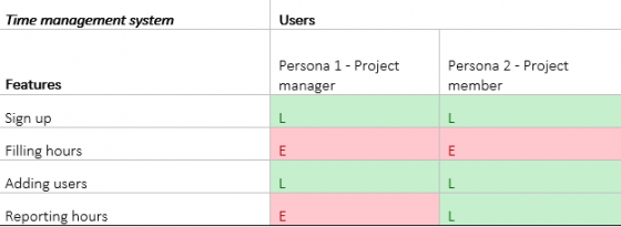
You can essentially create a matrix where each row signifies a feature which the users can use and where columns signify different users. You can add two values to the table cells: “E” for effectiveness and “L” for faster learning, as shown on the picture below.
Step 2 – Work with L-s
Having this kind of a table already helps you a lot with the meetings, but you need to do a few more steps in order to actually create a good user interface.
Take all the functions with the green “L” cells and make these easily understandable for the users. Provide more help, give them less options at a time, add wizards, make selection options more visible, remove hidden functionality, provide them in form input validation and so on. Test it with users (do usability testing) to see how to improve your UI more.
Step 3 – Work with E-s
With red “E” cells you have to see the bigger picture. What really makes a task faster to finish. For example, you shouldn't only make the process quicker in the sign up page but also create easier process for someone who is creating accounts for 50 people in their company - you need to understand when the user has to repeat the process several times and make it as a one step.
So you will need to use bulk actions, graphs instead of tables, remove wizards, add autofillable forms (not only fields), add keyboard shortcuts, remove reasons for mixing the input devices, add favourite locations and shortcuts system, fast understandable alert system, multiple windows support and so on.
You also have to have super fine consistency all over your UI regarding some main elements like save button or filtering fields. You need it for users to know your system by heart after a couple of usages.
Here you can do “time on task” tests and eye tracking studies to understand how fast the users can use your system (using real world tasks) and what they actually notice in your UI.
Step 4 – Work with “L&E” in one feature
This is a balancing act. You basically need to make your system easy to learn and fast to use. So no wizards allowed here. You can use info tips and help-on-demand functions, create keyboard shortcuts, add remember-my-choice features with page settings, and add undo functions and so on.
By now you will probably have more effective meetings and having a super useful user interface - seems like a not-too-small side effect. Maybe by now you have even updated your usability problems and new feature request priorities ;)
And if you need help with your user interface design then don`t be a stranger.


