

How to create the most user-friendly online store in Estonia
For the recent E-commerce UX conference, I assessed the user experience and accessibility of 37 Estonian e-shops. It’s safe to say that I got a good overview of the usability of Estonian online stores today. In this article, I will highlight the key features of a user-friendly e-shop and some mistakes to avoid.
The overall shopping flow was pretty straightforward and fast in most of the stores I rated. What stuck out were interactions that simply weren't thought through or confused the user. In terms of accessibility, Estonian e-shops still have a lot of work to do.
The current low level of accessibility is upsetting because it is precisely those who find it difficult or impossible to physically shop, such as the elderly or the disabled, who would benefit most from online shopping.
To identify the usability problems of an online store, I strongly recommend conducting tests with real users. By distancing ourselves from the actual visitor of our online store, we can see the user's journey from a completely new angle and identify previously unnoticed problems – for example, how the search works or how complicated it is to fill out the forms.
But how to make an online store user-friendly? There are basically three things on a store’s website that you want your customer to be able to find even with their eyes closed: the search box, the "Add to cart" button, and the "Confirm order" button. It seems odd that some online stores seemed to be working hard to hide these things.
The home page
Search
Search is one of the most important things on an online store’s website, especially if that store sells a wide range of goods and it takes time to search for items by category. Where and how to start the search need to be clear at first glance.
This means that the search bar must be located where the user expects it to be (in the header, central position) and contrasting enough with the surroundings to stand out.
The search must be intelligent and find matches that the user is most likely trying to find. For example, if the user searches for two keywords, such as "oval mirror", it is important to narrow down the search and only show oval mirrors, not all oval products as well as all mirrors.
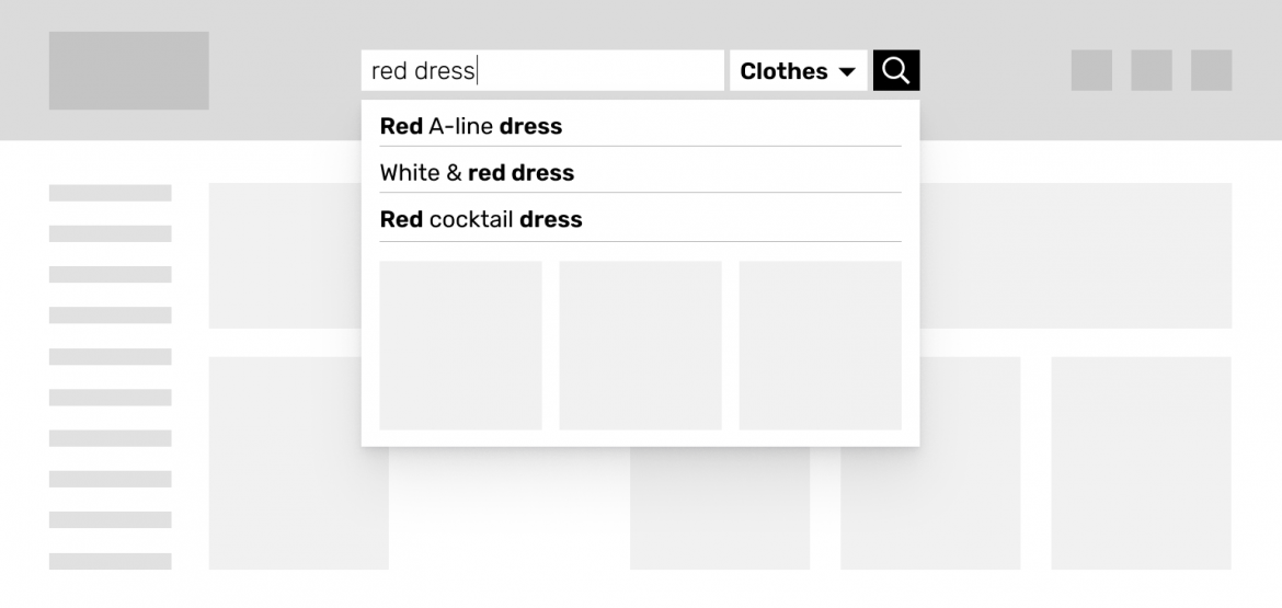
The search must be forgiving in terms of spelling and also provide the user with popular or related search terms. It is also nice to display possible matches right under the search box, before the user has clicked on the “Search” button.
If there are many product categories, it is convenient for the user to be able to choose which product category to search from before launching the search. Even if the search doesn’t return any results, it is still a good opportunity for displaying popular products, so the user can continue shopping.
Menu
The clearer and simpler the menu, the faster the user will reach their desired product. A large multilevel dropdown menu is usually a bad solution as it requires a firm hand and precise mouse movement and it is easy to accidentally close or open it.
An overload of information and thousands of options can disorient the user and must be avoided. One simple menu bar from where the user can then narrow down the product category step-by-step does the job, especially if the page has a decent search engine.
It’s also good to visually show which menu items have a sub-menu and which ones don’t. This ensures fewer surprises for the user and the page will behave as expected.
A frequent question is whether the navigation should be fixed to the top when scrolling down the page. There are arguments both for and against it but in general, I would recommend hiding the menu when scrolling down and bringing it out again (in a minimized form) when the user starts to scroll back upwards. This uses up less screen space while giving the user a quick way to navigate or to start a search.
Of course, I cannot stress enough that a modern website must be accessible to meet the European Union requirements, and one important part of ensuring accessibility is to support keyboard navigation.
To test it in your online store, you just need to open the website and start pressing the Tab key on your keyboard – can you see the focus and can you move onto each clickable element on the page?
Read more about ensuring web accessibility here. As you can see, keyboard navigation is linear, from top to bottom. This means that at the beginning of each page, the user needs to tab through the header and the menu, which can take tens if not hundreds of clicks in some cases.
To avoid this, it is important to have a skip link ("Skip to Content") at the beginning of every page which, when clicked, takes the user directly to the main content of the page. Such a link actually existed in some of the e-shops I rated, but none provided an ideal solution.
Mobile menu
Smartphone screens are getting bigger and bigger, and when holding the phone in one hand, the entire screen isn’t equally easy to reach. The most unreachable area of the screen is the top left corner.
Unfortunately, it is also where one of the most important navigational tools is often placed – the menu button. A better option is to place important things like the menu, shopping cart, and search buttons in the right corner, or even at the bottom of the screen where they move along when scrolling and are always available.
Of course, when using a solution like that, then the bottom navigation must only contain crucial elements and not occupy too much of the valuable screen space. It is also important to ensure that the buttons are large enough to be easily pressed with a finger. Oftentimes, the actual interactive area of a button or icon is made too small, making it difficult to hit.
If the button only contains an icon instead of text, it is important to give it a text alternative (e.g. aria-label) in the code, which also allows assistive technologies such as voice commands and screen readers (a program for the blind that reads out everything on the screen) to use them.
It is also important for assistive technologies and search engines that the page has the correct language code – I was amazed at how many online stores had that wrong.
Colors
Color contrast shows how much the colors of the text and the background differ from each other. Dark text on a dark background and light text on a light background are harder to read than dark text on a light background.

A page with good color contrast is also convenient for the elderly and people with low vision, and when using monitors with a low contrast or mobile devices with dirty screens, which are often used in poor lighting conditions, such as outdoors. High contrast makes texts visible and readable, and helps ensure that important features do not go unnoticed.
In many online stores, important elements such as the search box, menu button, and product sorting dissolved into the rest of the page due to low contrast. Color contrast can be easily checked online, for example with this free tool.
Banners
Most online stores have automatically changing banners on the home page that add life to it and allow for displaying multiple campaigns or news at once. However, for people who have difficulty reading or concentrating, the banners can be a headache.
To ensure accessibility, the user must be able to stop the movement of the banners (and all other moving elements) – a pause button must be available that stops any animations on the page.
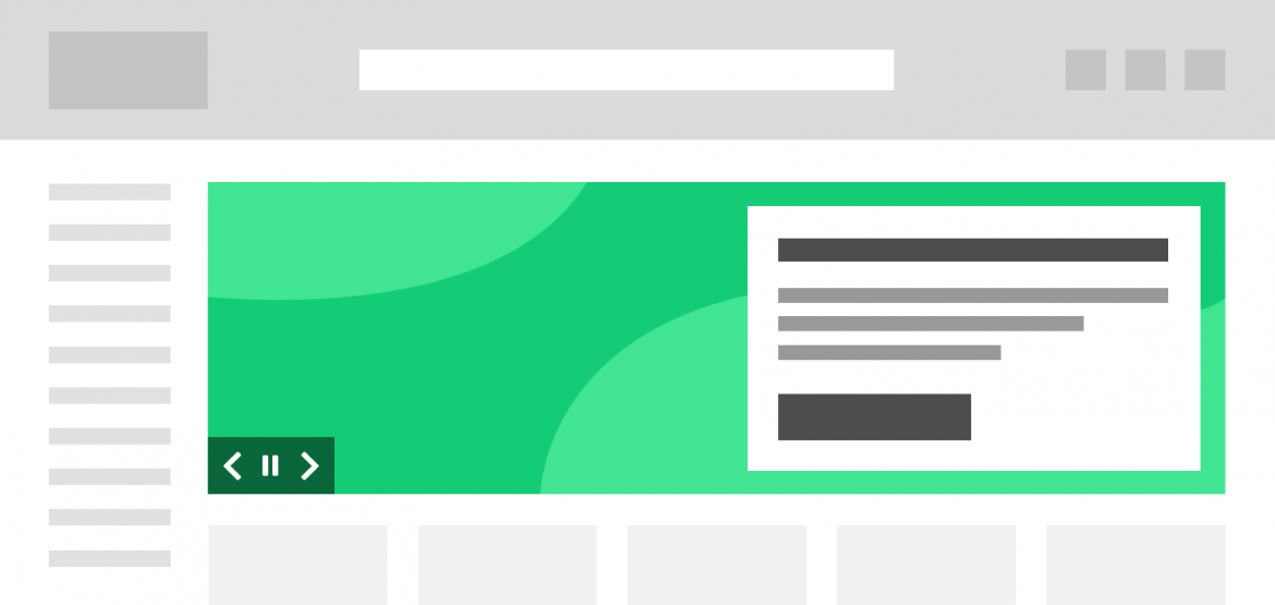
In case of banners, a very good solution is to add text on top of the image via HTML, not with design software. This means that the text is machine-readable (Google can see it!), does not get blurry when the user zooms in, and it also adapts to tablet and mobile.
Visually impaired people can customize any text added in HTML (for example, change its color or line height) or have the text be read out loud by a screen reader.
Products list
So now, we have reached the products list. If there are many products, it is definitely useful if they can be filtered and sorted. However, we should never show filters that aren’t adequate for the product category – no one wants to choose a "sink material" when looking for a floor lamp.
If products can be filtered by color, it is necessary not to display too many similar options ("blue", "darkblue", "dark blue") and, when the user finally picks “beige”, then black and dark brown shoes shouldn’t be displayed. If there are many options under a filter, such as brands, then the user should also be able to search from among those.
If tens or even hundreds of products are displayed, then they are usually divided between numbered pages, which can be navigated via a "pagination" bar.
Alongside this common practice, the use of a "Show more" button after every few dozen products is becoming more popular, which is more intuitive and allows the user to load products without reloading the page.

It is important though that when the user clicks on a product and then returns to the products list, that their scroll position has been retained. Another thing that saves time is if the product can be added to the shopping cart directly from the search results view, rather than having to go to the product detail view.
For grocery stores, it is convenient if the contents of the shopping cart can be displayed in parallel with the products list, providing the user with an overview of what has already been added to the shopping cart and what else is needed.
Even on a small device, it is generally good to display products not in one, but two columns – that way, more products fit on the screen at once, but product images are still relatively large. Since there is less space on mobile, it is worth reconsidering which information is truly essential in the products list and what can be hidden.
Product page
In the product detail view, users want to see additional images, a description of the product and its price. If there are several product images, it is important to make that clearly visible (for example, as thumbnails under the large picture).
In some online stores, the product's measurements were nicely and illustratively shown on the product’s image, but the measurements must also be presented as text so as to ensure that they are also available for assistive technologies (Google’s robots, voice commands, screen readers).
The description and parameters of the product can be even more important than the image, depending on the product, so they should not be hidden under offers, similar products, etc., especially in mobile where the user doesn’t get a good overview of the content at first glance like in desktop.
In a single line of text, the number of characters must remain under 100, ideally under 70. If the lines are too long to read, the eye will wander at the end of each line, trying to find the beginning of the next. Additionally, reading is more complicated when text is centered or justified and in all-caps. It is better to always use left alignment and minimal capitalization.
For a clothing or shoe store, it is also a good idea to include a measurement chart on the product page, where bonus points go to ones that are simple and provide visual measuring instructions.
One shoe store had this convenient solution: if the user forgot to choose the size of the shoe and clicked "Add to cart", rather than displaying a frightening error message, the size selection box was automatically opened for them.
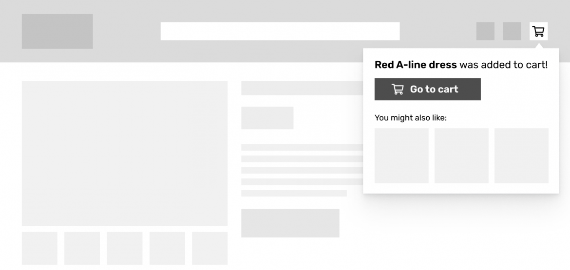
The “Add to cart” button must be clearly visible. If the user adds a product to cart, it is not a good idea to take them straight to the shopping cart page as this will prevent additional shopping, which is definitely something we want to encourage. A better option is to show a notification about the item being added, accompanied by a link to the cart view.
Basket
The shopping cart view must be clear and provide a good overview – highlight the important things and hide the unnecessary. In general, it is beneficial if all the steps necessary for placing an order can be done on the same page. This decreases confusion and means that there is less going back and forth.
The process can be divided into steps, but the steps should be located on the same page, compact and easy to grasp. It is convenient if the contents of the shopping cart are visible throughout the purchase process.
It is also good to show some kind of value proposition in the shopping cart, e.g. free delivery or flexible return, which can give the customer that last push towards placing an order.
The user should never be required to log in or sign up to make a purchase since this may seem like a time-consuming commitment. In the contact details form, mandatory fields must be clearly indicated. If mandatory fields are marked with an asterisk, an explanation must be provided before the form (this is one of the accessibility requirements!).
Blank and filled fields should look different enough to make it clear which fields are still empty. Of course, it is important that the autofill function fills the form correctly.
For example, if the form has the fields "Name" and "Last name", then autofill as well as a large number of users will probably fill in the fields incorrectly, and the database will receive the customer’s name as "Sarah Smith Smith".
A frequent problem is that when the user types something into the fields, their labels disappear, so if they use the autofill function, then they will no longer be able to determine whether the fields were filled in correctly or not.

If the user makes mistakes while filling out the form, then it is good to highlight those immediately, before the user clicks "Confirm" (inline validation). Using the right field types in HTML (for example, type="number" for numbers) helps with validation and also displays the correct keyboard on mobile devices (e.g. numeric keyboard for entering a phone number).
And if the user still makes an error, the error message must be displayed where the user can see it immediately, without scrolling.
If the user orders their products to be delivered to a parcel terminal, then they should not be forced to enter their home address anywhere. The user should be able to search through the list of parcel terminal locations as those lists contain a lot of options.
In some online stores that I rated, parcel terminals could even be selected from a map. However, if they opt for home delivery, then the user will benefit from the being able to search for their home address, which will help to slightly speed up the filling of the form.
Finally, user-friendliness is also demonstrated by how the terms and conditions of the online store are presented – if they are easy to comprehend and read, it shows that the company cares for its customers, which in turn can reduce fears and doubts. To present the conditions in a friendly and clear way, it is good to divide them into chapters and allow users to search in them.
Conclusion
A positive online shopping experience consists of a thousand aspects and we only scratched the surface of this topic in this article. However, these tips can help make the user's journey more convenient and efficient and thereby increase sales.


