Service Plan - Visualizing Processes for Better Customer Experience

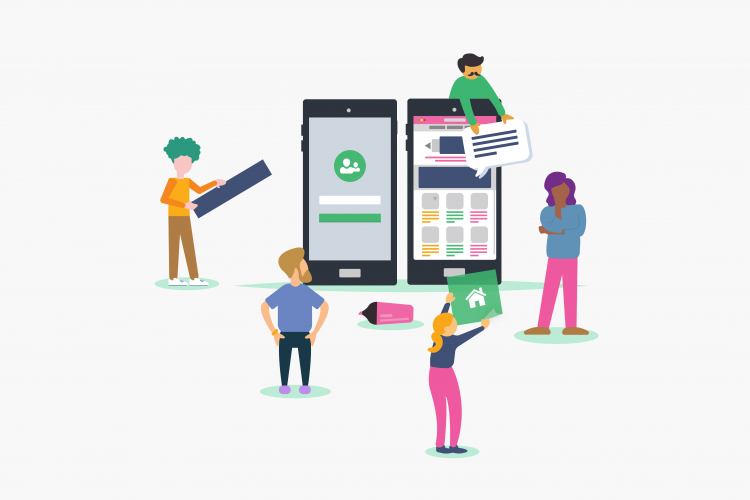
You might have heard of the "customer journey" as a design method, but the concept of a "service blueprint" might still be new to some. Designing an excellent customer journey is crucial, but if an organization can't function smoothly in delivering its services, then a great customer experience can't be sustained for long. Mapping a service blueprint is a method that helps integrate service usage and delivery into a cohesive whole, being a key tool in service design.

WCAG 2.2 and new success criteria

Last October, the long-awaited version 2.2 of WCAG (Web Content Accessibility Guidelines became the official W3C recommendation. Today we will give an overview of what’s new and how it will impact us. Although WCAG 3.0 (which is promised to cover more user needs, be more flexible in terms of different technologies, tools and content, as well as easier to understand) is also being developed, it will still take years before it will become an official recommendation.

Does your digital environment meet accessibility requirements in force from 2025?

Accessible digital environments are independently usable by as many people as possible. An accessible digital environment is designed and developed in such a way that its texts can be read also by the elderly, layout and functions are understandable also to first-time users, and the page is usable for people with special needs and various assistive technologies (navigable with keyboard, screen readers, voice commands, eye sensors) etc.

What can the private sector learn from the public sector in service design?

Service design is not something to do when you have leftover time and money. The new norm should be to focus on how to be customer-centric, what changes it requires, how it relates to today's business goals, and what it means for every person in their daily work. What can the private sector learn from the public sector? We share our observations on similarities, differences, and lessons that both sectors can reflect upon.

Web accessibility: one form suits all?

There are bigger or smaller web forms on almost every website, but a lot can go wrong with them. From the accessibility aspect, the form must be simple, understandable, and navigable with a keyboard (for example, for a person with motor impairment who is unable to use a mouse) as well as various assistive technologies, such as a screen reader (software that reads out everything that happens on the screen to a blind user). Let's see how to do that.