Can a Time-Critical Information System Provide an Empathetic Customer Experience: The Emergency Response Centre's SOS Case Study
Working in collaboration with the Emergency Response Centre and the Ministry of the Interior's IT and Development Centre (SMIT), we contributed to improving the workflows of rescue coordinators and logisticians.
The primary measure of a rescue coordinator's work is speed – the rapid delivery of help to those in need. However, this can occasionally lead to a poor customer experience.
Our specialists' objective was to ensure that help reached people as quickly as possible, while simultaneously ensuring the rescue coordinator offered a positive customer experience, encompassing shorter, conflict-free calls.
For a smooth and efficient workflow, it's crucial that both the rescue coordinator and the logistician have a thorough understanding of the information system, knowing it like the back of their hand. The interface should be user-friendly, avoiding any complexity or ambiguity. It’s important for the system to be both intelligent and rapid, capable of immediately suggesting potentially related incidents at the beginning of a call.
This feature is especially useful in situations like a multi-vehicle accident, where there might be several callers reporting the same event. The system should be designed to quickly recognize and merge these reports, ensuring it's treated as a single incident to avoid duplications.
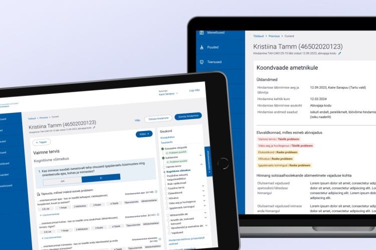
The existing workstations of rescue coordinators and logisticians were very complex, requiring excessive preliminary actions for simple processes. Our specialists stepped in to design new workstations, recognizing that effective UI/UX design is crucial for enhancing customer experiences by enabling faster and more efficient interactions.
A key objective for the new HKSOS (Emergency Response Centre's SOS System) was to streamline workflows. An example of this improvement is the reduction in the number of screens from four to three. This change not only simplifies the workflow but also eases IT demands, as staff previously had to juggle four screens at once. Additionally, reorganizing the screen sequence for logical flow and creating a more compact, smarter event creation form were essential steps.
While the HKSOS interfaces with various applications, this integration can introduce challenges. For instance, if the system encounters difficulties in alerting emergency resources, it needs to have readily available alternative options. Yet, these contingencies can potentially slow the system down and make it more prone to technical disruptions. The design therefore carefully balances functionality with the need for system stability and speed.
We aimed for an ambitious vision without overcomplicating things
We employed a variety of methodologies to reach the future HKSOS:
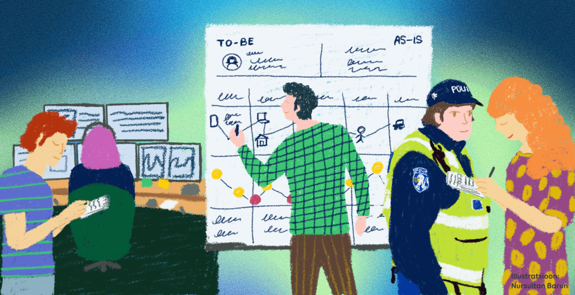
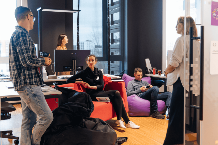
- Observation: Our team made site visits to emergency response centers to directly observe and interview rescue coordinators and logisticians, gaining insights into their daily tasks and challenges.
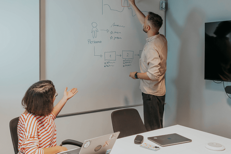
- Journey Mapping: We meticulously analyzed the paths of various incident scenarios, both in their current state (as-is) and how they could ideally function (to-be), to identify areas for improvement.
- Interviews: Engaging in conversations with police, fire, and ambulance personnel was vital. It helped us understand their specific information needs and the nuances of their workflows, guiding our design process.
Identifying bottlenecks and proposing solutions
In the empathy phase it was essential to monitor the actual system usage and user experience closely. We discovered that users' verbal accounts didn't always align with their actual practices, leading us to identify numerous activities that could be streamlined for greater speed and user comfort.
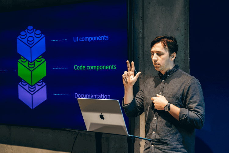
The Emergency Response Centre faced the challenge of lacking a unified design system. This resulted in a mishmash of related applications, each with its unique appearance and behavior. Implementing a cohesive design system was a critical step towards enhancing the overall system.
A consistent design language and the reuse of components contribute to creating uniformity. This uniformity is key in reducing user confusion when navigating between different applications. For further insights, please refer to our earlier blog post about design systems.
During the visualization phase, we developed a design system specifically for HKSOS and crafted a prototype for an updated rescue coordinator and logistician workstation. Subsequent usability testing was conducted in emergency response centers nationwide. Our focus was on creating a solution with eye-friendly colors and clear, legible typography.
Challenges
We encountered four principal challenges in this project:
- Complexity of the Information System: HKSOS was intertwined with a vast array of applications.
- Technical Limitations: The pre-existing user interface technology didn't support dynamic solutions, such as screens adapting to user activities.
- The One-Minute Rule: The system required the capability to identify life or health threats within one minute.
- User Sensitivity: The high-pressure nature of the work and the demographic profile of the staff implied that any changes, even those designed to simplify and accelerate processes, were met with resistance. Our aim was to engage users extensively, ensuring that all upgrades were straightforward, comprehensible, and comfortable, particularly considering their resistance to change.
Our projects and solutions are always user-centered, so we took the following nuances into account:
- Clear and Simple Design: We emphasized straightforward and intuitive interfaces to enhance user comprehension and ease of use.
- Larger Text: Considering the diverse age range of users, we increased font size for better readability.
- Contrast in Color Choice: Given the 24/7 nature of the service, and acknowledging that rooms can be dimly lit in the evening, we implemented a dark theme. This not only improves reading experience in low-light conditions but is also easier on the eyes.
- Clear Notifications and Instructions: We ensured that system notifications were simple and unambiguous, especially for indicating errors or additional required actions.
- Continuous User Involvement in Testing: Regular feedback from users during testing phases helped us identify potential issues and areas needing improvement early on.
Conclusion
The primary challenge of the project, as the title suggests, was determining whether a time-critical information system could provide an empathetic customer experience. From our experience, the answer is a resounding YES! A well-thought-out design that prioritizes user comfort certainly supports an empathetic customer experience. 🌟🚒


