
What to keep in mind when creating and testing a user-friendly online store?
There are various different testing types and methods that are used for testing online stores. We will likely even be publishing a series on some of the different technical testing types (e.g. different devices, performance tests, cross-browser testing, SEO etc.) on our blog soon.
Trinidad Wiseman is a UX-oriented (user experience) and human-centric company, which means that we also follow these core values when developing and testing online stores. In addition to marketing and pricing policies, clients are also influenced by the purchasing process and interactions in the fierce competition between online stores.
In other words, they are influenced by everything they experience when buying something on their device. What the purchasing process looks like as a whole depends on development partner’s experience and work quality as well as the store owner’s own awareness on the subject and their interest in creating a high-quality online store. It is precisely this “quality” that the tester must contribute to via non-functional usability testing. An exemplary UX process should definitely include persona-based usability tests with end-users.
The importance of usability testing when testing online stores
In the article “How can a tester create added value?”, I have previously looked at the most important skills of a tester – their ability to see the product from the end-users perspective and to think outside-in, not inside-out. A quality product must be of good quality from each party’s point of view, but especially from the end user’s point of view since the product is aimed at them.
This kind of approach is very important when it comes to online store since based on the requirements and documentation, the result may be a store with a modern design, good technical capabilities and few errors, but for the client, it may still lack that “special something” that would drive them to make a purchase. This means that in addition to technical topics, the tester must also pay increased attention to non-functional testing AKA specifically usability testing. You can read more about usability in our previous blog posts.
Next, we will have a look at two important topics around which most of what determines the quality of an online store is centred. Based on my own experience and research, I will also highlight those “special somethings” that a tester as part of the development team and as the client’s good consultant should pay attention to.
Product presentation and findability
In online stores, where you cannot touch or smell items, where you cannot check an object’s ergonomics or compare them or put them next to each other, the virtual presentation of the product becomes very important. The presentation does not mean just product photos. Rather, it starts from the grassroots AKA the product name and thinking it through properly.
There are many examples out there where the product name includes the brand and model name but does not include a general term for it that would indicate what kind of an object it is (e.g. “Smiles X7” vs “Electric Scooter Smiles X7”). If a user enters the general term into the search bar instead of the product name, then they might not be able to find the product via Google or on the store’s website. Additionally, if only the product name is used, then a potential client may need to spend a lot more time browsing through product lists and pages to figure out what object the product actually is.
Based on the above, in addition to navigation (menus, product categories, breadcrumbs), we should always also think about how users look for and find products by the search terms they use. In the case of online stores, the saying “what you cannot find, does not exist, and what does not exist, cannot be bought” generally holds true. Rare are the cases where someone turns to customer support to find a product in an online store. You can get a very good overview of the search terms your users use by setting up an appropriate Google Analytics report. You can also set up Hotjar’s software on your website, which tracks a user’s behaviour if you follow GDPR requirements properly.
The information displayed in product lists and in a product’s detail page also plays an important role in the presentation, in addition to a well thought out product name. Here are a few examples:
- Do both views immediately display the product’s current stock status and on the detail page, the delivery fees, so the user does not have to make extra clicks or look for this information separately?
- Does the detail page also immediately show courier delivery times?
- Are similar/related products also recommended for the user and is feedback from other users also displayed so that the user can take those into account when making a decision?
- Does the detail page include breadcrumbs so the user could easily understand where they are currently located and which category they can return to?
- Does the client feel like the product and the offer are both desirable?
Small details like this all play a part in the client’s purchasing behaviour and the purchasing process.
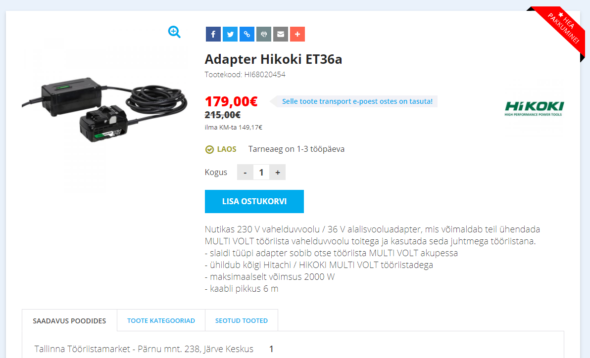
Screenshot 1: an example of a product’s detail page, where a lot of the information needed for making a purchase is all present in the view. For example: whether the product is in stock or not, the delivery time, availability per store and delivery fees, the price without VAT, a “good offer” label etc.
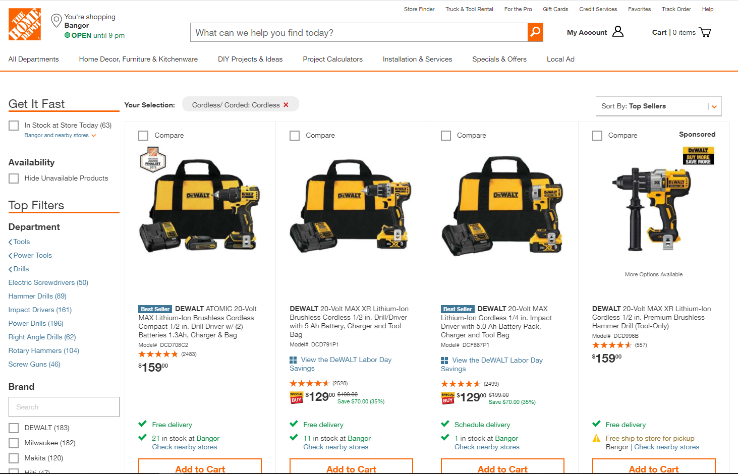
Screenshot 2: Home Depot, which was named the online store with the best user experience by the Baymard Institute. The store also displays a lot of information necessary for making a purchase (stock status, user reviews, delivery fees, closest stores). In terms of usability, it is really important to ensure that the user does not have to open up a product’s detail page to add it to the cart.
The purchasing process
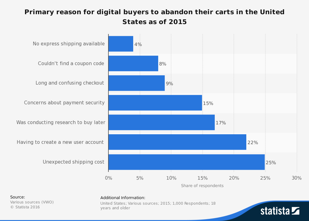
In addition to everything mentioned above, another important aspect of the purchasing process is what happens after the user clicks the “Add to Cart” button. The results of research conducted by the Baymard Institute show that a staggering 69% of online store clients do not finish the purchase after they have added something to their cart. Of course, not all of the reasons are connected to the online store’s usability, but it definitely belongs among the more important reasons.
The development company and the product owner must do everything they can to ensure that the purchasing process is not cut short due to bad user experience. As a tester, I believe that usability can be improved if, during the cart phase, you pay attention to and direct the tester’s attention to the following nuances:
- When filling out forms, the selected fields should be connected and data entry should be in a logical order. For example, if a private client selects a parcel terminal as the delivery method, then they should no longer have to fill out the address fields, which would be required for the courier delivery method;
- The amount of data that the client needs to enter to make the purchase should be as minimal as possible. In other words, the cliché “less is more” is true here – do not ask for data that you do not need (e.g. country);
- “Subscribe to our newsletter”, “Sign up for our mailing list” and other similar options should not be checked by default – this will only cause further frustration in the client because they will have to make an additional click to remove it. In case the client does not notice the pre-checked box, the result might be an angry customer – why are you sending me spam? I have not agreed to this!;
- The shopping cart should be located in its traditional place AKA in the top right corner since that is where people will look for it. All other options are not user-friendly;
- If the user has the option of creating an account, then all of their previous orders should be saved and ideally, they should be able to pick between different delivery addresses (e.g. work, home, mother-in-law). This would enable them to perform a so-called one-click purchase;
- When paying by credit card, you should create trust by adding information about how secure credit card payments are in this particular online store;
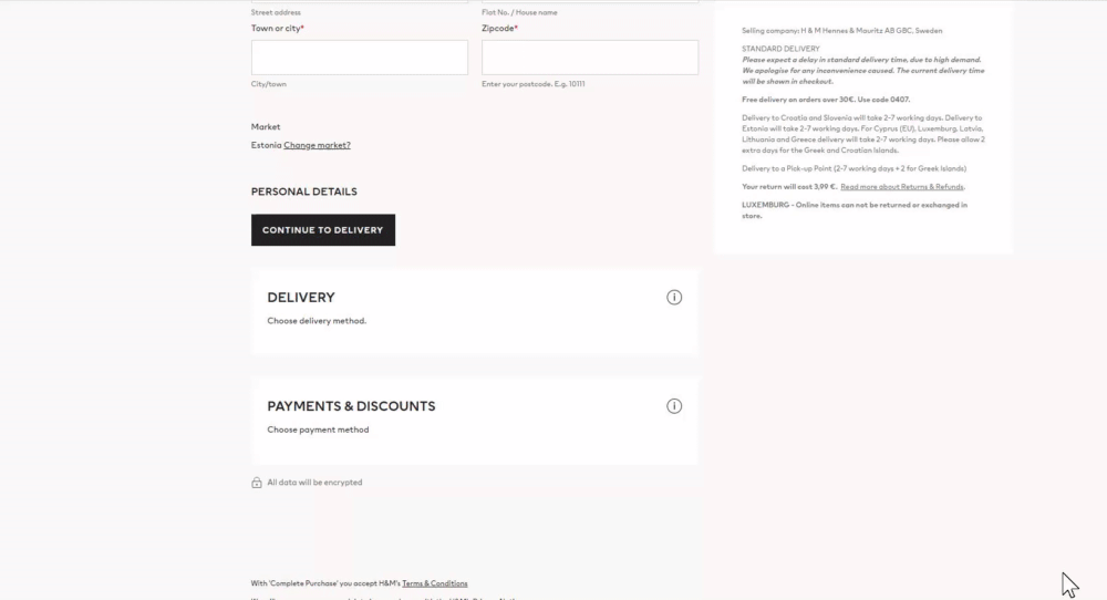
Screen recording 1: an example of H&M’s online store , where a lot of information has been added about every delivery and payment method, which creates trust and helps answer any possible questions that the user may have.
- An online store should offer as many different delivery methods as possible – all parcel terminals, couriers, delivery robots, drones etc. If possible, you should also offer the option of coming to pick up the order yourself because if, for example, the total value of the order is 5 EUR, then the cost of sending it to a parcel terminal may make up too much of the order’s total cost for the client. The initial 5 EUR purchase may be followed by a larger purchase if the so-called trial purchase was successful. This means that small purchases are also very important when creating customer relations;
- Session storage AKA if a neighbour comes to chat with you, then when you come back to finish the purchase later, you should be able to continue from where you left off and the products you chose should still be in the cart;
- You should also be able to make a purchase without having to create an account. If you force a client to create an account to make a purchase, then they are very likely to leave if they can get the same product from somewhere else under similar conditions.
In conlusion, a tester cannot be someone who takes product photos for the online store, writes up product descriptions, is responsible for the UX and the design, or decides on the pricing policy. Instead, a tester with knowledge of UX can be an observant consultant who can offer good human-centric solutions by thinking about the interests and needs of the client. I hope that my suggestions in this article have been useful for you and will help in you in creating a more user-friendly online store and a more successful business.


