The Evolution of UI/UX Design Trends
The beginning of the new year is a perfect moment to dive into the world of design trends. UI/UX design trends are evolving and constantly influenced by technological advances, changes in user behavior and needs, and innovation. Staying on top of trends and looking to the future is essential to creating modern and user-friendly user experiences.
In this post, we look back in time, tracing the evolution and current state of UI/UX design trends, and discuss how they may change further in the future. Cover not only well-known trends, but also emerging trends.
1. Minimalism: less is more
Minimalist design has emerged as a pervasive trend in UI and UX that carries the "less is more" mindset. This trend emphasizes simplicity, clean and clear lines, and focusing only on the essentials. Today, minimalist design has evolved to become more multi-faceted, still maintaining clarity but enhancing personalization options and functionality.
The concept of minimalist design 10 years ago is a little different from today's, but you can still notice the characteristic features to todays design.
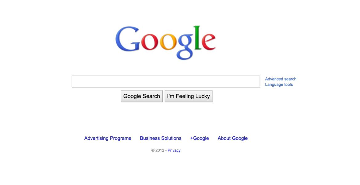
For example, when opening the Google home page in 2012, only a search bar was displayed where users could enter search terms. Search results were presented clearly and cleanly, highlighting links, titles and metadata through a minimalist layout. Simplicity was the key, focusing only on the most important thing - search.
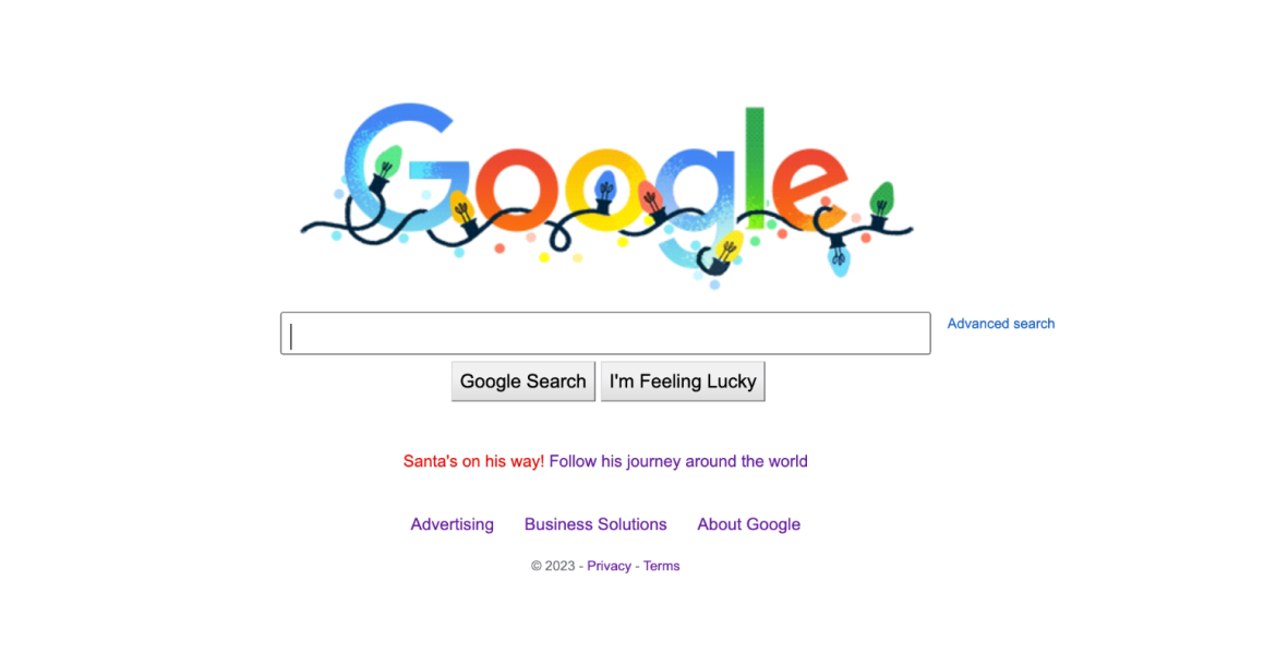
If you visit the Google home page now, you can notice light animations that enrich the home page and the content field. The animations often correspond to some current global holiday, such as Christmas or New Year.
Personalization has become more important - personalized recommendations can be found below the search field, based on users' previous searches and search history. It adds a more human touch to the minimalist design.
Search results may contain more graphic elements, such as images or infographics, to provide more information at a glance. Despite the added improvements, the overall picture is still clear and user-friendly.
Google Search in the year 2023 illustrates how minimalist design can adapt to the times and users' needs while adding a more modern feel. Simplicity and functionality are still paramount, but advanced features give users more control and a personalized experience.
Looking at the future
We can only imagine minimalist design not only in two dimensions, but also spatially. Already in the next decade we can likely witness the emergence of 3D minimalism. Elements can begin to subtly float, creating an immersive and novel environment. This development would bring forth a visually engaging minimalist digital space that may still seem science fiction at the moment.
In the future, minimalist design may evolve to the point where it becomes almost invisible. Elements can remain in the background, opening only when needed. Such an approach, often referred to as "invisible design", would focus on removing unnecessary elements and functionality.
Within the next decade, minimalist design may include gesture navigation as a primary means of communication. Users would be able to navigate the interfaces with natural gestures, eliminating the need for visible buttons or menus.
"Minimalism becomes more playful and creative. An abundance of identical cream-colored designs do not convey the character that the owner of the page has, and it could change. I can already see the little that appears to the viewer is being spiced up and enlived. Minimalism regains its artistic value!" - Darja Prants
2. Microinteractions
Microinteractions have become an important design trend, involving animations or interactive feedback that occur in response to user actions. This trend is increasingly on the rise, as small details like these increase user engagement and create a more pleasant experience.
In today's mobile and web applications, microinteractions are very fascinating details that not only show user actions, but also enrich the aesthetic side of the design.
Microinteractions 10 years ago were not yet as widely used and developed as they are today. Back then, simple hover effects were used, where elements change color or a small animation appears when the cursor moves over them, but they were less noticeable than today.
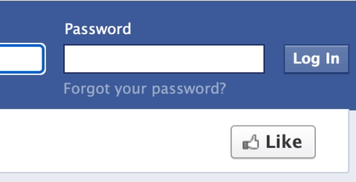
In 2012, Facebook introduced the now-popular “Like” button. Back then, Facebook's "Like" button was simple and static. Users saw that their posts were rated when the button simply turned blue. It was simple feedback, but not particularly interactive or animated.
Web form submissions often lacked noticeable animations or dynamic visual feedback. When the user filled out the form and pressed the submit button, a simple confirmation message was usually displayed, without any special animation or effects.
Looking at the future
In 10 years, users may interact with digital interfaces using biometric signals such as facial emotions or eye movements. When the "Like" button is pressed, the interface can react to the user's facial expressions, for example showing a happier icon.
In the future, microinteractions may be able to synchronize the emotions of multiple users, enabling group-friendly experiences. For example, if several people press the "Like" button at the same time, a synergistic animation or effect can occur.
“Microinteractions help to make the user interface more intuitive and lively through simple animations. In 10 years, when virtual and augmented reality have established itself in the design world and when designing user interfaces, spatiality and greater freedom of interaction must be taken in account, which make the implementation of microinteractions even more important.” – Norman Niklus
3. Dark theme
Once considered a niche functionality, the dark theme has become a necessary design trend. In addition to its aesthetic appeal, the dark theme offers practical benefits such as less eye strain and better battery life for devices with OLED displays.
10 years ago, a dark theme was considered more of an aesthetic choice. In 2014, apps and web pages mostly had light backgrounds, which was the widely accepted standard at the time. Platforms offering a dark theme were the exception rather than the rule, and its use was not yet widespread.
At the same time, there were already good examples of the purposeful use of a dark theme. Some apps, such as professional photo or video editing apps, already offered a dark theme to reduce eye strain.
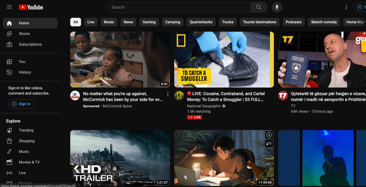
Dark mode has become extremely popular and has been widely adopted. Several major platforms, such as Twitter, Instagram, YouTube, as well as many operating systems, now offer users the option to select a dark mode as well, which provides a better reading experience in darker environments. This reduces eye strain and also extends battery life on OLED displays.
The dark mode has also been constantly updated with various options. Users can often choose between different dark shades or automatically schedule a dark mode depending on the daylight.
More and more web and mobile apps and platforms are starting to offer both dark and light modes. This provides users with their preferences and more convenient navigation between different platforms, without the eyes having to constantly readjust to the brightness of the screen.
The dark theme has also been constantly supplemented with various options. Users can often choose between different dark shades or automatically schedule a dark mode depending on the daylight.
More and more web and mobile applications have started to offer both dark and light themes together. This provides users with their preferences and more convenient navigation between different platforms, without the eyes having to constantly readjust to the brightness of the screen.
Looking at the future
The future of the dark theme could bring a contextual change, where certain elements dynamically switch between light and dark depending on, for example, the time of day.
In the future, users may have the ability to customize the darkness of their interfaces. Adjusting the depth of shadows, intensity of dark backgrounds, or even color temperature may soon become a standard feature.
Dark themes can evolve to include bioluminescent colors and luminescence, or soft, luminous elements that illuminate specific areas. These subtle light sources add mystique and direct the user's focus without compromising the overall dark aesthetic.
"My experience shows that dark mode is much loved because it is less straining on the eyes in a dark environment, creating less contrast between the dark environment and the bright screen. For OLED screens, dark mode saves the battery and also the environment. The future may bring even more energy-efficient technologies.
I like to think about different environmentally sustainable solutions, such as the ability of devices to display energy saved by adjusting screen brightness. I think that the dark mode could also spread from the digital world to the physical world, for example by adjusting the brightness of the bathroom lamp at night, which would help manage both sleep rhythms and electricity bills.“ - Mari-Ell Mets
4. Neomorphism
To begin with, many have certainly not heard of such a term. So let's get this straight first. 10 years ago, the trend, especially on mobile devices, was the skeuomorph. It is an online representation of digital interface elements as objects of realistic design. Skeumorphism evolved into neomorphism due to several developments and changes in design trends.
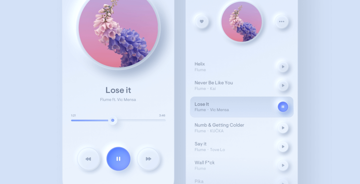
Neomorphism is a design style that has become a futuristic trend in UI/UX. Unlike flat, minimalist shapes, these apps take a more tactile approach. Buttons and elements mimic physical forms while casting subtle shadows to create the illusion of depth. This trend not only gives a fresh futuristic feel but also makes users feel more connected to the digital environment.
Looking at the future
In the next 10 years, neomorphism in user interface design may move from static visuals to more interactive levels. Elements can begin to dynamically respond to user interactions by providing haptic feedback. Users can feel the real click and movement of virtual buttons and sliders.
Neomorphism can start creating dynamic lighting and shadows. As users navigate the digital space, light sources can adapt in real time, casting shadows that shift and move with each interaction.
“As its name suggests, it is a new arrival of the skeuomorphic design style. I don’t think it will be an era-defining style that will last for 10 years, but like any trend, if used sensibly, you can get good results. Personally, I find its uses to be relatively limited. It is well suited for designing simpler displays with little information, where the goal is to provide a certain experience or feeling. It remains too sprawling for practical, large data processing designs.” – Hardi Niilo
5. Personalisation
Personalization has become a central UI/UX design trend. Data analytics and artificial intelligence are used to tailor the user experience based on individual preferences, behavioral patterns and context. This includes not only visual customization of the user interface, but also functional aspects such as personalization of recommendations and individual settings.
10 years ago, personalization options were rather limited and rare. Websites and apps customize content primarily based on general demographic information, such as the user's location or language preference. It was quite rudimentary compared to today's level of personalization.
At the time, personalization was mainly about simple user interface customizations, such as choosing color schemes or adjusting the size of the interface. However, truly personalized user experiences were less common.
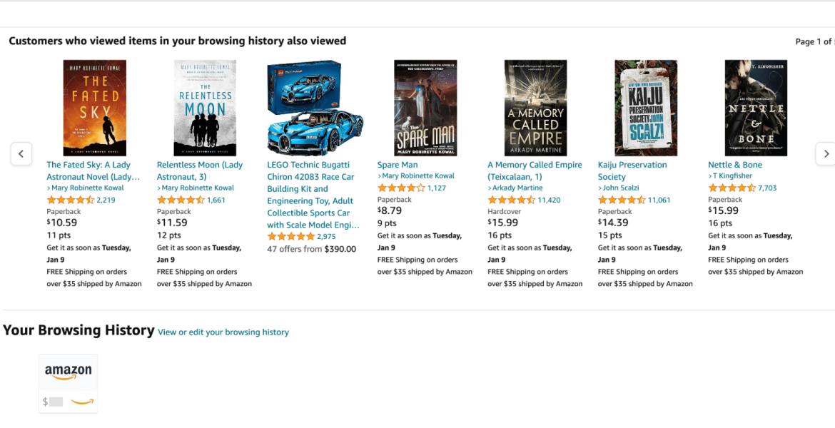
For example, e-commerce platforms currently display recommendations to the user based on their previous purchase history or viewed products. The platform may also use personalized discount coupons or advertisements to entice the user to make a purchase based on their previous preferences.
However, personalization options are not limited to product recommendations. Social media platforms also customize users' feeds by showing content that algorithms think the user will find most interesting, based on their previous behavior, shared content.
Looking at the future
In the future, AI may play a central role in creating personalized and adaptive user interfaces. Design systems dynamically adapt to user preferences, behavior and context.
In 10 years, platforms may use advanced artificial intelligence and machine learning algorithms to better understand user behavior in different contexts. For example, the application automatically adapts to the user's location, activity or time.
Emerging technologies such as virtual reality can take personalization to a whole new level, offering users a fully customized virtual environment based on their preferences.
"If currently the personalization of products or content is quite common in digital channels, then in the future it will probably also come to physical environments that will make available facial, emotion and identification and biometric sensory recommendations in some store, for example, products that are just right for us and show through augmented reality, how using a product would be for us.
In the same way, maybe it can can even recommend the necessary medicine from the pharmacy if we have fallen ill?! Although data protection and ethics definitely set stronger limits for a good hyper-personalized solution." – Timo Treit
In the future, we can expect even more dynamic, interactive and personalized user experiences, where artificial intelligence and new technologies play an important role. Trends are constantly evolving, taking UI/UX design down new and exciting paths. So let’s wait and see what new and interesting 2024 will bring in the design world.
