Evaluating the writing of microcopy in Estonian with neuro-UX
We all come into contact with different user interfaces (e.g. through the web, self-service, ticket purchase systems or other similar services). In most cases, the user interface contains a large amount of microcopy . In this article, I will discuss the importance of microcopy and describe the results of an exciting experiment that I conducted using the neuro UX tool.
What is microcopy, and what is its significance?
Most of the words and phrases on user interfaces that help and guide the user in different ways fall under this category. Some simple examples of microcopy are the words on various buttons or the error messages displayed when an incorrect password is entered. However, the creation of microcopy needs to be paid more attention to, or the comfort of navigating the interface can suffer.
The microcopy has been studied a lot - but only in English
There have been several studies, articles and books in English about microcopy, but there are no great sources of information about it in Estonian.
Until now, designers mostly used the results of English microcopy research or relied on their intuition to create microcopy in Estonian. However, without further research, it is not possible to say whether either of these approaches will create the best experience for the user.
Microcopy in Estonian needs a closer look
To be able to make more informed decisions when designing interfaces in the Estonian language, I conducted an experiment to investigate the nature of microcopy in Estonian. To do this, I ran several user tests with 2 goals:
- I wanted to know if I could apply the knowledge about microcopy found in English studies to prepare microcopy in Estonian.
- I compared the microcopy, created based on the knowledge found in English, to what is currently found in Estonian user interfaces to find out which approach can achieve a better result.
Microcopy exploration through brainwaves
When conducting the tests, I applied neuro-UX as the primary tool. It makes it possible to measure the user's brain waves and track their eye movement on the screen, simultaneously recording the screen, clicks and other data streams.
Neuro-UX was great for testing different microcopy elements because it allowed us to learn what the user consciously and subconsciously feels when experiencing different microcopy. Through brain waves, it is possible to measure the user's honest reactions and emotions, which may not always match what he says.
I compared the Estonian microcopy in use with the version adapted to English
I selected specific elements that would be more effective to test with an eye tracker during neuro-UX tests. As a basis for testing I chose a website in Estonian, in which these same microcopy elements would not follow the microcopy compilation principles mentioned in English sources.
Based on this web page, I created a second test variant, where Estonian microcopy was aligned with English principles. By juxtaposing two different versions of microcopy in Estonian, I determined whether it would make sense to follow the English principles of microcopy in Estonian microcopy or not.
What are the test results?
Error messages
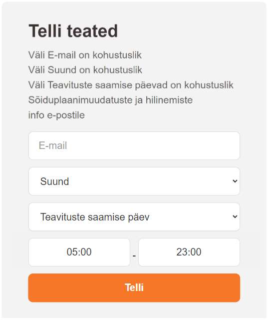
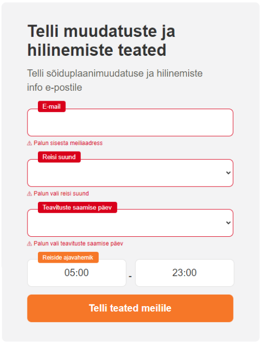
Error messages were displayed in the test when the tester tested what happens if he does not fill in any fields and tries to subscribe to notifications to his e-mail (see figures ''Error messages A'' and ''Error messages B'' below).
In the case of the variant that does not comply with the requirements of the English microcopy, it took the user much longer to read and understand than in the case of the variant that complies with the principles. In addition, it required a lot more attention from them. The second option, which follows the principles, was understood instantly, and we could move on to the next task more quickly.
On the other hand, the user's level of pleasantness in perceiving the error message elements was sometimes similar for both variants. This can be explained by the nature of the error message as a negative element - regardless of whether the error message is easy or difficult to understand, seeing the error message in many cases still creates a negative emotion in the user (especially in the context of filling forms).
However, with a principled solution, users spend less time in a negative state because they understand more quickly how to correct mistakes. Also, in certain situations, changing the tone of some error messages makes it possible to create a more positive mood in the user. Still, in the case of form field error messages, this approach does not alleviate the user's negative emotions.
Error messages A: The original variant of error messages displayed on the web page
Error messages B: A variant of error messages aligned with English principles – error messages are highlighted and displayed next to their respective fields
Success messages
Success messages were shown to users after they had completed the necessary options (see figures ''Success Messages A'' and ''Success Messages B'' below).
Although the version of the prototype that followed the principles of English microcopy generally required more attention from users to understand, their level of pleasantness was higher for the success message. This can be explained by the fact that by reading a clearer success message, the user has a better understanding of what happened and what will happen next. In addition, understanding a message accurately creates a more positive state of mind in a person than not understanding it.
A short and clear message should be used, but this may not always be possible. In such cases, the designer can make an informed decision based on the context of the success message.
The first option is to use a longer but clearer success message, which requires more effort to read and understand, but instead creates a more positive state in the user when they understand it more precisely. Another option is to use a shorter and more general message, which is not so clear, but from which the user can move forward faster. Both approaches have their purpose.
Success messages A: The original variation of success messages displayed on the web page
Success messages B: A variant of success messages aligned with English principles – the success message describes precisely what will happen next
Placeholders
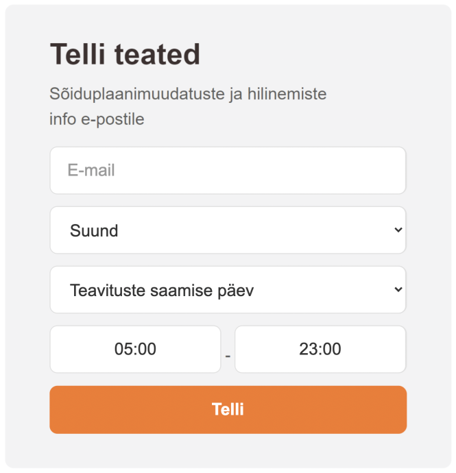
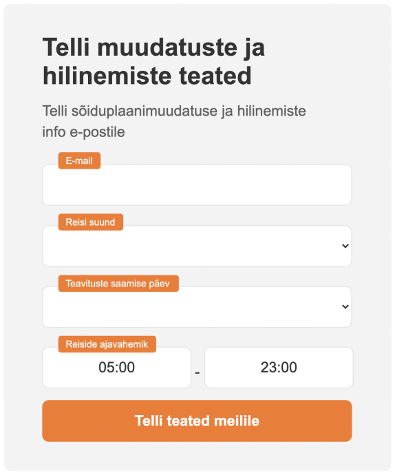
In the case of the task testing placeholders, the user had to fill in five fields simultaneously (see the figures below, "Spacefillers A'' and "Spacefillers B'').
Although there was no discernible difference between user metrics when filling out the fields of the different variants of the prototype, it was evident in tests where the testee chose to check the information they entered before sending it. Testees had to work harder to understand the A variant because of the use of placeholders to mark the fields - it took more work to understand what the field required after filling it.
For form fields, in most cases you should avoid using placeholders as field titles, as this makes data validation difficult. Headings separate from the fields should be preferred because they remain visible when the field is filled in. Placeholders are useful for providing examples rather than replacing a field title. For example, a few examples of frequent search words can be used as placeholders in the search box to make it easier for the user to find the search box and thus perform the search.
Placeholders A: The original variant of placeholders displayed on the website
Placeholders B: A variant of placeholders aligned with English principles – placeholders are not used in place of field titles and are therefore readable even when the fields are filled in
What to remember when creating microcopy in Estonian?
As a result of the tests, it can be said that in most cases, the findings for microcopy in English work similarly in Estonian, but the context and specific features of the elements should always be taken into account - similar elements may require a different approach in different places on the interface.
Currently, it is often noticed on the Estonian-language web that the importance of creating microcopy has been underestimated. It is helpful to test the microcopy used in the prototyping phase to determine whether it gives the desired result.
In conclusion
During the tests, I studied only a few elements of the microcopy, and I got confirmation that this topic still needs further research to determine how other elements and linguistic features work in the Estonian microcopy. For example, one part that can affect the user's state of mind is formal and informal "you", which do not exist in English and are therefore not considered in these principles.


