What is microcopy and how to write it
When talking about the user experience of a webpage or app, people usually think of navigation, visual design, layout etc. But oftentimes, an important element of UX is overlooked – microcopy. The term “microcopy” usually refers to small bits of copy within user interface, for example tooltips, buttons, guiding texts on forms, placeholders, etc.
A well-written piece of microcopy that has been crafted with care and consideration:
- helps the user to complete an action
- encourages and motivates the user to continue with the process
- nudges the user towards the desired action (for example buying something, signing up to become an user, subscribing, etc.)
- establishes a unique brand voice and tone
Hence, good microcopy can improve the user experience greatly. And on the flip side, confusing, contrasting or badly written microcopy can ruin an otherwise excellent user experience.
So, let’s take a closer look at what characterizes good microcopy and how to write it.
Simple and clear
One of the must-haves of good microcopy is simplicity and unambiguity. The working memory, which people use for complex cognitive tasks like learning, comprehension and decision-making, is quite limited. Every time a user has to think about what a certain UI element is for and how it responds, it puts burdens her working memory intensely (Krug, 2002).
As a result, the user gets frustrated and is likely to leave the site.Therefore, avoid complex and specific terms and use common words. Using a unique style, unfamiliar button texts or foreign terms requires mental effort from the user and burdens their working memory.
This distracts them from accomplishing their main task on the site. So, review your texts critically and identify where you can shorten the sentences, eliminate complex terms, or otherwise make your text more succinct.
Concise
A clear and simple text usually also means being concise. Lengthy sentences enriched with metaphors and epithets should remain in fiction and not be used in user interface texts. Microcopy should be as short as possible and easy to grasp. However, keeping your texts plain and simple doesn’t mean sacrificing the understandability and clarity of the content.
So, the rule of thumb is that microcopy should be as short as possible, but as long as necessary. Additionally, it is a well-known fact that people don’t read on the web, instead scanning to quickly find the information they need. Short, simple sentences help to do that more easily.
Helpful and supportive
Every time a person visits a website or uses an application, she has a specific goal in mind - booking a dentist’s appointment, buying a lawn mower, entertainment, finding information etc. At the same time, she wants to reach her goal as quickly and smoothly as possible.
The purpose of microcopy is leading users in their journey towards their goal, ideally so that their journey is more like the daily commute to work rather than sightseeing in a foreign city where they have to stop at every corner to check the map.
It’s important to be empathetic towards your user and to anticipate any possible obstacles on her path, and any hesitations and questions at every step. This enables you to provide information, explanations, encouragement and support at the right moments, so that the user can move on in a straightforward manner while feeling motivated and confident during the process.
The invitation to try Pipedrive’s demo is a good example of how users are encouraged to try the product by alleviating the fear that it will cost them. The call-to-action button clearly states that the service is free and the small text below it confirms that no credit card information is needed.
It is anticipated that people might be hesitant about trying the product thinking that it might be expensive and this doubt is alleviated with the use of adequate microcopy. Additionally, the whole text is simple and understandable.
Human
Fortunately, robotic, technical and incomprehensible UI messages belong to the past now. There is an increasing focus on making digital products more humane, warm and friendly. Microcopy is an opportunity to give your product a distinct voice that makes it human and memorable.
Adding emotion and personality to microcopy is the cherry on top of the cake, which makes your website or app enjoyable or positively surprising. This helps to distinguish your product from other similar ones and ensures that people want to come back.
Here is a good example of microcopy that feels very human and friendly. Although it’s a negative message saying that the client can’t order food to their desired location, it’s conveyed in a positive manner. The first sentence suggests that there are real people behind the product who work hard every day to make the service better for their customers.
Next, they apologize and give the impression that the user is highly valued as a customer. Another good thing about this message is that it’s not a dead end where the only option is to use the back button. Instead, there is an attempt to find a solution to the problem by inviting the user to find out where she could alternatively have her food delivered to
People often think that good microcopy should also be funny. However, you have to be very careful when spicing up your texts with humor because a sense of humor is very individual - what makes one person laugh will not make another move a muscle in their face. Thus, there is a risk of exaggerating with humor, so that it becomes inappropriate or, at worst, offensive to the user.
A good example of this is confirmshaming, which is unfortunately quite common. Below, you can see how the customer is ridiculed for opting of discount deals.
Consistent with the brand
Microcopy should be consistent with the company's overall identity and values, and also with their style of customer communication. For example, if a company is characterized by credibility, reliability and traditions, then very familiar and funny texts are not appropriate because they contradict the company’s image. Therefore, if a company has a brand or communication strategy, it should be ensured that all of their microcopy goes hand-in-hand with that strategy.
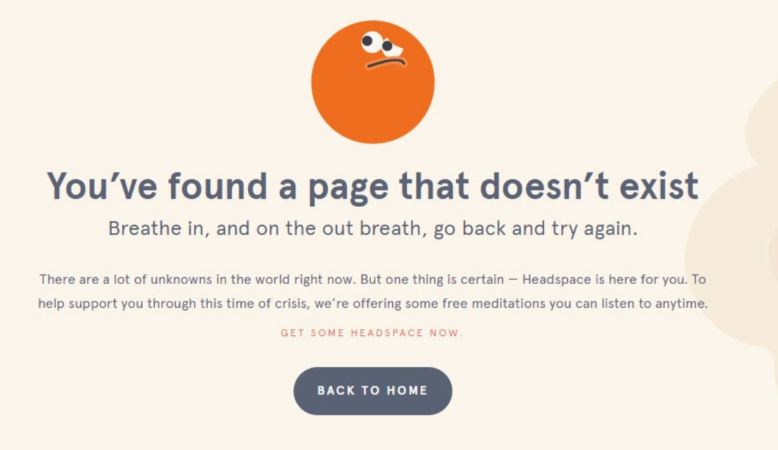
A good match between the product and the message displayed to the user is very well illustrated by the example below. The Headspace app guides meditation and helps to improve mental well-being and peace of mind. The message users encounter on their “Page not Found” page fits very nicely with the nature and the purpose of the entire application. The text is calming and instills confidence that the user can count on them, even in difficult times.

In conclusion, I would like to emphasize that since each user interface message is an opportunity to improve the user experience of your product or webpage, microcopy should not be left to chance. When creating a new digital product, microcopy should also be taken into consideration from the very beginning of the process.
For example, when conducting your user research, pay attention to the language used by the target group and collect feedback on the comprehensibility and clarity of the texts when testing the usability of the prototype.
Krug, S. 2002: Don't Make Me Think, Revisited: A Common Sense Approach to Web Usability


