Award-winning Case-study: Breden's Online store
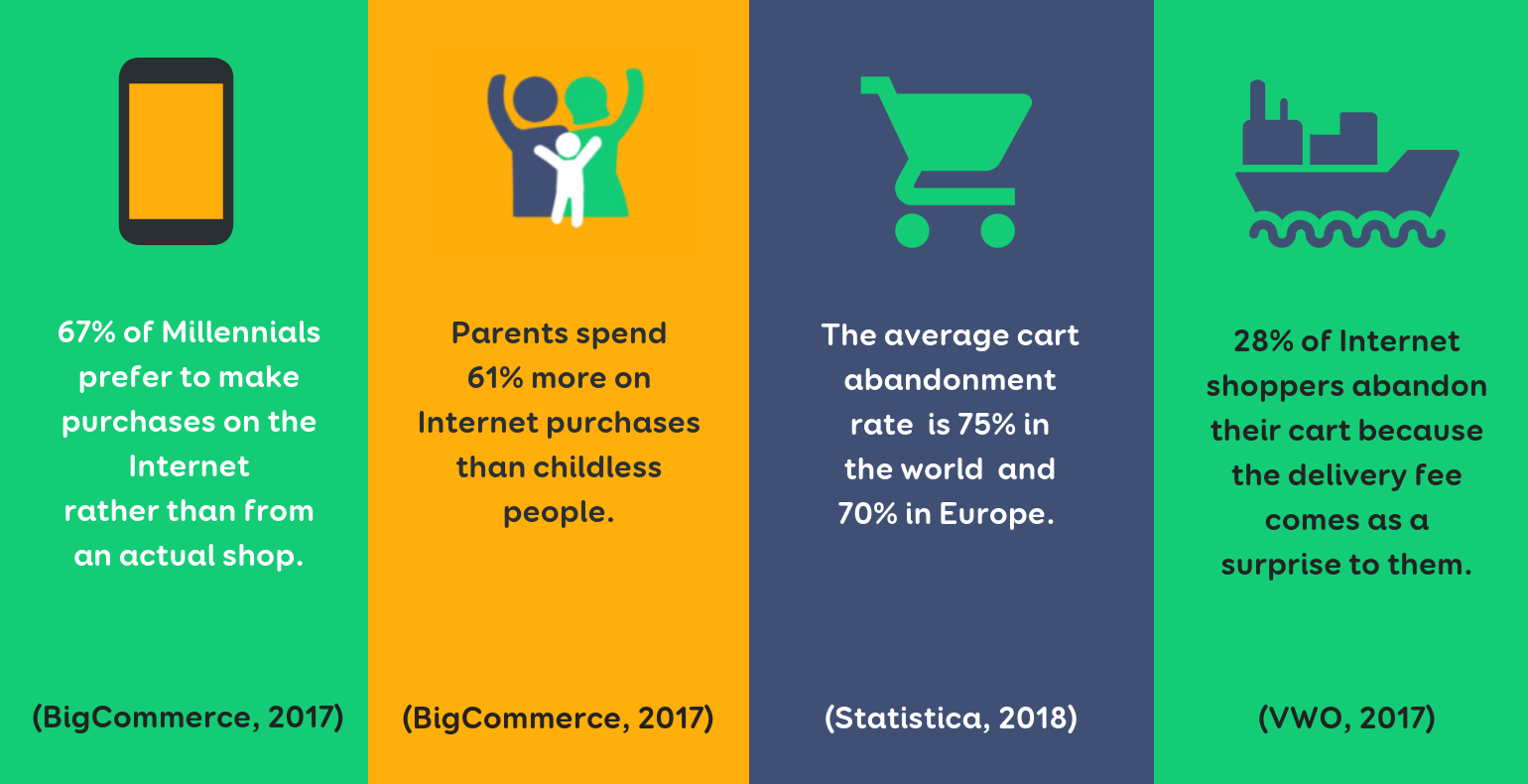
E-commerce has been growing an average of 25% a year globally and as many as 30% in Estonia. Many new e-traders are entering the market. To achieve success, traders are looking for the best technological solutions, spend a lot on web marketing and endeavour to offer the best customer experiences.
But which are the experiences that internet shoppers are looking for?
MOBILE PURCHASES
One of the trends in e-commerce is that people want to acquire and are accustomed to purchasing goods “on the go”, i.e., with their mobile phone.
According to a global survey by Criteo in the fourth quarter of 2017, half of web shop traffic originates from mobiles phones, but only a quarter of the purchases are made through that channel. The same report claims that Europeans made half of their purchases via computers, 27% through apps and 23% via a browser on a mobile phone. Compared to the previous year, the number of purchases made via phone had grown by 21%. Three times more purchases are made through apps compared to simply via a browser on a phone.
So, what does this mean?
That you should invest in developing both the mobile view of your web page as well as apps.
CART ABANDONMENT
One of the most annoying things for e-traders is cart abandonment. On average, 75% of carts are never purchased (Statistica, data from the first quarter of 2018) and experts estimate that the number will grow.
Amazon allows for purchases to be made with just one click, but there are shops that require lots of clicks, filling in dozens of fields or confirming your identity via e-mail, an SMS confirmation code or other features. If there are too many steps or interfering factors between reaching a webshop and making a purchase, it is highly likely that the purchase is postponed or made elsewhere.
The statistics for cart abandonment vary across goods but always depend on the design and optimization of the decision process.
UPSELLING AND CROSS-SELLING
In e-commerce, upselling means displaying and recommending a better and more expensive product next to the item a customer has chosen or is viewing. In the case of cross-selling, web shops display and offer customers items that may go together with the goods the customer has chosen or that other buyers have often selected together with the product in question. The purpose of both techniques is to increase the number of sales as well as offer a smoother purchase process and better customer experience.
BREDEN KIDS’ STORY
Breden Kids’ (now Breden) webshop is one among thousands in Estonia. It’s a family company that sells children’s clothes of Estonian design made with well-considered patterns and using high-quality materials. The competition is tight on the children’s clothes market both between small and large companies, and entrepreneurs must fight for customers’ attention and loyalty on a daily basis. Breden Kids’ competitive edge is their patented original product, the hat-scarf.
Issues with Breden Kids’ web shop
Breden Kids’ main target customers are mothers who want their children to be comfortable and warm and who appreciate high-quality Estonian products. In terms of Internet shopping, they value simplicity and speed because it’s complicated to find the time for long and undisturbed browsing while taking care of the kids.
The usual web shop checkout solution didn’t correspond to the ideal customer experience Breden Kids wanted since a customer had to go through too many stages in order to make a purchase and people often ran into issues with this. In other words, the conversion rate decreased because the purchasing process was difficult. Customer support was overburdened and the number of abandoned carts was high. The poor usability of the checkout limited additional sales. The situation was especially challenging for the mobile view of the web page.
Owing to this, Breden Kids decided to increase the efficiency of their web page primarily by improving customer experience with the mobile first approach but also wanted better desktop solutions.
UI/UX: Trinidad Wiseman
Development: Acty OÜ
The objectives of the survey on the web page’s user experience and development were defined as:
- Reducing the cart abandonment rate
- Increasing upsell at the checkout
- Increasing the number of returning customers
- Reducing inbound calls from customers
- Improving customer experience (CX)
CUSTOMER EXPERIENCE RESEARCH
The starting point of every user experience design project is knowledge about the preferences, behaviour and consumer habits of potential customers gained from surveys and their analysis.
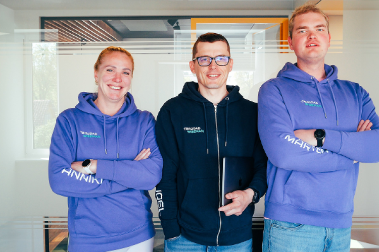
Liina Martõnjak, the user experience architect of Trinidad Wiseman, says: “There are things that no specialist can change. Internet shopping just differs from actually going to the shops. Often people simply want to view the goods, save the things they like to a wish list to have a closer look at later, or to show them to a family member, compare prices, etc. It always pays to ask customers why they didn’t make a purchase. The causes may be web page errors, complicated purchase process, poor communication of delivery costs, the requirement of creating a user account, long delivery times, low reliability of a webshop. If you don’t ask, you don't know.”
We tested users with various devices, conducted a survey and thorough interviews.
KEY FINDINGS FROM THE INTERVIEWS
- Users couldn’t find an easy way to remove goods from the cart.
- Users wanted to view the size of products in the cart without clicking on the items.
- The stages of the purchase process weren’t transparent. Users didn’t understand what stage they were in at a certain moment.
- Users found it confusing why they had to enter an address when they chose a parcel terminal as their preferred delivery method.
- Users weren’t able to find the field where they could enter a discount code or gift card number.
- Most of the survey participants found it difficult to use the shop environment on a mobile.
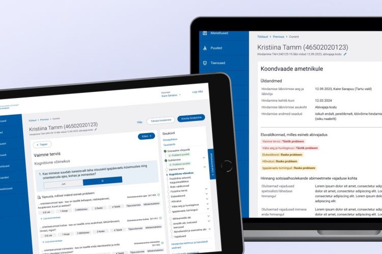
After the interviews, we mapped user journeys and designed a solution based on the analysis.
RESULTS:
Before realising the solution, Breden Kids spent a lot of money on Facebook advertising to attract new customers; however, many carts were abandoned due to the poor user experience. Today, the process is much simpler and emotional purchases can be easily completed. Thanks to improving the user experience, the number of abandoned carts has reduced significantly and Breden Kids was able to achieve the same sales results with 30% lower marketing costs.
- The workload of the customer support reduced by 70%. Customer satisfaction increased and the quality of purchase experiences shifted closer to the quality standards of Breden Kids’ products.
- The value of an average cart increased by 10%.
- The number of abandoned carts has decreased 5 times (0.5–1.4% instead of the former 6–8%).
- The number of inbound calls reduced by 70%.
- Turnover increased by 10–15%.
- Applying additional dynamic upsell logic in the cart contributed to a 2–5% growth.
HOW TO MEASURE THE EFFICIENCY OF RESOURCES INVESTED INTO USER EXPERIENCE DESIGN?
Measuring the tangible or financial results of investing into an excellent user experience may seem impossible or complicated. Breden Kids’ Mediabrands Digital project is a good example of the contrary.
Every well-executed campaign increases the immediate conversion rate, but in addition to this, more measurable factors related to user experience design project must be taken into account; some of the results are immediately evident, but e.g., word of mouth marketing can’t be measured at once, as its benefits are revealed later.
Aldar Reinberk says: “A web shop owner must think of the future, not only about increasing short-term traffic and sales. A strategically thinking e-trader should optimize their shop, keeping in mind excellent customer experiences so that a customer would want to make purchases from the shop in the future as well.”
To guarantee that ROI would be clearly measurable, one should follow the example of Breden Kids and start the entire improvement process by measuring the performance of a web page and application, or reviewing the analytics so that it would be possible to compare the improved results with the previous situation later on.
There are several metrics and quality indicators in e-trade and web marketing. The main ones to follow in offering the best customer experiences are:
- Turnover and conversion rate
The conversion rate shows what share of the web shop visitors actually become paying customers. The happier a web shop user is, the more likely she is to make a purchase. Investing in user experience guarantees that potential distracting and hindering factors that may cause a user to leave a site without making a purchase are eliminated.
- Average cart value
This indicator helps to follow the efficiency of upselling and cross-selling. Together with additional data, it may also provide an excellent insight into the shopping behaviour of various target groups.
- Customer service productivity
Investing in user experience often helps to avoid wasting employees’ time. It may be owing to a drastic drop in inbound calls to user or customer support or providing the IT department the opportunity to do something of real value for the business instead of dealing with emergencies all the time.
- Rate of returning visitors, loyalty
It is important to track the proportion of first-time and returning visitors with the help of the web shop’s analytics. Internet shoppers like simple and intuitive environments. If a customer’s experience is positive, they will revisit your web shop.
WHAT DETERMINES THE SUCCESS OF A COOPERATION PROJECT?
The project for improving Breden Kids’ web shop was developed in cooperation of Acty.ee, Trinidad Wiseman and the customer. Acty OÜ has created more than 50 e-commerce solutions. These include both small web shops as well as complicated full e-commerce solutions.
Acty.ee digital strategist Aldar Reinberk says that the three most important factors in a cooperation project are:
- the parties’ passion towards developing their product or service
- a certain mindset that arises from the conviction that all situations have a positive solution
- believing in a shared purpose.
“It is extremely important to think of all the parties as “WE”, not as “customer” and “contracting entity”.”
According to Breden Kids’ executive Merle Leemet, cooperation either provides energy or drains you of it. “In the case of this project, cooperation gave energy, as the entire team focused on solutions—how to get things done, not how they couldn’t be done.”
WHY INVOLVE USER EXPERIENCE SPECIALISTS AND DESIGNERS IN WEB DEVELOPMENT?
Solving issues in the design phase may be up to ten times cheaper than doing it later in the development phase.
Involving user experience surveys in the project guarantees that the development will move in the right direction from the start. Resources invested in user experience help to avoid expensive individual development works in the future.
In conclusion
Breden’s story serves as proof of global statistics. Improving user experience helps to reduce the cart abandonment rate and increase average cart value.
Used sources:
https://ecommerce-platforms.com/articles/ecommerce-statistics
https://www.statista.com/statistics/457078/category-cart-abandonment-rate-worldwide/

