User interface prototyping – 14 tips for doing it better
In this article, we will describe the principles of user interface prototyping and the methods used for it. We will also provide 14 suggestions for improving your prototyping process.
If you work in a so-called mixed team and the subject of user interface prototyping pops up, then at some point, you may find yourself thinking whether it would be better to immediately start coding and create the prototype like that or not. This question is quite understandable since designers often work alongside developers.
From a developer’s point of view, it is convenient to be given code that can be used immediately. On the other hand, it completely destroys the whole point and the essence of prototyping.
That is because the purpose of prototyping is to play through different ideas and variations. Playing ideas through is time-consuming, which means it cannot actually be done via programming because writing code also takes quite a bit of time. But designers need to be fast, willing to experiment, and ready to discard a finished prototype at any given moment to create a new one.
If the user interface has been designed in code, then it is no longer easy to discard it since too much time has been poured into it. You will have spent quite a bit of time on writing HTML, CSS, and JavaScript; you may have even put time into playing around with various JQuery plugins. But all of these are technical details that should not come into play before the development phase.
Our experience
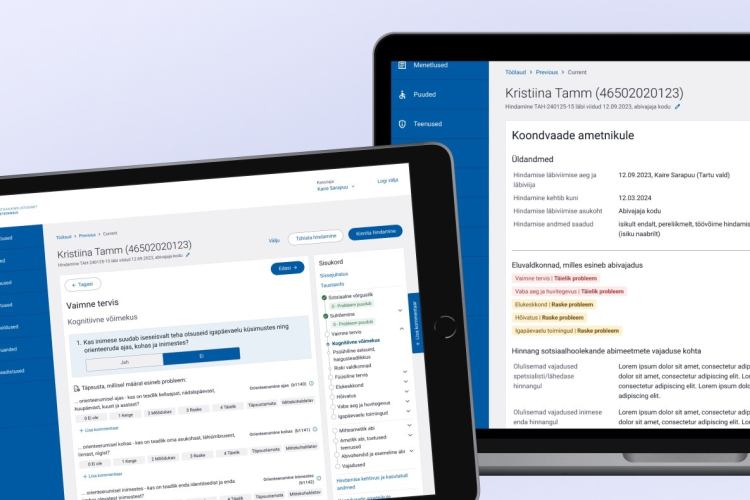
At Trinidad Wiseman, we use the Axure RP prototyping environment for our projects. It allows prototyping even the biggest of websites (e.g. the eesti.ee portal) quickly and iteratively. As a result, we can create clickable high-fidelity prototypes that are interactive and can be used for testing.
These prototypes are interactive in the sense that the website created with it looks and acts like the real thing, but is not connected to a database, which means that no data is saved.
Sometimes, only one small part of the prototype is functional. It makes the work of the developers significantly easier and having a prototype provides them the opportunity to concentrate on what is actually important.
It is important to note that on average, writing code takes about 6-12 times more time than prototyping! Once it is done, people will start to subconsciously avoid any criticism and to defend their work.
Here are 14 tips that you can implement to improve your prototyping process:
#1. be quick and clever.
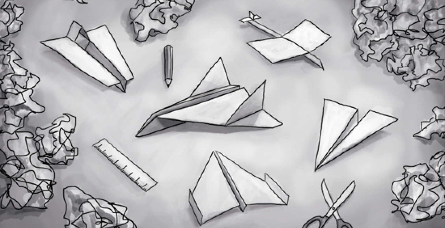
Prototypes are meant to change and do not have to be perfect. Create your initial prototype on paper, keep adding to it and changing it and once you are satisfied, move on to more complex methods.
#2. increase complexity step-by-step.
Start with the navigation and continue with planning the space for the layout. From there, move on to more detailed elements, interactions and finally, the visual design. To get correct results, you must build your prototype on a step-by-step basis.
#3. test early.
The purpose of usability testing is to improve your prototype. The results of the test will not tell you how good of a designer you are, but what you need to do to improve your user interface.
#4. show it to your team members.
After the prototype has already been polished, the last thing you want is to discover an annoying last-minute surprise. The business people, developers, and other team members are your best friends – talk to them.
#5. use a prototyping solution, e.g. Axure RP.
Paper prototypes are nice if you are working on a smaller website or app, but they are unsuitable for bigger projects. If you are working on a large system or a huge interaction, then it is better to use a specialised tool. Furthermore, it is not considered polite to show up to a meeting with only a handful of screen views drawn on paper.
#6. a finished design vs a sketch.
If you show people a version of the solution that is ready or almost ready, then they will always comment on the colours, buttons, shapes, and other details. In other words, they will provide feedback on elements that are, at that point, not a priority since they will be worked on later, during the design phase.
The prototype thus stops being as efficient, and people must be clearly told that they are currently being shown an interactive drawing. This means that people should be able to clearly understand that the user interface prototype is not the final version of the product.
It is better to make the prototype black and white than colourful, which is something that can be changed in nearly every prototyping software. But avoid going too far: use a simple web font and avoid making the prototype look too much like an illustration.
#7. show pictures as soon as possible.
If you wish to get feedback from business managers, then show them specific pictures of the prototype.
#8. keep working on the prototype until an agreement has been reached on all elements.
Do not stop sooner. If you start programming or working on the visual design, then your work will become inefficient with no way of going back
#9. if you are using software, align all of your elements.
The prototype does not have to include the final design, but it should not be overtly messy and confusing.
#10. if you are designing an information system, avoid lorem ipsum.
Use real examples taken from actual forms and real content. If you do not have that, then copy over text from a similar system and give your data some context. The information architecture shown in the prototype must also work in the real world.
#11. if you are using a prototyping environment, add comments.
Most software already has the option to add comments. It helps to reduce later guesswork and to understand clearly why certain decisions were made at some point.
#12. if you wish to get feedback, then show your prototype and explain it.
Invite people over and show them the user interface or grab your laptop and visit them. Do not send e-mails, because everyone has an opinion. Instead, it is better to invite everyone over, to bring them together and then let them talk through you as well as with you.
#13. play around with your prototype.
Click on buttons, fill out forms, try to find something AKA use it like the end user would. You may find many illogical spots even before handing the prototype over to users. This may sound like the logical thing to do, but in reality, a lot of designers skip this step.
#14. be consistent.
One you have multiple completed pages, do not change anything about their form or logic. If you get a great idea near the final phase of prototyping, then you are left with two options: either you change the usage logic across the whole website (all the pages) or you do not implement the change. The worst thing to do is to start using the new form, logic, or design elements on all the new pages while leaving the olds ones unchanged.
What next?
These are some of the principles we follow at Trinidad Wiseman. A lot of them came from experience and we did not follow all of them ourselves when we were first starting out.
Of course, there are more technical tips and tricks to learn as well, but the first thing you need to do is understand the main principles of prototyping. Start with sketches and then add to them and test them until the prototype is complete.
If you wish to make your developers happy, then you can also turn the final version into a coded version but remember that everything else up until that point must be done within a prototyping environment.

