How we sought to plan the unplannable, i.e. how we digitized the process of reporting traffic accidents
How are road accidents being dealt with currently?
Many of us might have, at some point, found ourselves involved in a traffic accident. Regardless of the circumstances of any specific accident, it is an extremely stressful situation for anyone - after all, health, money and time are at stake.
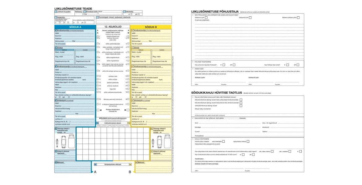
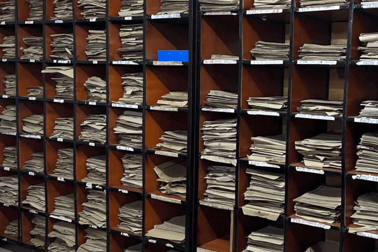
Among many other factors, the situation must be recorded, and the collected information must be forwarded to insurance providers. Traditionally, the first step has been the so-called blue-yellow piece of paper called "Traffic Collision Report", where it is possible to draw out the situation in addition to adding text. As a sidenote, filling in this form can also be difficult for drivers with previous filling experience.
Regretfully in its final format the stored information may be incomplete. This leads insurance providers to use the assistance of third parties (eyewitnesses, camera recordings, police officers, etc.) in order to clarify the circumstances of the event.
In an ideal world, this paper document should be readily available to all drivers in traffic. In reality, many find themselves in situations where the unexpected strikes us at a time when the correct forms are out of reach. In such cases the Emergency Response Centre is often contacted for step-by-step instructions.
Disadvantages of the existing solution:
- the form is paper specific and thus requires the presence of said form;
- it is often unclear to users which specific case type has taken place and how it should be correctly recorded;
- users' handwriting, style and skills to complete the form are different. Consequently, the quality of the filled form is uneven;
- when drawing up a claim, the parties involved focus more on finding the culprit than on documenting the situation - in the event of a dispute there is not always a fixed point of reference;
- 1 person can complete the form at a time, and there is just one copy. Storing information for multiple parties requires either multiple fill-ins or taking pictures of the original;
- the information filled on the form is static and must, as a rule, be duplicated to the digital format provided by the insurer.
How to improve the current situation with IT?
Imagine that you find yourself in one of the situations mentioned above - what do you think the fastest and most convenient way to pass on the required information to the other party and the insurer is?
For many, the most logical option is to take advantage of the capabilities of modern mobile devices. You've probably heard the phrase "a picture is worth more than a thousand words." In a stressful situation with different opinions and interests this expression, to no surprise, holds true.
A single picture of a scene is a powerful source of knowledge from which you can deduce more information than even a very skilled wordsmith can muster - information such as location, vehicle and injury position as well as road sign placement.
Working closely with the Estonian Traffic Insurance Fund, we found it most efficient to keep focus on elements which hold greatest weight and have significant measurable impact. This meant that we had to refrain from designing the application exclusively to the statistical average of users (men aged 25-35).
In the process of striving for a solution that fits best, we decided to take an additional step back and further simplify the process so that it resonates with a significantly larger group of experienced and unexperienced users. To achieve this we decided to implement and reuse simple elements and views. The goal was to make the purpose of a single view as unambiguous and clear as possible.
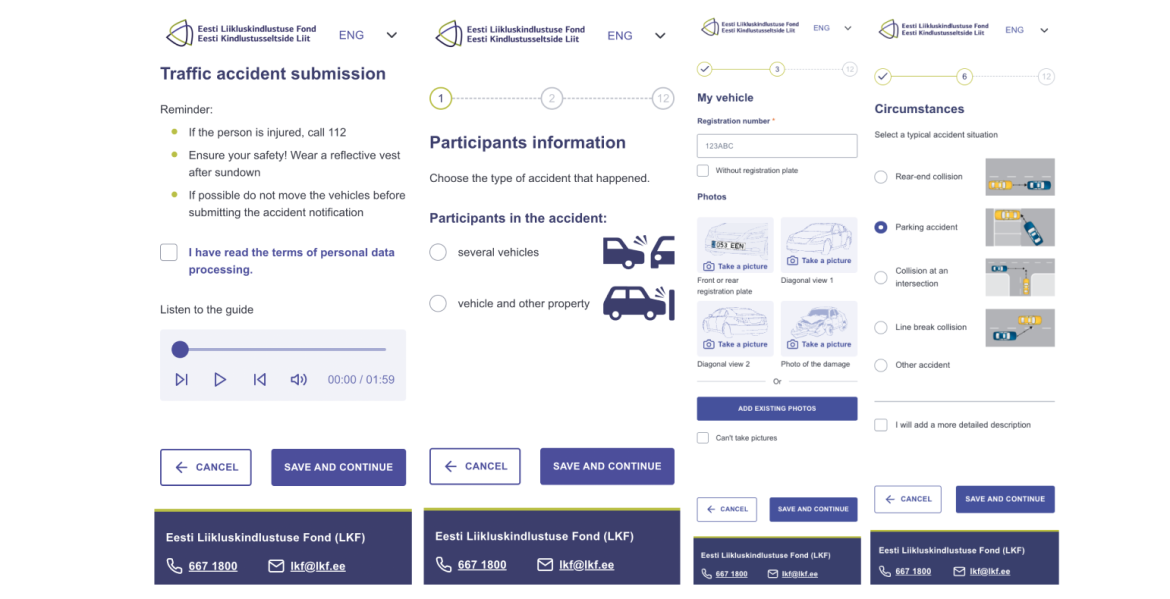
Not exclusively limited to photography, Estonia is in a unique position: in contrast to other European countries the IT-infrastructure focused on e-government and centralised information exchange provides us with access to unified data warehouses. This means that the application can use the vehicle registration number to request data about insurance companies that provice coverage to the vehicle.
Access to insurer information allows the application to automatically submit the filled information directly to insurer specific databases. This eliminates the need for the user to duplicate identical information across multiple web-environments.
Which is better: a mobile app or a web app?
For any mobile-based application, the first step is to come to a grounded decision on whether to move forward with a mobile application (Native-app) or a web application (Web-app):
- Mobile app means an application is downloaded locally to your device and is updated and managed by operating system administrators, such as the Apple iOS App Store or the Android OS Play Store. The application can be accessed by clicking on the icon downloaded to the device.
- Web application means a web page is running in a web browser and does not require a separate download or manual update by the user. The application can be accessed from the domain of the website.
The are many pros and cons to both solutions. We have previously described the features of Native-apps in our article: Native versus cross-platform: which approach should you use?
Our main goal was to create an application that was easy to update. The applicable changes are immediate for a web application and do not require the user to update the application separately.
This application is the first of its kind in the world and must be scalable both horizontally and vertically to support the expected growth of users or the desire to at some point enter new markets.
On horizontal and vertical scalability in the language of metaphors: let's look at the metaphorical goal of removing 600 tons of sand from the sand quarry with dump trucks. The capacity of one dump is 30 tons. A vertically scaled operation would mean increasing the car's engine and carry capacity which would in turn increase the amount of sand transported in one go. However, horizontal scaling adds additional dump trucks to the fleet without changing the towing capacity of any single-vehicle.
When making a choice, we also imagined what kind of user experience the application would have if a collision occurred "in the middle of the forest". At this point, it can be considered utterly unreasonable for most users to search for, download, and register for the application. The user returns to the paper-form which in turn means that the created application is unavailable to users in certain situations.
Today's web technology development also allows web applications to access the device's GPS. As a result, the decision to move forward with the web application filled all the necessary boxes.
How we managed to combine the best of both worlds, i.e. continuous integration + continuous deployment
One of the primary concerns when giving up on native mobile apps is speed and version control. Mobile applications are optimized for specific devices and, as a result, have a significantly better runtime speed.
Mobile applications are packaged in a way that makes switching between comparative versions relatively convenient and intuitive. When deciding in favour of a web application, this functionality is lost - or is it?
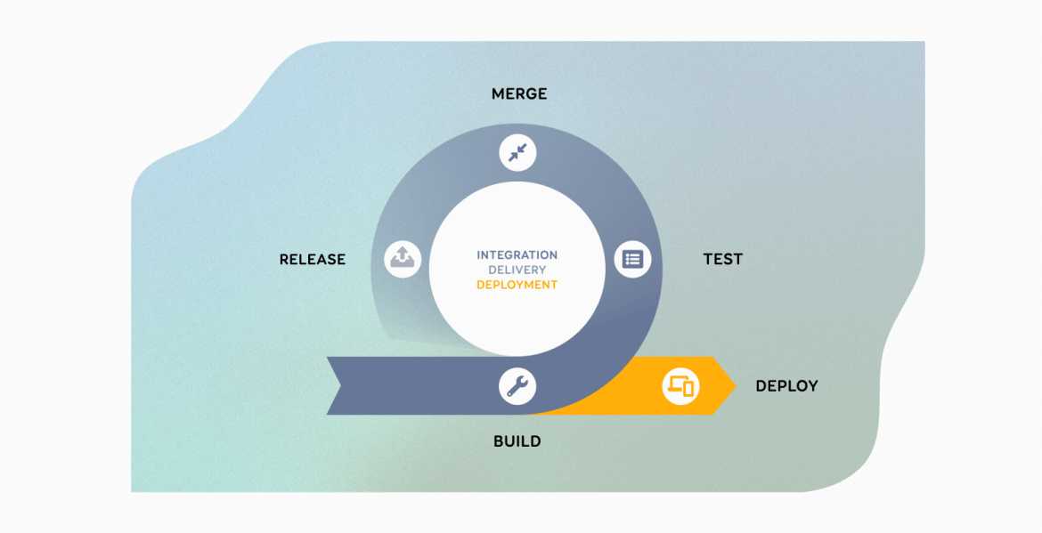
The original drawing comes from here.
Continuous Integration (CI) and Continuous Delivery (CD) are designed to support the smoothest and most convenient development cycle possible. The structure is broadly divided into three parts:
- Image - a snapshot of a specific visual/technical development. A development image is a packaged element that can be displayed to users through a server;
- Harbor - version control, which stores different unique versions of Image in a list;
- Docker - A Linux server designed to present Image files to an end-user through a domain.
CI / CD capability on a car example: looking at the CI / CD capability using cars as an example. We need to distinguish between the vehicle body (visual) and the engine (functional) as entirely separate elements. In general, these elements are independent of each other and function separately. If you are looking to upgrade a vehicle's engine, you do not have to replace the entire vehicle, only the engine element. The engine elements have a separate storage unit that stores both old and new versions of the engine.
How did we solve challenges: validating data and using multiple devices for fill-ins?
Let's say you had a traffic collision and the other party diligently fills in information from their point of view. How can you make sure that the information they enter is correct and considers both parties' interests?
On a fun note, one of the options is always to stand by the other party and allow yourself to scrutinize every line of text they write. However while such dynamics are suitable for some, an application with a wide range of uses must allow for more flexibility.
Based on the issue above it was essencial to add value through 2 functionalities:
- the possibility for each party to independently fill in information about themselves. The goal is to accelerate the process by which information is entered by two or more parties.
- the ability to confirm the information filled in by the other party on their own separate smart device. The aim is to allow for additional transparency through sharing the information entered with all parties involved.
Several participants can enter valid information about themselves in parallel only if a case initiated by one participant can be opened on another mobile device. In order to allow accident information to be entered in several devices simultaneously, the application is structured to enable the user to share a link of the incident to other parties via either a QR code or an SMS.
Clicking on the link opens a parallel connection to the case where each participant is expected to only fill in information relevant to the party. Subsequently, by filling in information all data is separated and continuously saved.
In order for insurance companies to determine and conclude liability it is important for users confirm data entered by other parties. Participants who feel more comfortable filling in information one device will have access to the information, that has been filled in about them, after initial confirmation of the case. Access is provided to the previouslly filled contact number via a link or via SMS.
The link allows you to edit and verify your personal information. When modifying personal detaiks, the previous entries will not be deleted, and the insurance officer will have access to all data related to the case when making the final insurance decision.
As an additional and technically unique value for Estonia, both parties can choose any suitable insurer to deal with the insured event. This is because when case-handling is concerned the injured party can choose between their own insurer and the insurer of the liable party. For vehicles with valid comprehensive insurance, a reference to the insurance provider is displayed.
What did we learn?
Ironically, I wish for you, as a reader, to get to know the new application and its solutions provided as little as possible. When starting off your day by sitting behind the wheel of a car, none of us wants to end our journey prematurely and start filling in insurance data.
The Estonian Traffic Insurance Fund's "Traffic Accident Notification System" analysis and development required concurrent focus on many everchanging elements. We set a goal is to plan for the unplannable and thus create value for a vast target group of drivers required an approach that was user-centred.
Stressful situations, in turn, require the application to be structured around simple and straightforward elements. Ease of use, connectivity, simplicity and scalability are essential for both the accident participants and the insurance companies tasked to analyze cases.
