Accessibility issues caused by web developers
Web accessibility has become quite a trendy topic thanks to the European Union directives and raising awareness. An accessible website is built to be robust, perceivable, understandable, and usable in many different ways so it can be accessed by as many people as possible. Today, the level of accessibiliity is still relatively low.
In this series, we explore which accessibility issues can be prevented by different parties in web development. In the first part we talked about the role of web designers. In this article, we will talk about which criteria of the WCAG standard must be taken care of by web developers.
The most important thing, of course, is that the developers are familiar with the principles and techniques of accessibility and that they review their work on at least a basic level before forwarding it to QA.
This means running the code through an automatic checker as well as navigating through the page with a keyboard (Tab key) and, even better, with a screen reader.
Read more about accessibility on our website. Our specialists are happy to help you — contact us and order a digital accessibility audit, consultation, or training from us.
The keyboard is used for navigation by people who for some reason are unable to use the mouse (hand trauma, motor disorders, etc.). Keyboard support also allows people to use the webpage with a variety of assistive technologies.
A screen reader is a program which reads everything that happens on the screen out loud. These are mainly used by blind people. Screen reader support also allows robots, such as Google, to better understand the website.
VoiceOver screen reader is built into all Apple products, and the NVDA screen reader can be downloaded for free for PC users. A quick Google search will provide you with basic screen reader keyboard commands, and then you can start practicing.
Plugins designed to check accessibility can also be added to your development environment to keep an eye on the quality. The sooner accessibility problems are discovered, the less needs to be redone later. Now, let’s look at some of the most common accessibility issues and how to fix them.
Missing or invalid language code
As mentioned above, screen readers read out all the information on a page. In order to read text in the correct language (with the correct pronunciation), it is important for the page to have the correct language code.
If the code is missing or incorrect (for example, English language code used on a page that is in Estonian), this will cause difficulties for screen readers and web robots. Most WCAG automatic testing tools will also detect the invalid language code.
"Jump to main content" link is missing or not working
When navigating with a keyboard, you will quickly find that it is quite annoying: navigation is linear - from top to bottom, from left to right – which means that you have to go through a lot of repetitive content (header, menu items) at the beginning of each page before the main content can be reached.
To avoid this, it is important to ensure that one of the first elements on the page is a "Skip to main content" link, which, when clicked, moves the focus (both the keyboard and screen reader focus) to the beginning of the content section of the page.
The link can also be hidden until the user moves the focus to it. There is a common myth that the skip link is used only by the blind, and therefore can be invisible. But in fact, it is also used by viewers, and therefore, it is important that when the link is focused, it becomes visible and, when activated, it actually works.
Focus is not controlled
The focus of the keyboard and screen reader differs in that the keyboard can only navigate along clickable elements, but the screen reader can navigate along all elements of the webpage (including headings, pictures, texts). Controlling the focus with scripts comes into play when the focus order of the keyboard or screen reader on the page needs to be corrected.
If using simple semantic HTML, without manipulating the order of elements with scripts or styles, then there is probably no need to control the focus of the keyboard or screen reader. In general, however, there are certain places where manipulation is required to keep the focus order logical.
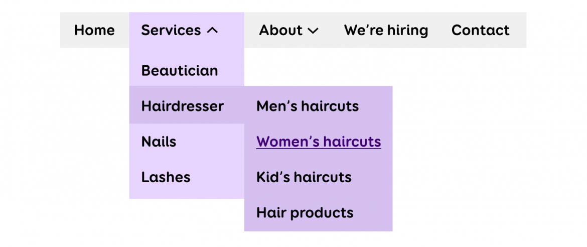
For example, if there is a 3-level menu on a page, then after pressing the first-level menu item, it makes sense that the focus moves on to the second level and by pressing a second level menu item, it moves to the third level. The logical order generally runs from top to bottom and left to right.
When a mobile menu or modal window is open, it is important that the focus of the keyboard or screen reader does not go under it, but stays inside the modal window for as long as it is open. However, it must always be possible to close the modal window with the ESC key. When the modal window closes, the focus must be directed back to the button that opened it.
Focus order is illogical
All elements that can be clicked with the mouse must also be focusable with the keyboard. It is recommended to always present interactive things with semantic elements such as <a>, <button>, <input> etc. Non-semantic elements such as <div> are not clickable by nature and therefore cannot be focused with the keyboard (Tab key).
If there are elements on the page that are not interactive by nature, but must be clickable, then they must be added to the focus sequence using the tabindex attribute. Tabindex can have different values.
tabindex="0" simply adds the element to the natural focus sequence. In general, tabindex="0" is what you want to use.
tabindex="positive number" adds the element to the focus sequence to the position indicated by the number. For example, with tabindex="1", the keyboard focus goes to that element first, and with tabindex="32" that element is the thirty-second element to gain focus.
Positive values are problematic because if an element is added to the page, the sequence numbers must be changed, and support technologies may not understand them correctly either. Positive tabindex values should not be used at all.
tabindex="-1" removes an element from the focus sequence and makes it focusable only through scripts. This means that the user cannot go to this item with the keyboard themselves, but scripts can still put focus on it. For example, when a modal opens, the focus is often moved onto the entire modal using the tabindex="-1" attribute.
Missing or bizarre text alternatives
For screen readers, voice commands, and other assistive technologies, it is important to ensure that elements which are presented with an icon or image have a text alternative available in code.
If the image is presented with an <img> element, a text alternative is added through the alt="Image description... " attribute. For other elements (different icons, close button with “X”), the aria-label="Image description... " attribute is used.
If no alt attribute is added to the image, the screen reader reads out the image’s file name, which is almost never informative. If you leave the alt attribute blank, the screen reader will not read that picture out at all – this is good for decorative images, such as background photos, which rarely convey important additional information.
When it comes to clickable icons, then without alternative texts, screen reader users will simply not know what they do. However, not every icon requires an alternative. For example, if there is also the word "Print" next to the printer icon, then the icon does not provide additional information and therefore does not require a text alternative.
There are also rules for writing the text alternatives – they must be specific and convey the same meaning as the picture/icon itself. For example, the alternative to an envelope icon should probably be "E-mail" or "Send message" rather than "Envelope".
Definitely avoid words such as “picture”, “link”, “click” when writing alternative text, and don’t fill the alternative texts with file names or random text strings. View examples and tips for writing alt texts.
Picture - Alternative text cannot be missing, include the file name, or contain the word "Picture". Alternative text can be left blank if the image is simply illustrative.
Repeating links
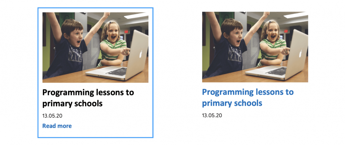
It often happens that several links that lead to the same page are placed next to each other. For example, an icon and text, or a news article image, title, and "Read more" are all separate links that lead to the same page. This means that keyboard or screen reader users must make 3 clicks instead of 1 to move over each news article.
It is better to put the picture, title and "Read more" all in one link. This way, there will be no repeating links and it will be easier to use the page with assistive technologies. Another option is to link only the title of the article, but then the option to click the image is lost, which is convenient, especially on mobile.
However, if you leave "Read more" to be a separate link, it is important to link it with the title of the article, for example through the aria-describedby attribute. Otherwise, it is not clear to the screen reader which article can be read further.
The screen reader does not read out status messages
Status messages, such as error or success messages, search box states ("Please wait...", "34 results found", "No results found"...), how far something has loaded, how much time is left to confirm the transaction, etc., must be automatically read out by the screen reader, without actually moving onto the messages.
To make the screen reader read something automatically, the aria-live or role attributes can be used. When you use these attributes on an element, the screen reader responds to changes that occur within that element.
Therefore, to automatically read an error message, the container with the aria-live or role attribute must already exist on the page when it is loaded. Then, when you insert the error message into the container through a script, the screen reader will read it out loud.
Aria-live="assertive" works just like role="alert" and causes the screen reader to read out the content as soon as it appears – even in the middle of a sentence. This is good for particularly critical messages, such as session expiration.
Aria-live="polite" works just like role="status" and makes the screen reader read the content out when the previous sentence is finished. This is good for less critical messages.
Conclusion
Although web accessibility is not just the developers' job, a great deal of responsibility lies with them as well. In this post, we explored the most common accessibility issues that can be prevented by web developers. In the previous article, we examined the same question in the context of designers, and next time, we will look into the role of content managers in accessibility.
