Why is website navigation important? Which menu navigation is good?
People visit websites, use web applications and software because they want to find information or complete a task.
For example, buying ferry tickets, declaring taxes or keeping up to date with the news - these activities can be called tasks that the user wants complete. If the navigation of the page does not help or hinders the user, it is a problem that in the worst-case forces the user to leave the website and look for other solutions.
In this case, the entire platform becomes useless or even damages the company. Menu navigation exists to help us find content, and it should be simple and intuitive.
Therefore, it is crucial to pay attention to menu navigation when creating a new web environment. The user-friendliness and good navigation of the website ensure the user's satisfaction, giving him logical and easy access to the information he is looking for.
It is especially important to make the system easy for users who have no previous experience with the platform. If a person has to think about how to find information, then the platform logic does not work. On a page with difficulty navigating, users may become frustrated, inactive, confused and may lose their focus.
When developing websites or platforms, there is sometimes a desire to highlight a single element to motivate a person to come back - for example, discount code or a points collection scheme.
Unfortunately, it is often not analyzed how this fits in with the rest of the website logic and how this logic will affect the end-user. Sometimes it is wiser to disassemble and rebuild the logic of the entire platform to ensure that the user knows where they are, where they have been and where they are going.
Terminology
In some places, terminology can also cause problems when navigating. A person cannot or does not dare to press anywhere because the wording does not meet expectations - for example, the name is too formal or very specific in an environment aimed at ordinary users.
It is essential to consider menu navigation language and labelling. The elements in the navigation should be descriptive and give the user a clear signal of where he is going. Website menus often contain general keywords such as "services" or "products," which do not communicate anything in any way.
Instead, the visitor should be saved from thinking and clicking too much. The navigation of the website should be made descriptive, i.e. reflect the content of the subpage. For example, in the case of a travel company, the site could have separate links with the following names: destinations, timetables, group voyages.
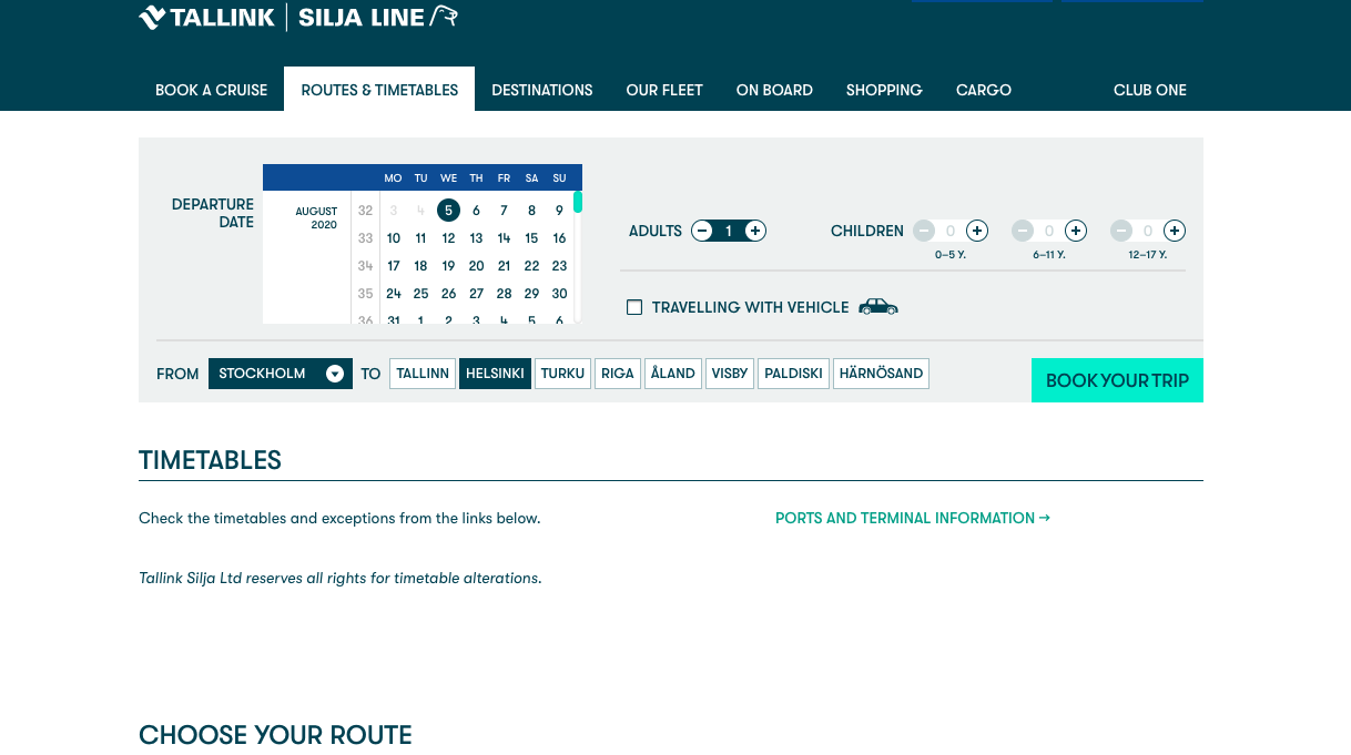
Tallink e-store
If both the menu navigation and the layout of the page are clear and purposeful, then the user can be saved from additional clicks and reach the desired information faster.
In addition, It is also clear to the user which name or description corresponds to what he is looking for, how he has to move on and what to do next. By thinking about the navigation of the platform, we ensure that the user stays on the page for longer.
It also helps to increase the engagement time with the content and increases visitor interest in the content of the page.
Keep your website simple
When developing a website or any software, it is advisable to think about logic and try to predict the user's actions. When a visitor comes across a website for the first time, he should immediately understand what awaits him behind each link.
Placing a large number of links in the visible area does not make a choice easier, but rather complicates it. There are too many links to see at once. This is due to a person's short-term memory, which can usually remember up to seven details. Thus, the menu of different digital products could contain no more than 5-7 links at a time; otherwise, the attention will already be distracted.
The menu with a smaller number of links is more convenient for the visitor, and he can quickly take a look at it at once. Also, it's important to remember that if you remove options from the menu, the remaining links become more prominent.
Minor removal can bring out the most important thing for the user. In other words, any element that is not needed should be removed; therefore, only important elements remain.
As many psychological studies show, the person's attention is at its peak when the memory or event is somehow different from what has been experienced before or is at the beginning or at the end of something.
Be it a list or a table. The same applies to the menu navigation of the website. By adding more important links at the beginning of navigation elements or menus, less essential links in the middle and more important links at the end, the links at the beginning and end will receive more attention. For example, there is usually a "contact us" link at the end of the main menu.
Drop-down menu issue
Drop-down menus are annoying for website users and can be a barrier to navigation. This is also confirmed by the website usability study conducted by Nielsen Norman. This is especially true of the main menu, where the use of drop-down menus should be avoided because the visitor's gaze moves significantly faster than he can move the mouse.
So he's ready to think about his next move before he gets to click anywhere. However, this can lead to users skipping, not clicking at all, or clicking on less (commercially) relevant content pages. In general, this is well reflected in the page traffic statistics.
How to improve navigation?
In Trinidad Wiseman, we have conducted workshops, with end-users, that focus on mapping the platform's existing user paths (as-is) and ideal paths (to-be). The analysis of the situation in as-is focuses on the main bottlenecks of users today and identifies the main problems of the existing solutions. This, in turn, provides input for creating a to-be process that maps users' idus eal step-by-step journeys and expectations for future applications.
When creating to-be processes, we use, for example, the method of mapping user journeys - storyboards. The storyboard methodology allows to reach a common Tong of the ideal user journey in the system through discussions. The workshops outline a step-by-step journey, the most convenient, easiest, and fastest way for users to reach their goals in the UI.
In order to map users' work processes more effectively, user groups or personalities are also created - real-life portraits of users, archetypes that carry the basic needs and characteristics of users.
Mapping ideal routes helps to create navigation and functionality based on user needs. It describes and visualizes a conditionally ideal process for the end-user to use the service, including the use of the user interface.
Before publishing a website, it is essential to conduct a menu navigation user test to determine how much time and effort it takes visitors to review the content of the site, and whether and where there are still obstacles. Once the barriers are removed, the result is that a user-friendly website has a better chance of success in the market.
We hope you find our navigation post useful and it gave you new ideas on how to make navigation and finding information on your web easier :)


