How everybody benefits from accessibility
When something is accessible, it means that as many people as possible – including people with disabilities – are able to use it. Accessibility is part of providing equal opportunities and helps people with disabilities take a more active role in society.
In the physical world, accessibility can mean ramps, wide elevator doors, and tactile maps in Braille. In digital environments, accessibility means that all information and functionality are available also to people who are blind, deaf, have motoric or cognitive disabilities.
However, accessibility is not only for people with disabilities. It also benefits the elderly, people who wear glasses, people with temporary disabilities – such as a broken arm or an ear infection – or who just happen to be in a loud environment. An accessible website is simply more user-friendly because it meets a variety of needs, preferences, and situations.
Read more about accessibility on our website. Our specialists are happy to assist you – get in touch to order an accessibility audit, consultation, or training.
Software development plays an important role in accessibility because according to our audits, about 75% of accessibility barriers stem from front-end code. It means that developers’ skills and experience are crucial for accessible digital environments.
Ensuring accessibility can also bring a business advantage, more and happier customers, better search engine findability, and lower legal risks, especially regarding the new accessibility requirements coming in 2025. Dealing with accessibility shows empathy and helps build an inclusive brand image.

What makes a website accessible?
People with disabilities typically use the same computers and smart devices as everyone else but if needed, modify them or use certain assistive technologies.
Users with motor disabilities might use special keyboards and mice, switches or sensors. A digital environment must be built so that all functionality is usable also with a keyboard. This basically means that all clickable elements must be focusable with the Tab key and clickable using the Enter key. Try it out on your own website!
Blind users typically use a screen reader – software that reads out everything happening on the screen. To enable screen readers to read content correctly, elements' labels and relationships must be understandable programmatically, not just visually.
Images and icons must also be equipped with text alternatives in code. Most of the extra effort required to support screen readers also improves SEO, providing direct business value.
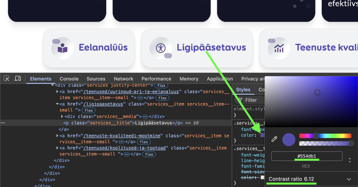
Users who wear glasses, are colourblind or simply in poor lighting conditions, may find it difficult to see text or elements if their colour is too similar to the background. To ensure accessibility, it is crucial to check the contrast ratio between colours.
There are various free tools available, such as WebAim Color Contrast Checker. Browser developer tools also often show the contrast ratio of text and background colours.
Many people with visual impairments, but also the elderly or those who wear glasses, zoom or increase text size in their browser or devices. To ensure that the page adjusts accordingly, all measurements must be defined in relative units (not pixels), so they scale according to user preferences.
When is a digital environment officially accessible?
In 1999, W3C published the Web Content Accessibility Guidelines (WCAG) 1.0. As the digital world has evolved quite a bit since then, the current published version is WCAG 2.2. WCAG includes criteria that determine whether a digital environment meets A, AA, or AAA level.
Level A requires minimum compliance, such as the ability to navigate using a keyboard and providing text alternatives for images. Level AA includes more advanced criteria, such as sufficient contrast between text and background, clear focus indicators, and meaningful error messages. Level AAA is the highest standard, requiring compliance with all WCAG criteria. It might not be mandatory, but is recommended.
The European Union's digital accessibility standard is EN 301 549 which includes WCAG level AA requirements and various additional requirements. Therefore, meeting WCAG requirements alone is not enough to ensure accessibility in the EU.
For the Estonian public sector online environments, compliance with EN 301 549 has been required since 2019, based on the EU Directive 2016/2102, which is transposed into the Estonian law under the Public Information Act.
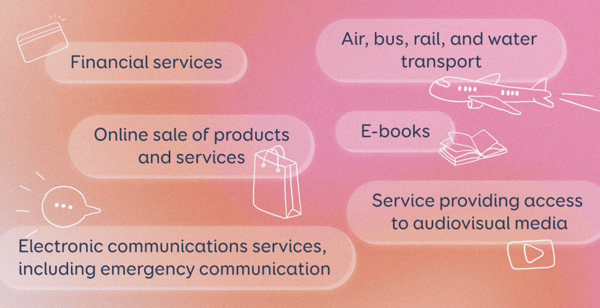
From 28 June 2025, the same accessibility standard will be required for products and services. The European Union Accessibility Act (Directive EU 2019/882) has been transposed into the Estonian law as Accessibility Requirements for Products and Services. These requirements must be followed, for example, in online sales of any products and services involving consumer contracts.
How to meet all these requirements?
The official documentation for accessibility requirements is extensive, written in complex language, and difficult to grasp. Simpler tools however are often superficial and unreliable.
It is important to understand that automated tests detect only about 30% of accessibility issues. Manual checks are essential for identifying the rest. Plugins or widgets that promise to "fix" accessibility issues automatically also cannot be trusted – even with AI, they are too good to be true.
Trinidad Wiseman offers trainings that give an overview of accessibility or dive deep into testing, designing and developing accessible solutions.
We conduct accessibility audits for websites, mobile apps, and digital documents, and based on the audit, we prepare accessibility statements. See our services on the website and contact us if interested.
