When four becomes one: things to consider when merging complex systems together, ECHA case study
In our modern world, the ubiquity of chemicals in our surroundings often goes unnoticed. From industrial processes to household items, the sheer volume of chemical substances has surged, necessitating a robust regulatory framework for their evaluation and approval.
The efficiency of submission systems in handling those processes becomes crucial. A well-performing system not only ensures the safety of these substances but also holds significant benefits for both the environment and humanity.
Fast paced technological development and digital transformation demand flexibility and constant readiness to change even from the biggest and most stable enterprises. Things that worked so well just yesterday will seem outdated tomorrow and keeping up with the pace is quite a challenge.
ECHA 4 Submission Tools
This was exactly the case of ECHA (European Chemicals Agency) that decided to undergo quite drastic change and merge their existing submission systems into a new single one.
Trinidad Wiseman assisted them in a very first steps of the way, conducting necessary evaluations, research and educational activities to facilitate a better vision of the upcoming changes.
ECHA is a European Union agency that focuses on the safe use of chemicals. It implements the EU's chemicals legislations to offer safety for human health, the environment and innovation in Europe.
Currently, ECHA manages 4 different submission platform, each covers a certain EU legislation:
- REACH-IT (manages REACH and CLP regulations, allows to securely submit, process and manage data and dossiers);
- R4BP3 (submissions related to the Biocidal products regulation);
- ePIC (PIC submissions, export outside the EU);
- ECHA Submission portal (online way to centrally manage notifications for hazardous mixtures).
Each of those systems is very specific, has its own user interface, terminology and level of complexness. It is also very important to manage each submission in a correct way because the stakes of making a mistake during submission process are often too high and may result in fines, process delays and rejections.
And four systems are not a limit – there is always a possibility of EU issuing new legislation that will require developing yet another digital submission tool in ECHA’s portfolio.
Starting the project
ECHA themselves proposed a logical solution to the issue – merge of existing into the single submission portal and ability to integrate new EU legislations and submissions in future to this new portal. This was the moment when Trinidad Wiseman stepped in.
A half-year project was divided into three strategic steps (work packages, as we called it):
- preparatory activities;
- usability evaluation of four existing submission systems with ECHA partners and clients;
- based on results of the testing, low fidelity conceptual design of a single submission portal.
In the final months of the project TWN usability experts have also conducted a 2-day workshop on UX methodologies and tools to give ECHA employees basic competences for future work with digital products and user interfaces.
What were the main challenges?
One of the biggest challenges in such projects is the ability of the designer to grasp very specific context relatively fast and adapt to unfamiliar jargon, industry practices, and the overall ecosystem of the domain.
Moreover, the process of adapting to a new domain requires UX designers to be quick learners and effective researchers. They must conduct in-depth investigations to comprehend not only the technical aspects but also the cultural and contextual factors that shape user interactions within that specific domain.
Learning “the lingo” of a particular industry is also crucial to effectively communicate and collaborate with stakeholders, including subject matter experts and end-users. Without a solid grasp of the domain's specifics, designers may struggle to identify user pain points, anticipate needs, and align the user interface with the industry standards and expectations.
This is why documentation studies, preparatory interviews and learning the ropes of the project were crucial part of the project and had a special place in the brief.
This project had offered an opportunity to work with an interesting user sample, where user doesn’t have the luxury of choosing whether they want to use “the product” or not. ECHA users are obligated to use submission systems due to European Union regulations. Unlike typical free-market scenarios, their interaction is governed by regulatory obligations, not voluntary choices.
The complexity and highly specific nature of the project also meant that the trusted and classical methodology of usability testing is not applicable here for two reasons. Firstly, because the users have mastered the existing submission platforms to the degree where they would rather have things as is, than to fine tune anything. And secondly, because the submission processes were about to be changed anyway.
So instead of user testing it was decided to apply following methodologies:
- Expert design review - A usability-inspection method in which (usually) one reviewer examines a design to identify usability problems (Norman Nielsen Group, 2018). This approach allowed to address the first layer of the UX and UI related problems, that didn’t require high expertise in the chemical field or submission processes.
- Semi-structured interviews were conducted both individually and in groups. This step helped to learn about the existing usability problems within 4 submission systems so they could be avoided in ECHA unified submission portal design.
- Speculative co-design discussion to address the upcoming change in the submission process and how to possibly tackle it. The questions in this section provoked considering bold and risky design solutions, welcomed lively discussion and allowed participants to share their doubts and dreams in the context of ECHA unified submission portal.
Interviews with users and stakeholders
In the end, the task was to understand what is so good, that it needs to be preserved and migrated to the new unified submission system as well as to delicately address users’ resistance to change and how to make the transition as painless as possible for them.
For this purpose, interviewing only one group of stakeholders is not enough – understanding various perspectives of different user groups is crucial.
As a result, 3 interview groups were formed:
- ECHA representatives of 5 Product Owners (1 per REACH-IT, R4BP3, ePIC and 2 of ECHA Submission portal) to provide the overview of each submission platform structure, functionality, navigation patterns and both UI and UX design. Background information such as amount of design iterations, age of the system and regulatory details were provided to give a better understanding of submission system specifics.
- ECHA Customer Support representatives to share and discuss the most recurring technical and usability issues across all 4 submission platforms. This information will help to avoid similar issues when creating the unified submission system.
- ECHA clients from the companies cross Europe that use ECHA submission systems in their work processes. The most diverse sample with 18 expert users from 6 companies participating in 7 group interviews. They provided a first-hand experience as well as demonstrated some practical examples of submitting the dossiers and implications that can occur along the process.
All the participants showed high motivation to share their experience with existing submission systems. Results showed little critical issues and overall high level of user acceptance of existing solutions.
ECHA Customer support feedback showed that most of the problems are technical and related to system performance due to user traffic during the peak submission periods.
Attitude towards the ECHA Unified submission portal creation was positive but also cautious, as users could foresee a number of problems that could potentially arise. Participants were eager to provide suggestions for creation of ECHA unified submission portal and were potentially ready to participate in the future co-design events.
Motivated and curious client is the key to the success
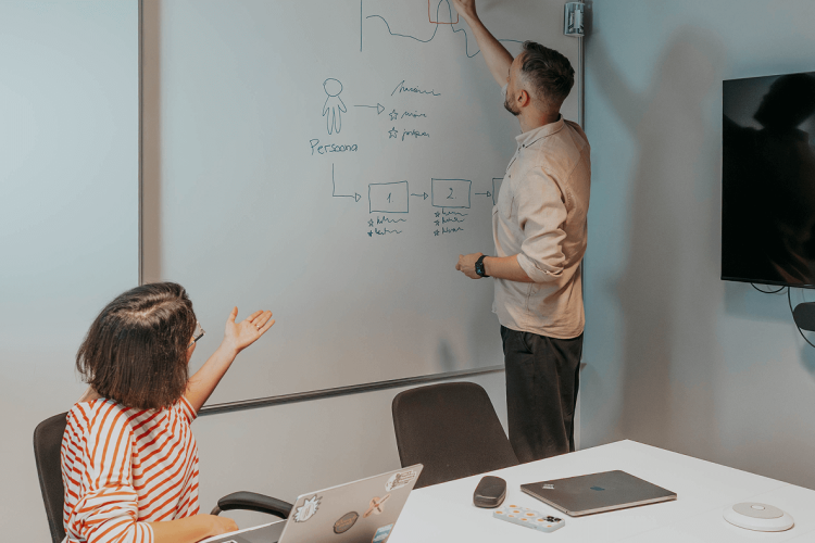
It is equally important for the client to understand the context of user research, rationale and the processes behind it. Client wished to obtain a better understanding of UX Design practices and tools, so 2 full-day workshops were planned and conducted in the ECHA office.
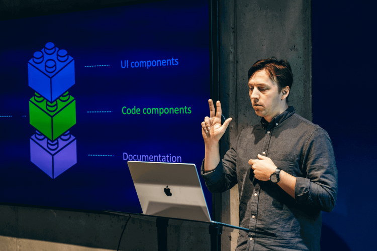
First workshop introduced the basics of UI and UX theory and guided through best practices of the usability testing. Second day was more practical and included some brainstorming exercises such as Edward de Bono’s “6 Thinking hats” as well as a 4 hour long co-design workshop.
15-17 ECHA representatives participated in total on both days. This is an admirable approach as learning the basics of interaction design and usability testing within the company provides a better ground for future work and interpretation of study results.
Outcomes and planning for the future
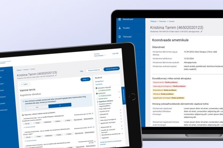
As a result of this half-year project an initial prototype of ECHA Unified Submission Portal was created. The design concept was based on conducted research, users’ feedback and best industry practices.
This mockup would serve as a starting point for future discussion with the users and stakeholders. It will definitely undergo many iterations, changes and refinements along the way, but it is a first step that we were proud to have a say in.
