
Our Lessons Learned from Building the Veera Design System, Part 2
In the first part of this article, we provided an overview of the Veera design system and the existing system’s limitations. We discussed how the Veera 1.0.0 project began, how we mapped the current situation and addressed challenges with design components. Today, we will continue with topics of accessibility, code components, and content creation.
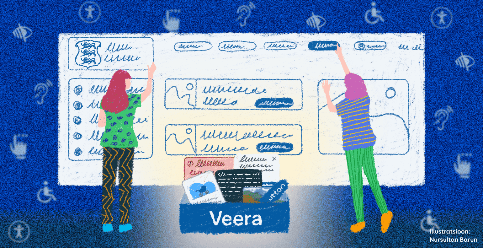
The Importance of Accessibility
In the first part, we mentioned that Veera framework is designed for building public sector e-services, which are required to be accessible by law. The aim of accessibility is to ensure equal opportunities for all and to make web content usable by as many people as possible, including those with special needs. The European Union web accessibility standard imposes requirements for web environments, largely based on the international web content accessibility guidelines (WCAG).
Ensuring digital accessibility often poses a significant challenge for institutions and is frequently below average due to a lack of skills and resources. One of our objectives in updating Veera was to build accessibility into the components from the start.
Accessibility is prominent in all parts of Veera - design components, HTML and CSS components, and documentation:
- Design components are created with accessibility principles in mind, such as high colour contrast, sufficient clickable areas, visible focus styles, and keyboard support. For Veera colour palettes, it is specified which colour combinations are suitable for text in both light and dark modes.
- Accessibility is integrated into the HTML and CSS components as much as possible to save developers time and effort. To guarantee full accessibility, it is important to follow accessibility guidelines when adding JavaScript, which was not part of the Veera 1.0.0 project for the sake of flexibility. JavaScript accessibility is currently described in Veera’s comprehensive accessibility documentation. The wish and hope is that in the future, Veera will be equipped with examples using different frameworks thanks to various development projects that use Veera.
- Veera documentation is organised by components. Each component’s description includes a sub-page dedicated to accessibility, which contains, among other things, detailed instructions for ensuring keyboard and screen reader support. For instance, it is described how the component should be activated with keyboard and which ARIA attributes it should have. The documentation also explains how to create the digital environment's accessibility statement.
In addition to using Veera design system, the principles of accessibility must be followed throughout the development project and the solution must be thoroughly tested.
Code Components
We faced the challenge of how to build a platform that would serve as a tool for as many specialists building national e-services as possible. The new solution needed to be widely accessible, easy to use, and flexible at modifying and adding components.
Minimum Veera
The idea was to build not just a Minimum Viable Product (MVP), but a Minimum Lovable Product (MLP) that would cover as many future use cases as possible. It was also necessary to consider that a developer's greatest enemy is the previous developer, and a good component library requires iterations, feedback, and further developments.
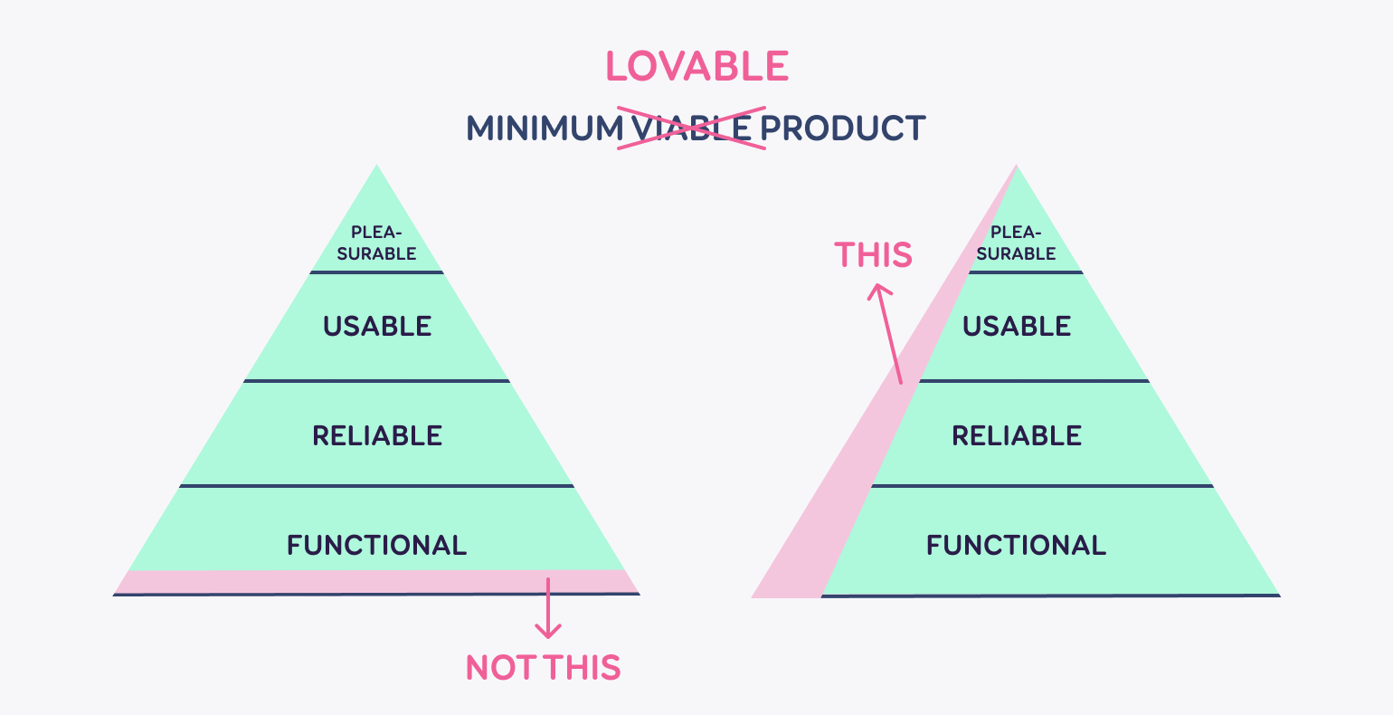
The Minimum Lovable Product (MLP) is a development strategy, where the product is designed with enough features to capture users' attention and create strong emotional engagement from the first interaction.
Unlike the Minimum Viable Product (MVP), which focuses on validating the most basic functionality of the product with minimal effort, the MLP goes a step further to ensure not only the functionality of the product but also its appeal and engagement to users. The goal of the MLP is to create a product that users not only use to solve a problem but also enjoy using.
What does this mean for Veera?
Veera's technical solution is specifically designed to allow the choice of integration depth at every level.
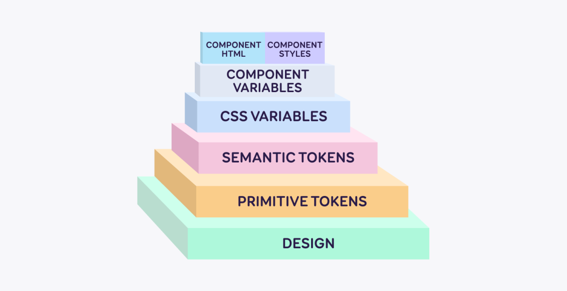
Currently, Veera provides:
- All tools from Veera's Figma to retrieve tokens
- All primitive variables generated from tokens
- All semantic variables compiled from primitives
- All CSS variables compiled from all semantic variables
- Component variables compiled from CSS variables;
- Additionally, a selection of sample components and views in HTML and CSS.
When you build Veera-based libraries for different frameworks, they will all share a common foundation. However, Veera's principle is to give control over the code, allowing decisions on how components are built and designed, and considering various current possibilities. You can start with suitable default settings and then customise the components according to your needs.
From design to development, automatically
Since there are many variables, it would be very time-consuming to gather and manage them manually in style files. The first idea for a quicker solution was to use the Figma REST API. However, this idea was quickly discarded because it is not sensible to recommend a paid Figma package to a client due to the large number of potential users.
Fortunately, Figma has just released a new variables’ API. To use it, we wrote a small Figma plugin through which all variables can be retrieved from Figma in JSON format. The plugin outputs the variables in a file according to W3 specifications, as well as in a structure customised for our own use, making it easier to generate code.
This seemed to work well - designers could provide developers with ongoing changes and updates, allowing developers to focus solely on building HTML and CSS. Over a longer usage period, it will become clear whether this is a permanently good solution.
Layered like a bogeyman: a platform, not a product
Creating an effective design system requires continuous feedback. Veera 1.0.0 is just the beginning, and with this project, we aimed to create a strong foundation for Veera's future developments. We took into account that it is not known what web technologies will be used in six months or two years.
Therefore, Veera's impact must be as extensive as possible, and the system itself must be adaptable and modifiable, relying on CSS variables that are easy to rewrite. It is also important that the system is framework-neutral so that it fits well with the various skills of partners and the technologies used in projects.
By using only HTML and CSS, we ensure that in future iterations (when, for example, a React library is added), it doesn't matter which web markup language is used (CSS, CSS modules, SCSS, Styled-Components, etc.). The same principle should also apply to other frameworks such as Angular, Vue, and Svelte.
On the other hand, too much ambiguity can lead to significant risks, meaning "one size fits all" solution can quickly become useless if decisions are based on too general abstractions and minimal common denominators.
What next?
A platform like Veera is not a one-and-done. Components and design systems quickly lose their purpose if not actively maintained. Our previous experience shows that shared responsibility means a lack of responsibility, and things can be left unfinished. Therefore, the Veera team must continually work with the new platform. Different users/opinion holders may have different viewpoints, but in making final decisions, the team must act as a filter and consider that it is not always practical to carry out all the wishes.
Content Creation Guidelines
Providing good user experience requires more than just good design: the content, or texts created for the design must be necessary, helpful, consistent, and clear for the user. Therefore, one of the project goals was to add content creation guidelines to the design system.
The biggest challenge in compiling the guidelines was that they needed to be general enough to cover the needs of all Veera users, yet detailed enough to provide immediately applicable solutions. In compiling the content creation guidelines, we used a knowledge-based approach. The guidelines for writing longer content texts and microcopy were crafted relying on the results of a content analysis of the current websites that were going to use Veera and on previous (linguistic) studies.
Thus, the first step before writing down the guidelines, was a content audit of the pages that would start using the Veera design system. Their inconsistencies and bottlenecks became the basis for developing more specific guidelines. Since the very first version of Veera (which we were developing further in this project) was based on the style guide of the Estonian Tax and Customs Board, we thought it was important to analyse the former style guide and transfer information that was still relevant. In the end, we summarised the principles of writing quality body text and guidelines for writing microcopy.
Every content creation guideline must consider how the text engages the user. Therefore, we first decided to establish general principles for writing texts, i.e., how texts should address citizens, and the principles of clear language. These principles were based on the analysis of sites using the Veera design system and on the guidelines of how to represent Estonia (we obtained the necessary information from the Brand Estonia website). We identified six common features that should characterise the language use of government agencies, to which we also added specific examples of how to convey these characteristics through language.
During the analysis, we noticed difficulties in choosing between the formal ‘you’ and the informal ‘you’ when addressing the user (Estonian language has two separate address forms to indicate the level of politeness: the informal “sina” and formal “teie”). While in the longer content, the formal 'you' seemed to be prevalent, the informal 'you' was used more in the microcopy texts. So, it was a mix and match with no consistency. However, since each institution must be able to decide which of the forms they use, whether the more distant and polite formal 'you' or the friendlier and warmer informal 'you', we did not want to limit their choice by deciding for them. Instead, we opted for supporting institutions in their decision-making process by offering recommendations based on previous linguistic studies on politeness and word form use.
In addition to longer content texts, microcopy – functional texts that help users smoothly reach their goals – plays a crucial role on websites. Since well-written microcopy is essential for enhancing user experience and usability, we added a separate section about how to write microcopy and what the microcopy writing process should look like to the content creation guidelines. Next, we added more specific writing principles and examples to the components section.
Thus, we compiled a compact guide with examples, which can be used to create more consistent and user-friendly texts. The content creation guide is based on our current knowledge and best practices, which, like the rest of the IT world's knowledge, may change over time. It was important to create a logical system that could be validated and amended as time progresses – after all, Veera is a living style guide.
In conclusion
Veera's latest version is a substantial upgrade from the previous one. Finally, it is a complete product that meets current best practices. Despite this, the RIA Veera team has much work ahead. The training session held on 19 March (check out the Theoretical and Practical part) highlighted the clear need for a joint communication channel that enabled quick responses to queries. Like all design systems, Veera requires continuous development. Web technology and tools are constantly evolving, and undoubtedly, teams using Veera will have many great ideas for improvements.
For the Trinidad Wiseman team, this was a project of significant importance, and it is going to influence our efficiency of user interface construction.
You can find the Veera design system here: veera.eesti.ee.
Read part 2 of the article, where we discuss accessibility, code components, and content creation.


