Updating the intranet
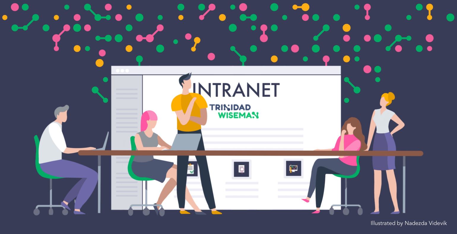
As a company grows, the internal communication should be supported by a well-functioning intranet. Nobody likes spending time on searching for information from e-mails and hard drives or wondering if a document is up to date. Here comes the help of the intranet, which helps to keep all the necessary information with the latest updates in one place. Additionally, the intranet is a good tool to have a great overview of all the vacations and business trips and sharing internal news and happenings among your colleagues.
Confluence is an excellent choice if you are looking for an intranet to store a bunch of information while making it easily accessible by employees. It is easy to set up and while considering your company needs. Confluence has a large number of different templates, so there is no need to reinvent the wheel. It is very easy to edit all the content, which makes keeping documents up to date simple. There is no need to worry about double documentation anymore.
You can connect Confluence with tools you already love. For example, you can amplify your team’s productivity by integrating it with Jira, Trello, Slack, Office, Dropbox, and customize your intranet with 3000+ Marketplace apps.
Freshening up Trinidad Wiseman intranet
10 years ago, we started using Confluence as our intranet, we decided to call it wiki. We started filling up our intranet with everyday knowledge and work methodologies. As our company grew, we saw the intranet as an opportunity to internally share knowledge and we encouraged everyone to get involved.
Today we have almost 100 specialists and many of them have contributed to our intranet growth and our small wiki has grown into an unbounded intranet.
Where to start?
We noticed that there was an increase in the number of questions from employees, to which we already had answers hidden in our intranet, we knew it was a sign that our intranet needs some attention and we decided to take action.
We started with defining the problem. The first step was conducting an interview. As seeing the bigger picture helps us make better decisions, we intentionally selected the interviewees from different departments and positions within our company. Our goal was to understand how people are using the intranet, what emotions are they having while using it, and why are they feeling like that.
By asking ‘’why?’’ over and over again we reached to the core of the problem and understood which issues needed to be addressed. In addition to interviews, we also created surveys, so that everybody was able to give their input to having a better intranet.
The interviews and the survey revealed the following problems, which we used as a basis for our work:
- There is no overview of the content that we have in wiki it's difficult to find the information you need
- Some pages have been forgotten and the information might not be relevant anymore
- The appearance of the intranet is not inviting
To understand the size of the intranet and to find pages that were no longer up to date, we started mapping all the pages that the intranet had. For a good overview we created a navigation tree in excel and added comments on an ongoing basis.
Card sorting
To improve navigation, we started to use a methodology called card sorting (Spencer, 2009). Card sorting is an effective, easy-to-use method for understanding how people think about content and categories. It helps you create information that is easy to find and understand. The principle of the card sorting methodology is that key contents are written on the cards and the study participants group the cards as it fits better for them.
In practice, the study is carried out in four stages:
- a person is given several cards with the names of different contents written on them
- the person divides these contents into predefined groups or invents a name suitable for each category
- this process is repeated with different people
- the results are analyzed to find common points of contact and patterns
We sorted the cards in a group of three people. For the results, we analyzed the results of the groups and found patterns.
Navigation testing
To test out our navigation, we used a Treejack environment, where it’s easy to upload navigation tree and to create tasks that participants are going to solve.
When solving the tasks, the focus is only on the navigation menu, therefore, by analyzing the results weak headings and mistakes in navigation can easily be fixed.
Visual design of intranet
Based on the information we had collected we focused on improving the navigation. We decided to create a home page that had an overview of all the content and for us to distinguish all the categories form each other, we used icons. The prototype of the home page was created on Axure.
We used Refined, to support the intranet’s design, which is a site-building product integrated with Confluence to make content clear, accessible, and actionable. For color scheme we used Trinidad Wiseman CVI. The result was a dark Blue background and for icons we used Green.
The final result
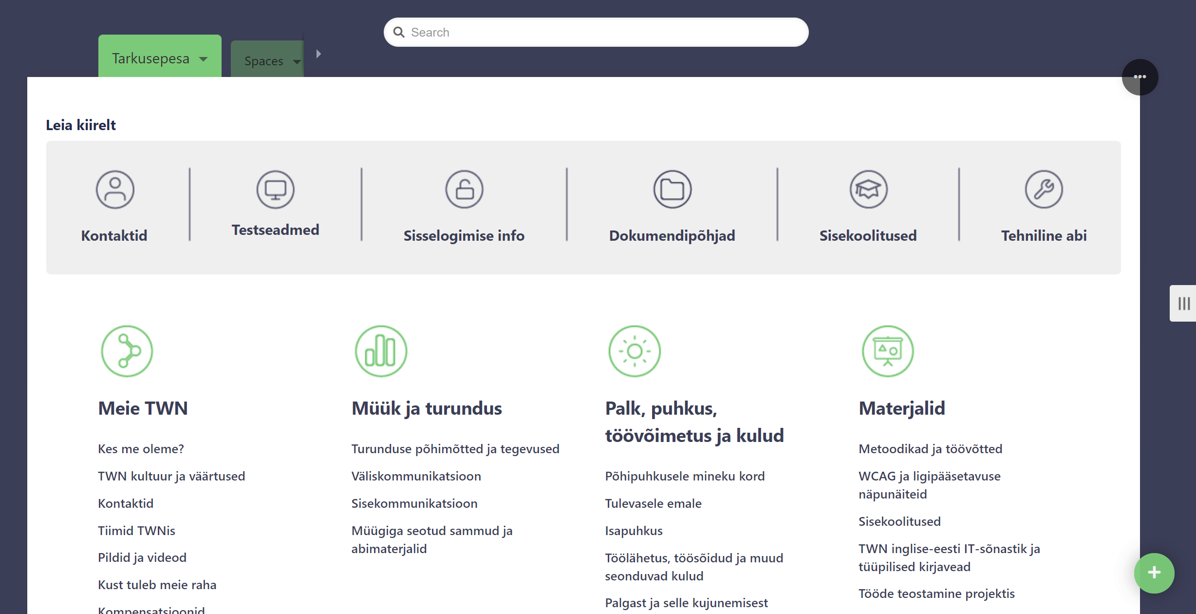
Looking back at the renewal of the intranet, I would say that the work was thoroughly done, and the time invested was well worth it. The use of the techniques described above has helped TWN to improve its intranet. Having a well-functioning navigation has improved the efficiency of internal communication and finding information has become more comfortable for employees.
References:
Spencer, D. (2009). Card Sorting: Designing Usable Categories
