Contributing to the environment with tackling UX issues, European Environmental Agency case-study
Ah, those warm summer evenings – by the sea, or a lake or maybe at the cozy terrace of your own house. The air is clear and fragrant of all the blooming seasonal flowers, the birds are singing, and the crickets are chirping, the lush midsummer greenery is so beautiful, and the giggling of your children, who run around on a soft emerald grass patch, is adorable.
You think about the future and how you would love to see your grandchildren doing the same thing one day. But then you frown, wondering, if in 20-something years from now, will the world be the same?
Our environment, the need for its preservation and the struggles that our planet goes through – all has been an increasingly hot topic of the last decade. European Commission emphasized the importance of green and twin transitions in its Strategic Foresight report in order to pursue the goal of achieving a carbon-neutral EU by 2050.
Information system of the European Environment Agency
Environmental scope of EU is broad and involves many initiatives and entities, one of the biggest one being European Environmental Agency (EEA). Established exactly 30 years ago in 1994, it is now operating within 32 member countries and six cooperating countries.
Within this impressive scale, the EEA provides independent information on the environment. Its goal is to help those involved in developing, implementing and evaluating environmental policy, but also to inform the general public. In order to do that, among other things, EEA runs and maintains four thematic environmental platforms:
- WISE Marine – Marine Information System for Europe
- WISE Freshwater – Freshwater Information System for Europe
- BISE – Biodiversity Information System for Europe
- FISE – Forest Information System for Europe
All four thematic information systems are filled with robust data such as reports, statistics and raw numbers, that is aimed for a very different target audiences. Policymakers, academicians, journalists and curious general audience – everybody is welcome to explore.
Each information system contains various sections and subsections, but there are two menu items that are consistently present at each platform: Countries and Data, Maps and Tools (or Data Catalogue).
“Countries” section provides a well composed overview of each member or cooperating country achievement in the particular environmental domain (be it a forest, biodiversity or waterbodies), displaying it as a nice summary of informative texts and infographics.
"Data catalogues and maps" contain literally thousands or reports and statistics, spreadsheets and geo-visualizations for a deeper research and data mining. But across four systems these sections were un-synced, unevenly structured and designed and didn’t look like they belonged to the same product family of a single organization.
There were also some troubles with systems performance and functionality which needed to be addressed. And this is where Trinidad Wiseman stepped in to help.
Helping environment by helping the users
Best decisions are informed decisions and when it comes to EU environment the information that you will be looking for is stored within EEA data repositories. Making those perform fast and improving the overall usability of the digital product would mean that users could access data faster.
As a result, they would do their own work faster and efficiently, resulting into thousands of contributions to various professional domains that are directly or indirectly connected with environmental issues.
If one person can complete a task 5 minutes faster and does this every day and at least twice a day? That means 260 workings days will result in time saving of grossly 43 hours, an entire work week! Now imagine thousands of people across the EU doing that and saving a work week per year, each? Potentially, it’s millions of human hours – meaning more efficient and productive society as the result. This is the hidden power of UX we’re talking about.
In order to make things right you need to understand what is wrong
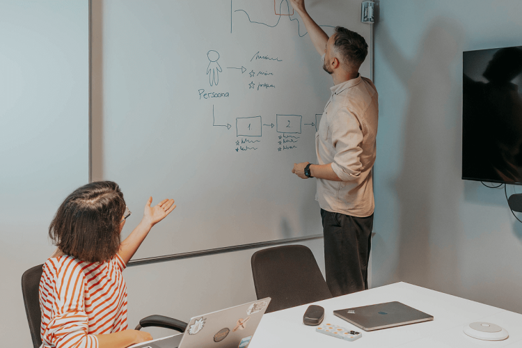
There are different UX approaches and methodologies that can be used for evaluation of existing digital solution. For this project it was decided to use a combination of following usability evaluating practices:
Competitor review
when working with a specific product it is always beneficial to look around a bit and learn how others have done it. Knowing best practices of a particular industry, ways of tackling issues with a very specific context and learning about innovative industry approaches is very productive way to put things into the perspective.
Professional benchmarking
evaluation of existing solution by an UX specialist with a clear argumentation and list of criteria. Benchmarking is very helpful for a quick fixes and delicate facelifts of the existing products because it helps to spot and eliminate the most obvious issues of usability and interface, leaving bigger problems for usability testing.
Usability testing
one of the best and most efficient practices in interaction design and method that is well-established in the industry. Helps to gather feedback from the users and indirect stakeholders, understand the flaws of the systems and how to address those.
And it’s never about only negative discoveries – testing with users helps to pinpoint positive moments of interaction and understand what makes the end user happy. Knowing “what is done right” has the same importance as hunting for the “wrongs”.
For this project we tested 4 information systems with 17 users. It was enough to gather a large body of feedback from the users and discover series of technical as well as usability problems.
This combination of methodological tools ensured that the result of the research will be as objective as possible. Leaning only on feedback from the users can result in fragmentation of services, because there were too many different opinions and attempts to cater them all. That’s why combining user testing with UX industry standards and evaluation of the existing market solutions is so important.
Big and small discoveries are equally important
When study results were gathered into the final report, we could see some general trends emerging.
1. information systems should be more focused
it was confirmed both via professional evaluation and by user testing that the targeting of the information systems should be more focused. And it is a common issue when it comes to complex systems containing many layers of information.
After some time, it is unclear who is the main user of this information and who should be in priority when handling this information. Scientists need raw data that they can use as a commodity for future analysis in the context of their research.
Policymakers and press usually prefer reports and comprehensive summaries, so they can understand the overall picture on some particular problem. The general public needs crystallized information in the form of press-releases, blog articles or even social media posts. Understanding how to cater the same information to different target audiences is the key to making sure it will actually reach it.
The solution to this issue might be prioritizing and limiting main information formats to the one that suits the primary audience. Or choosing an alternative route of creating different complexity layers for different target audiences within one information system and distributing the data accordingly. In the end, it is up to the client to decide.
2. Big digital products managed by different teams start to grow apart
The current design language was too inconsistent - it is completely understandable when big digital products managed by different teams start to grow apart. But when it comes to digital products that are connected by a common theme the users expect them to look similar.
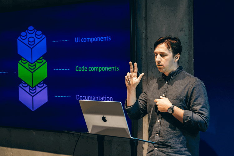
Graphic design, visual language of user interface, the consistency of usability patterns and tone of voice across the websites matter a lot. Especially if the final aim is to create a family-like look a feel.
There are multiple ways to tackle this issue. One solution could be taking one of the systems as an example and aligning all the others to it. This would be a risk-free solution that ensures that the final look will stay familiar to the user.
This is always a good way to lower the company spendings as this solution doesn’t require the creation of a new graphic design identity or a component library. It is always a possibility to avoid a “resistance to change” phenomenon, especially if your users are quite a conservative crowd.
Another way that is more complex would be to develop a new coherent system that would consistently use graphic elements and interaction logic across all four information systems. That would ensure it is tailored for this specific purpose and has the potential to cover different use cases. The downside of this approach is an adaptation period for users and higher budget for implementation.
Besides the bigger problems, smaller ones were also discovered, for example icons in different styles, summary download option vs no option, different font styles, etc. While none of those were critical, together they create the noise and inconsistency that gets in the way of a good experience. So, despite the smaller scale it is still good to put those issues to the backlog and gradually solve them one by one.
Fix the problems, keep what works
Of course, i is important to pinpoint the problems and fix what needs fixing. But good Usability testing not only finds the “wrongs”, but also highlights the “rights” – what is there in the system that works well?
Those things should be analyzed and kept within the system. Maybe there are some opportunities for learning and growth and these successful UI elements and UX patterns can be expanded or scaled to the entire product. In this project, we were looking for those moments of positive and smooth interactions and have found a lot!
This is especially important while conducting noticeable re-design to a digital product – keeping some familiar elements will help to smooth users’ resistance to change and help them to adapt to a new information system faster and with less stress.
Research activities like the ones described in this case study are especially relevant in the context of data-heavy systems, that tend to get rigid and resistant to changes. By testing with users and adapting systems even partially we make sure that the product will stay relevant for users and their practical everyday needs.
