

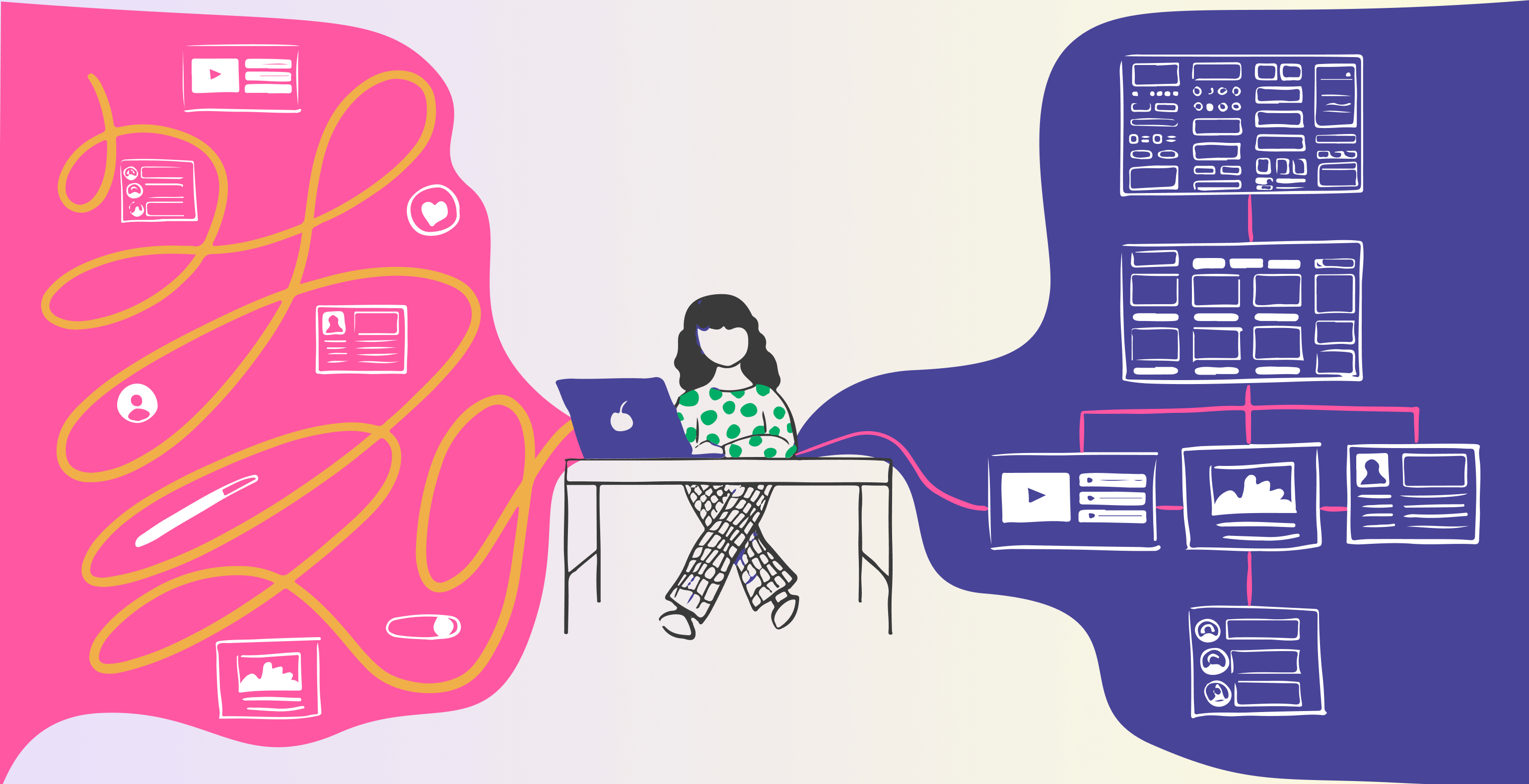
How to control chaos in software development with a design system and component library?
Developing a software solution is time-consuming and detailed, where design and development always go hand in hand for the best result. Large teams are not always very efficient when doing teamwork.
There are more misunderstandings; existing user interface patterns are often left undocumented or forgotten when team members change. Over time, a huge number of disposable components will be created, and eventually, no one will know where and what should be used.
Patterns that were supposed to stay the same have grown apart in appearance and functionality. Every component and pattern that is new and unique, like a snowflake, makes it very difficult to involve new developers and is not sustainable in a long-term project.
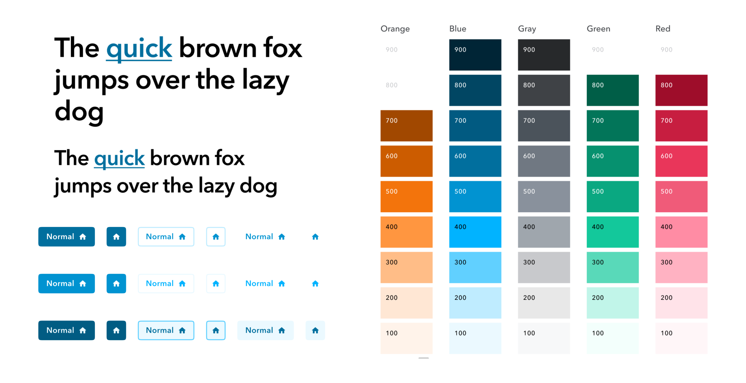
Design systems component library should only contain "clean" presentation components. Here are the most important features of reusable presentation components:
- only deal with the presentation layer;
- respond only to inputs;
- does not contain application-specific business logic;
- are agnostic to how or where the data is loaded.
A component library should not contain application-specific components that include business logic; otherwise, all applications using the system should have the same business logic constraints. In addition, the library should exclude one-off components, even if you hope they will one day become part of the design system - teams manage precisely as much code as they need.
In our previous blog, you can read in more detail what values design systems create in software solution projects.
Chaos management
Usually, making extensive changes in development projects halfway through the project tends to be quite time-consuming and painful financially and otherwise.
That is why our recommendation is always to consider the available information as much as possible in the project's initial phase. On the other hand, it is understandable that, for example, in an agile team, everything (including goals and information) is constantly changing. According to how all this is managed during the project; front-end developers are conditionally divided into three:
- users of external component repositories;
- DIY library builders;
- a combination of the previous ones, i.e., building on top of existing library
Pros and cons of using external component libraries
When using the existing systems, you can get started relatively quickly. You only have to deal with the development of functionality and the development of the so-called big picture. Therefore, external component warehouses are ideal for prototyping, ideation and MVPs.
Since the entire team has a limited number of resources - mental capacity and time, the use of external component libraries significantly contributes to solving real problems and putting together the big picture. The team can focus on business logic tasks and no longer has to contribute so much to interactions and the visual side.
In the case of external component libraries and design systems, the course of which cannot be influenced, their peculiarities and patterns must be considered already in the design and analysis. Overwriting the visual side may be challenging, and the overwritten patterns may break in the future, especially so, if tailoring the component to one's needs has been very custom.
In addition, over time, the component may no longer meet the functional requirements, and a choice must be made between three directions:
- push forward using existing opportunities (not very sustainable);
- replace with another component (quite extensive work);
- to rewrite everything (halfway through the project is still particularly large-scale work because the historical decisions will be lost, and retrofitting may prove difficult).
Pros and cons of building it yourself
Building a design system and the accompanying component library from scratch is more expensive and extensive than modifying a partially finished system. However, the significant advantage of building it yourself is complete control over the visuals and functionality because the system and the requirements often change over time.
Developers using the component library (especially junior developers) do not have to worry about implementing different UI functionalities but can focus on business logic issues and component integration. As a result, it is easier to involve developers of different levels.
Building a component library is quite different from day-to-day development activities because it tries to solve the problems of developers in addition to those of users. Practice shows that building libraries is only suitable for some developers.
For example, if your design system and components lack logic or are difficult to use and make them perform their function, outer development teams will give up using them quite quickly.
Unfortunately, they often build an identical system themselves, and several competing versions of the same thing emerge in a few years. What is certain is that the more experienced specialists build the library, the more useful the tool becomes for development teams. As with any development project, it is important to follow good development principles, keep the scope and think about the future.
How to build it yourself but sustainably
If you decide to build it yourself, the first task is to create an inventory of the most frequently used components. For apps and webs that aren't built on top of components from the ground up, someone has to manually go through everything and look for repeating patterns and components. For example, Nathan Curtis and Brad Frost have written about pattern and component inventory.
Components and the design system quickly become obsolete and lose meaning when treated as a side project. Our experience shows that "shared responsibility" in the case of a component library generally means that no one is responsible.
That is why the component library must be thought of as a separate product with its own management. There are as many different opinions as there are developers, it is not reasonable to implement everyone's wishes (one-off functionalities, application specifics), the library owners must be the filter that makes the final decisions.
Maintaining the scope is also crucial to creating a sustainable component library. There have been cases where components have grown into giant monsters over the years due to constant small changes. Managing and using them turns out to be quite a headache, as there are too many competing goals.
At this point, the metaphor of "grandfather's axe" or the ship of Theseus comes to mind: "if all the parts are replaced over time, is it still the same ship/axe or something new?" In other words, you need to notice when the original idea of a component changes and when it should be split into different functionalities/components.
It is always wise to describe other patterns, recipes and guidelines next to the component library. Audi and Atlassian UI kits are good examples. With this, we ensure the independence of developers, a smoother workflow in the project and prevent recurring problems.
We must remember that a single source of truth is also a single point of failure. Since the truth lies in only one source, every change and addition must be thoughtfully and systematically added, not to mention properly tested and versioned.
All components should first be broken down (already in the design phase) into their smallest reusable parts. This helps to compose larger and more complex components from smaller parts and "simple" components, while validating their implementation and making them available in case a third party needs to build a snowflake component.
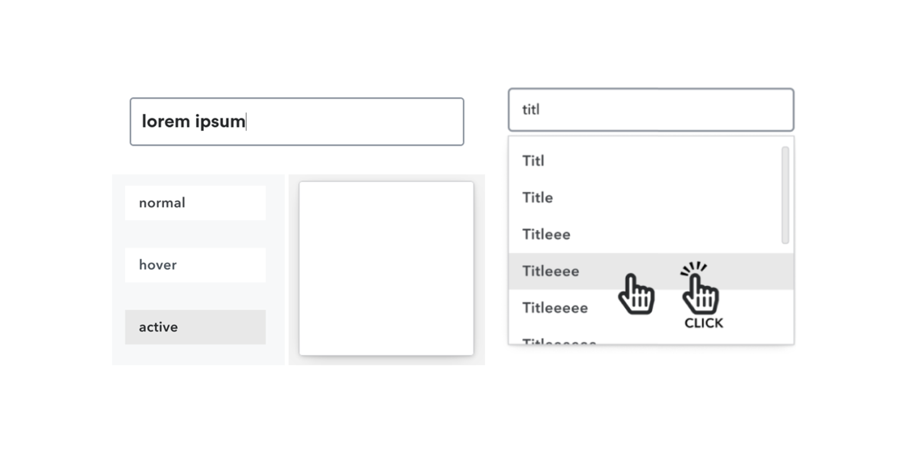
Describe the situations supported by the system and confirmed by the team and discard the unsupported ones to have less noise. At the same time, always try to build components that are durable enough so that "broken" states do not occur. The best use cases help you visualize all the different states of the components.
The tools we use
Storybook is a UI component development environment in which components can be developed and presented outside the main application. This way, you can work context-free with one module at a time and without a complex development stack. In addition, Storybook is very good for documenting and testing components in isolation and integrates with all popular JavaScript frameworks.
In principle Bit is very similar to Storybook. Still, in addition to the development environment, it also offers all the rest of the infrastructure as a service, which you would otherwise have to set up yourself as needed (package manager, public and private environments for viewing documentation and components, versioning, etc).
Depending on the project, we use one or the other. It must be considered that although Bit is a larger package, as is typical of turnkey services, it also contains paid functionalities. Using the tool, we lose control to some extent, as the service provider has already made some decisions. At the same time, for Storybook, setting up the infrastructure and best practices is going to take up more time.
Summary
Building a design system and component library is challenging and not a one-and-done job. Applications, best practices, knowledge and opinions evolve and change over time. There are many options to slow down the chaos and "software rot" that comes with it. One of the most basic and simple victories is the proper management and development of the design system and component library.


