

Web accessibility: one form suits all?
In our last accesibility post, we talked about colours, but today we will focus on web forms.
There are bigger or smaller web forms on almost every website, but a lot can go wrong with them. From the accessibility aspect, the form must be simple, understandable, and navigable with a keyboard (for example, for a person with motor impairment who is unable to use a mouse) as well as various assistive technologies, such as a screen reader (software that reads out everything that happens on the screen to a blind user). Let's see how to do that.
Reduce clicks
Let's be honest – forms are annoying. Especially when they ask for information that the system should already know. Whenever possible, various queries should be made in the background, requiring minimal input from the user. Entering or remembering information can be difficult for the user.

Image 1 – Checkbox, radio button and selectbox.
Where possible, selectboxes, checkboxes or radio buttons should be preferred over simple text boxes to reduce the need to enter text. Text boxes can be improved by showing suggestions or applying the autofill function that fills in the fields for the user. For the latter, it is important that each input field has the correct autocomplete value in the code.
Entering text on a smart device is more convenient with the right type of virtual keyboard. The input type attribute determines whether to display a full keyboard or one that is optimized for entering, for example, numbers or dates.
The size of the clickable area of the form field (text box, checkbox, radio button, selectbox, etc.) is also important and should, for the sake of comfortable tapping, never be smaller than 44 x 44 px.
Form field labels
The label plays a very important role – it lets the user know what needs to be written in the field. For the user to be able to visually match fields and their associated labels, it is important for them to be close together.
Seeing the relationships is a little easier when placing labels above the form fields. It is necessary to make sure that the elements that go together are closer to each other than the elements that are not related to them.
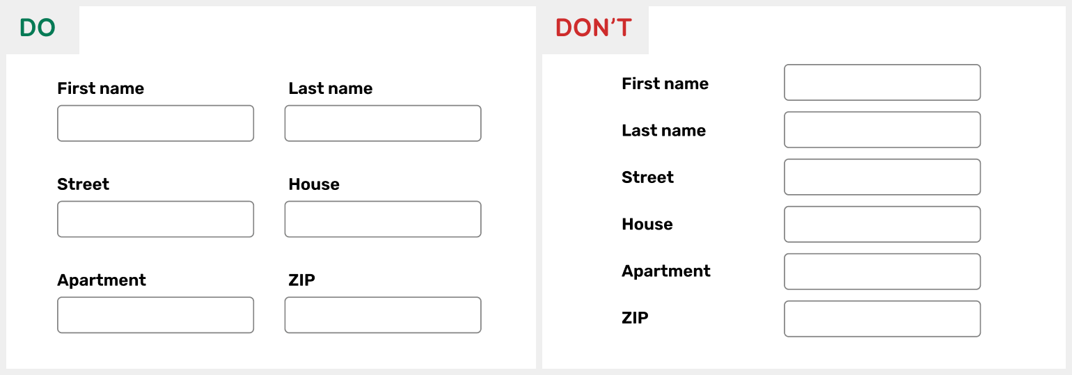
Image 2 - Good: The labels are placed above the form fields. Bad: The tags are placed to the left of the form fields, staying at different distances from the fields.
The label must give the user all the necessary information for filling the field correctly. Therefore, it is important that the label is written concisely, providing sufficient information about the format, length, etc.
Using a more accurate label "First Name" instead of "Name" reduces the number of errors made by both humans and autofill. Hints about a new password or date format are also always appreciated. If mandatory fields are marked with an asterisk, this must be explained before the form.
Form field labels must be well visible. They can’t be replaced by placeholders, for example, because they (1) are generally light gray and hard to read, (2) are not usually read out by screen readers, and (3) disappear when text is inserted / or when user uses autofill.
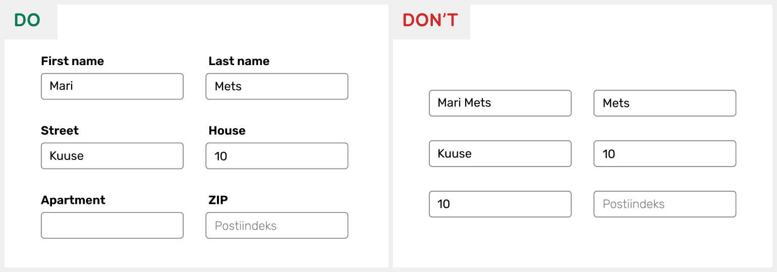
Image 3 - Good: Labels are visible above the form fields. Bad: Labels have been replaced by placeholders that are no longer visible after filling the form.
To support assistive technologies, form fields must be correctly connected to their tags in the code using for and id attributes. However, if the label is not intended to be shown visually (for example, in case of a search box), the field can be labelled using the aria-label attribute. Additional information can be linked to the field using the aria-describedby property.
Keyboard support
For regular HTML input elements, keyboard support is already built in. Problems may arise with custom input elements for which the keyboard behaviour needs to be thought through and implemented correctly.
For example, each form field must receive a distinct focus style when user goes onto it with the keyboard. Checkboxes, radio buttons, and selectboxes must work with spacebar. Radio buttons and selectbox options must be changeable with the arrow keys.
Error messages
Input mistakes can be avoided by giving users enough information to fill in the form and by limiting the input by type, length or pattern. For example, you can disable the selection of past dates from the calendar or the insertion of letters into the phone field.
However, if errors do occur when filling in the form, (1) the fields with errors must be distinguished from the others, (2) the error messages must be written out, and (3) if possible, correction suggestions must be offered (e.g. if it was a typo or wrong format). As we mentioned in the article about colours, fields with errors should not be distinguished by colour alone – you could add an icon or a thicker outline, for example.

Image 4 - Good: The faulty field is distinguished by both colour and icon, and the asterisk is explained before the form.
Errors can be written under each field or together in one place, offering the opportunity to move directly (using anchor links) to the field with error. It is important that if an error occurs, the error message is visible and automatically read out by the screen reader. It is good to use the aria-live attribute for automatically reading out messages.
Before submitting the form, the user should be able to check and correct their input if necessary, especially if automatic suggestions or corrections were made in the form. The form must be predictable in a good way – situations where the user might accidentally submit the form or lose the information already entered should be avoided.
Conclusion
Forms can be found on almost every website, but they often contain various accessibility issues. It must be possible to navigate the form using the keyboard and assistive technologies. Filling the form must be made as easy as possible by writing clear labels for the fields, using different types of inputs, recommendations, autofill, and limiting the user's input when necessary.
Next time, we will talk about the accessibility problems hidden in the modal windows and how to avoid these problems. More accessibility tips for front-end developers can be found here.


