
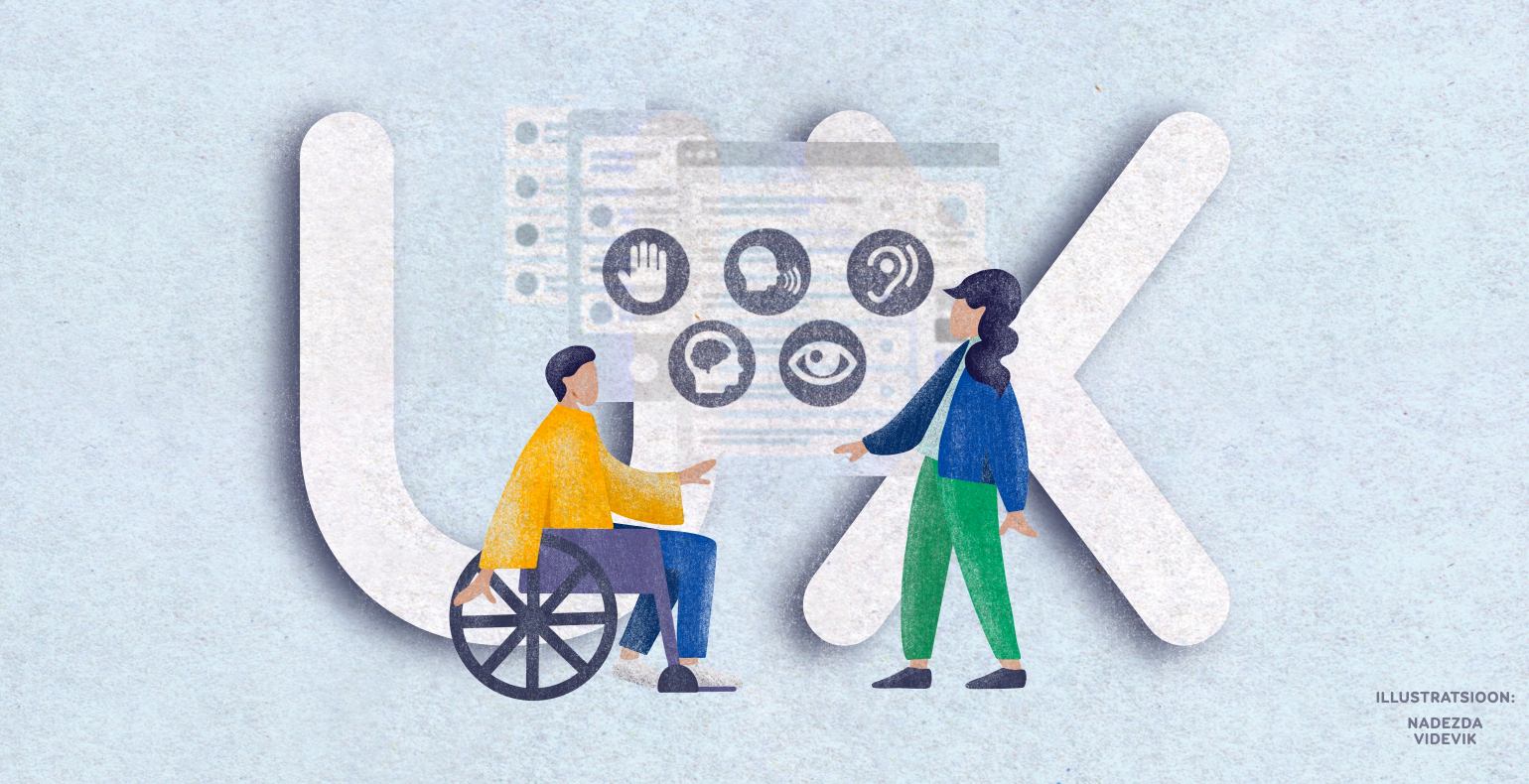
How to design for accessibility?
When something is accessible, it means that it’s usable for everyone regardless of their age, knowledge, abilities or disabilities. An accessible building would have a ramp for wheelchairs and perhaps doors with motion sensors.
An accessible website is one that is programmatically understandable and built in a way that allows the use of assistive technologies, such as a screen reader. However, usability tests show that it is not only the disabled who struggle with accessibility issues online. Most people encounter similar problems when using inaccessible websites. Another thing to mention is that an accessible web is more robust and SEO friendly.
When trying to fix web accessibility, we often tend to focus on giving orders to developers, though many of the issues could already be fixed in the design phase. Today we are focusing on easy solutions to consider when designing an accessible website.
With every solution, I’ve also mentioned the corresponding WCAG 2.1 success criterion and its level. The WCAG standard has three levels of conformance: level A requires the most essential requirements to be met, while level AA needs a set of more specific criteria to be met in addition to those of level A.
Level AAA means that the website follows all of the WCAG rules which may be quite time-consuming to do or, in some cases, even impossible. Therefore, most websites are required to meet level AA criteria.
Create a logical heading structure
Design pages so that they start with heading level 1 which is followed by a logical hierarchy of subheadings – heading level 2, then level 3 and so on. The style and size of the headings should be suitable so the content editors (or the designer) wouldn’t feel the urge to skip heading levels or misuse them.
Think about the following: are there any large outstanding texts on the webpage that are not actually headings? Could you redesign them?
Related WCAG success criterion 1.3.1 (level A)
Make reading as easy as possible
Try to keep a linear and logical reading order. Only use left-aligned text with sufficient font size, line height and paragraph spacing. Good universal line-height is 1,5 times the font size. Of course, keep in mind the font itself as well as the language (special characters etc).
The line length should not exceed 70 characters. Lines that are too long make it harder for the reader to keep focused and to move their gaze from the end of a line to the beginning of the next one. Lines that are too short can make the reader nervous, forcing them to switch lines too often and making it harder to “scan” the text.
Avoid underlined text, italics and capitalised text because they may decrease readability.
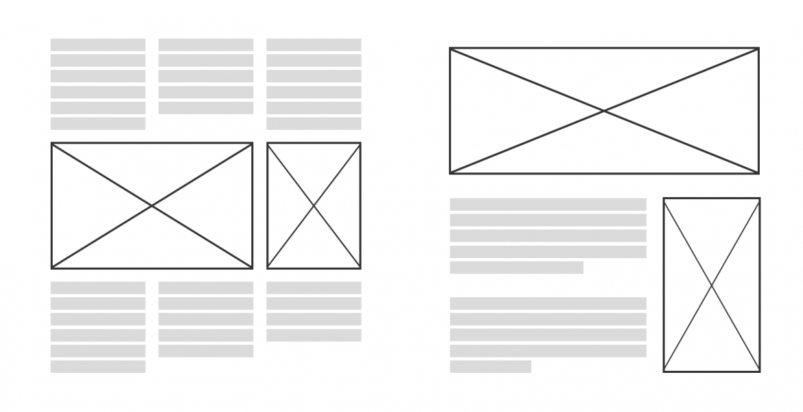
The picture below demonstrates how you can make reading order much clearer simply by rearranging pictures.
Related WCAG success criterion 1.3.2 (level A)
Colours, colours, colours
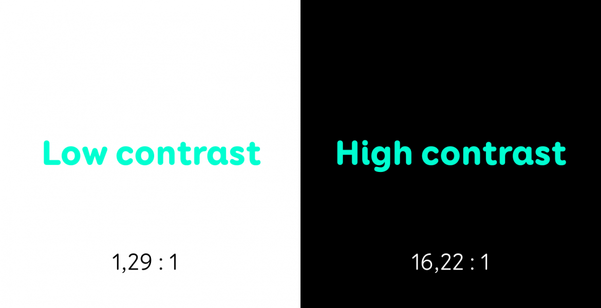
Of course, we will also talk about colour contrast – that pesky but extremely important aspect of web design for many users. We need to make sure that the colour of the text and the colour of its background are different enough for them to be easily distinguishable even by people who don’t have the best vision.
An important number to remember here is 4.5:1 – colour contrast ratios above than are considered to be accessible. If the font size is at least 24px or 18px and bold, the necessary contrast ratio drops to 3:1, because the text itself is bigger and therefore easier to read.
You can check the colour contrast of your texts with this free tool.
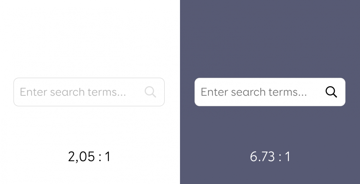
The minimum contrast rule also applies to different UI components – links, icons, input boxes etc. In one of my recent usability tests, a 65-year-old woman was unable to use the search box because they didn’t even notice that this light grey box with grey text existed on the page.
UI components must have 3:1 contrast ratio with their background. If an inline link does not have 3:1 colour contrast with its surrounding text, then you can simply underline it – that is enough to distinguish the link from the rest of the text.
Special tool for checking the colour contrast of inline links.
Related WCAG success criterion 1.4.3 (level AA)
Related WCAG success criterion 1.4.11 (level AA)
Distinguish states with something else in addition to colour
Which of the carousel dots is active? Which date in the calendar is selected? Which input field has an error? These are things that are often marked by colour alone. Active is green, inactive is red and the one you are currently on is blue, for example.
People perceive colours differently and every 1 man out of 12 (and every 1 woman out of 200) has some form of colour blindness. Many of us may not even know that we see some colours more similarly than others do. For example, orange and green can look almost identical to some people.
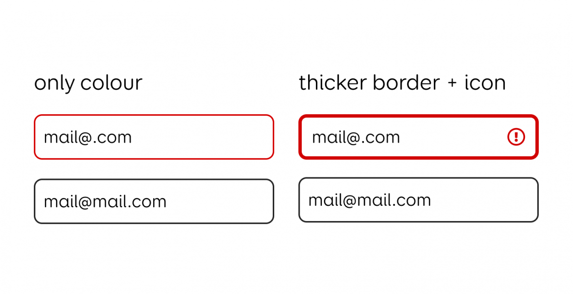
Input boxes with errors should be distinguishable by something other in addition to colour – like a thicker border or an icon. Also, don’t forget to add a descriptive error message.
Let’s look at another example:
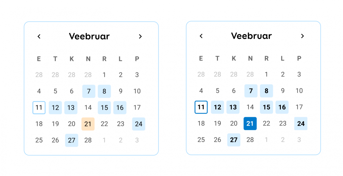
In the left-hand calendar, dates with events are marked with a light blue background. The colour contrast ratio of this light blue against white is 1.18:1, which means some users may not even see the light blue backgrounds and therefore, won’t know which dates have events. In the right-hand calendar, dates with events are also bolder.
In the left-hand calendar, today’s date is marked with a light blue border which has a contrast ratio of 1.56:1 against the white background. In the right-hand calendar, the border is made darker to achieve a contrast ratio of 3.02:1. A small colour change goes a long way.
Finally, in the left-hand calendar, the selected date is marked with an orange background which has a contrast ratio of 1.22:1 against the white background and 1.03:1 against the light blue backgrounds.
This means that users might not notice the orange background or it may look too similar to the blue ones. In the right-hand calendar, the selected date is marked with a darker blue which has a contrast ratio of 4.51:1 against the white and 3.8:1 against the light blue.
Related WCAG success criterion 1.4.1 (level A)
Related WCAG success criterion 3.3.1 (level A)
Be clear about what the user must enter into the fields
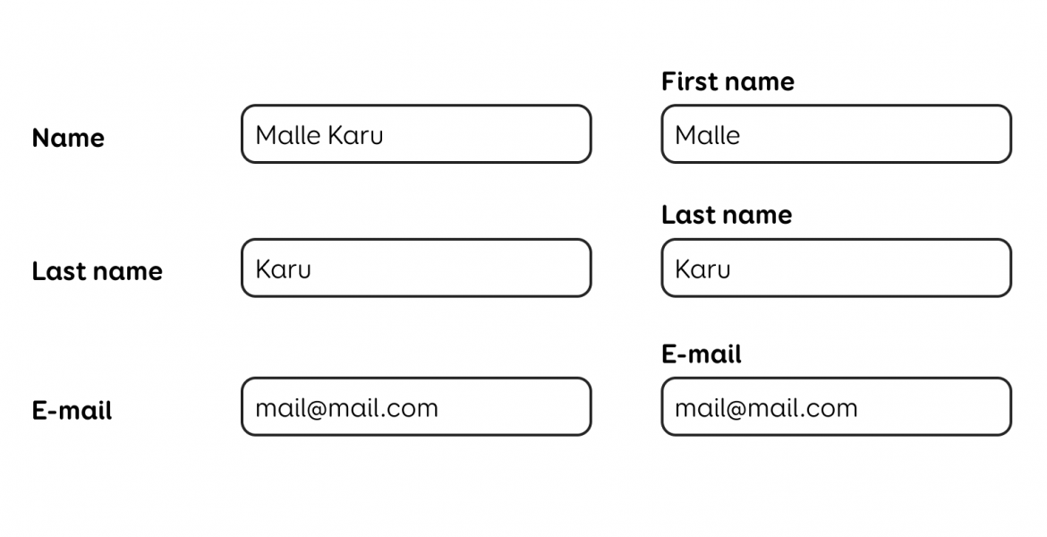
There is a lot that can be done wrong when it comes to input fields. It is important to make it clear what the user must write into the form fields.
Place the fields close to their labels. It is best to put the labels above the fields and place them clearly closer together so that they are further away from the unrelated fields.
Describe the expected input in detail – does the user have to write only their first name or their full name? Should they enter the phone number with or without the area code? In what format should the date be written?
Don’t rely on placeholders – grey text inside the input field which disappears when the user starts writing is not equal to a label. First of all, placeholder text is usually low in contrast and may be hard to read.
Secondly, screen readers rarely read them out. Besides, the placeholder disappears on input, so the user has no way of telling if they wrote the right thing in the right field. Think about it like this: the sender’s phone and the receiver’s phone – which field was which?
If you want to give the user extra information about the format or any other rules related to a particular input field, then you can add a smaller text beneath the field. Make sure that the text is closest to the field that it belongs to. For screen readers, the text also needs to be connected to the field in the code (for example, with the aria-desbcribedby attribute).
Related WCAG success criterion 3.3.2 (level A)
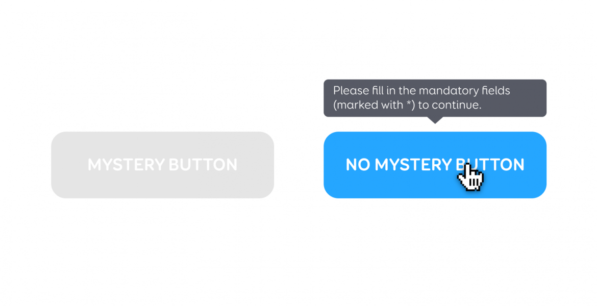
Don’t disable buttons
Disabled buttons are often used on forms where the required information has not been entered yet and the designer is trying to prevent the user from moving forward. But there are several accessibility problems that arise when it comes to disabling buttons.
First, the obvious – they are not very visible and may be easily missed by people with low vision (like the elderly) or they may cause confusion as to why the button cannot be clicked. While sighted mouse users may get additional cues when hovering or clicking on the disabled button, keyboard users and screen readers cannot focus on a disabled element.
So, blind people will not even know the button is there and keyboard users (like someone with a broken arm) will be unable to get extra information about it.
Instead of disabling the button, leave it enabled and simply show a message when it’s clicked. Explain what the user must do to move forward. Also, make sure the screen reader also reads out the message shown when the button is clicked.
Allow the user to stop moving or auto-updating content
We’re talking carousels, moving banners, auto-starting videos, animations, auto-updating notifications and so on. Anything that starts moving without the user’s consent, must be stoppable.
The reason behind this is that some users may have trouble concentrating when there’s visual movement on the page at the same time. So, add a pause button to your carousel design to stop slides from switching automatically.
Related WCAG success criterion 2.2.2 (level A)
Let the user see where they are
The focus states of any interactive elements (links, buttons, form fields, accordions etc) must be very visible. The user may not always be able to use a mouse for navigation and may choose to use a keyboard instead (the Tab key).
In that case, it is important for them to see where they are on the page AKA where the keyboard focus is at any given moment. Removing those “ugly” browser default focus states may be tempting but it lets down many users who will no longer be able to use that page with a keyboard.
If the glowing blue border is not quite your vibe, you can freely redesign it (make it better!), but just make sure it is clear where the user is at all times.
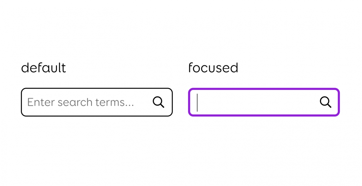
Related WCAG success criterion 2.4.7 (level A)
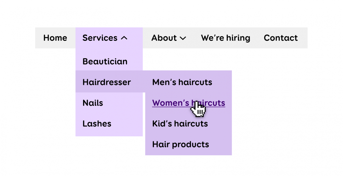
Carefully consider the behaviour of the menu
Multi-level navigation menus can be quite dangerous to accessibility. First, we have the types of menus that open on hover – these require precise mouse movements and are easy to accidentally open when simply moving over the navigation bar.
To get to the point shown in the picture below, the user must move the mouse along a complicated path from “Services” to “Hairdresser” and then right to “Women’s haircuts”. The user must be careful not to touch the “Nails” link below which would otherwise open its own submenu, thus closing the “Hairdresser” one.
Examples like this are actually not very hard to find on the web. If the user was to accidentally move the mouse away from the menu, all the submenus would close, forcing the user to start all over again.
Another negative aspect of menus that open on hover is that when tabbing through the menu, the user must tab over each submenu item of each menu item, thus wasting their time and causing them to exert more effort to get to the desired link.
So, as these examples suggest, the submenu should not open until it is clicked on – either with a mouse or a keyboard (Enter key). But here lies the second problem: clicking the menu item cannot simultaneously open a new link and a submenu.
Therefore “Services” cannot be a separate webpage. This would be especially problematic on mobile devices where the menu is not always on-screen: clicking “Services” would take the user to a new page and close the menu.
To get to “Women’s haircuts”, the user would need to open the menu again and select “Hairdresser” and then open the menu for the third time to choose “Women’s haircuts”. This example also comes from a real website.
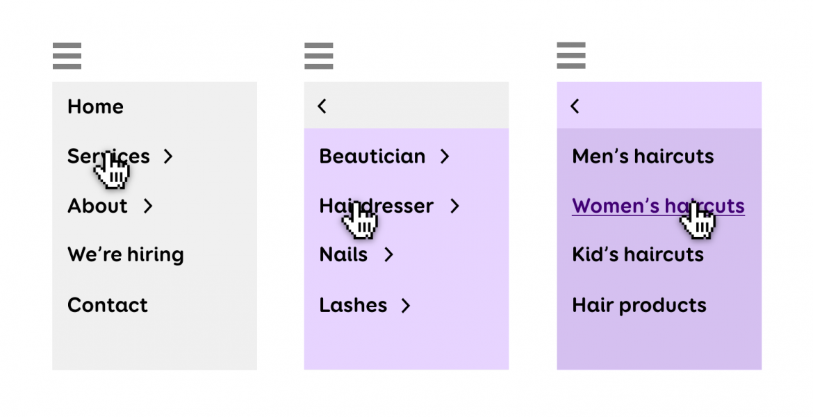
Since finding the desired page from the menu may not be the easiest for everyone, the website must include at least one alternative way to navigate to a certain subpage. This could be achieved with a search box or a site map, but the user must have a choice in how to navigate between pages.
Related WCAG success criterion 1.4.13 (level AA)
Related WCAG success criterion 2.4.5 (level AA)
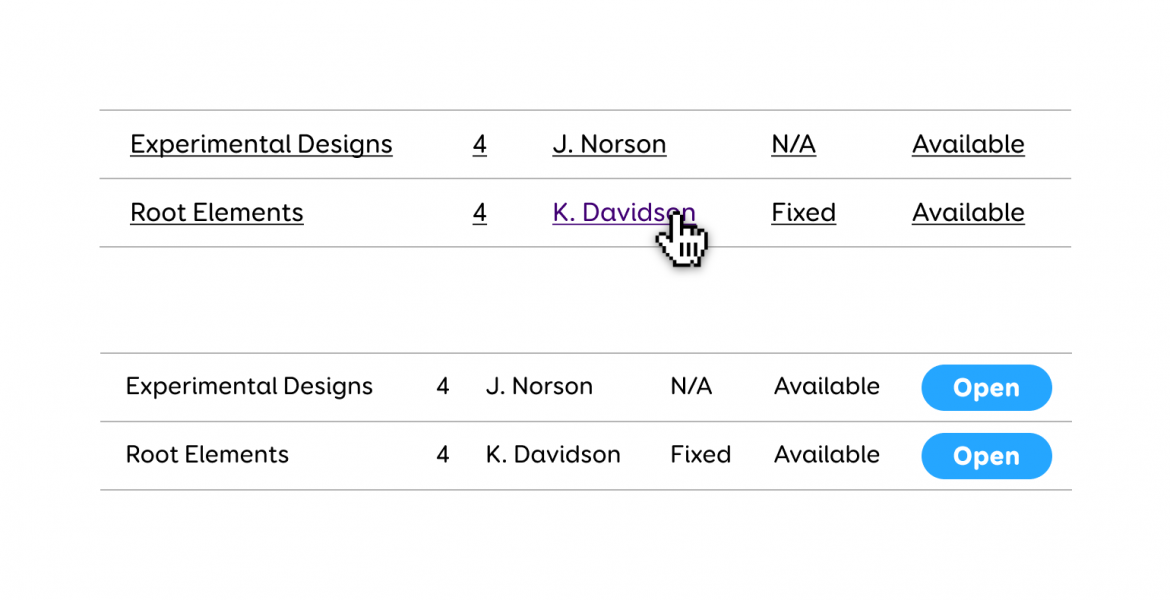
Steer away from repeating links
Try to avoid creating multiple links that go to the exact same location. For example, news articles – the picture, heading and „Read more“ button could all be one link instead of three separate links. A similar situation occurs in tables that have multiple links in the same row that all go to the same place.
It would be a better idea to make the whole row clickable or to simply add a button at the end of each row. Otherwise, the keyboard navigation would be unnecessarily slow because the user would have to move over each and every link, and screen reader users would have to listen to the same link over and over again.
I hope this article gave you some ideas to try out in your next design project. More tips on accessibility and usability can be found on accessibility.twn.ee (in Estonian).


