A prototype is a plan, not just a sketch
When it comes to creating a webpage, app or data system, then both the big picture as well as the details are important. On the one hand, all interest groups and final users should have a chance to express their points of view and wishes. On the other hand, it is necessary to ensure that all key aspects are formed into a single vision in the initial phase. The most common way to achieve this is by prototyping.
PROTOTYPE CREATION PROCESS
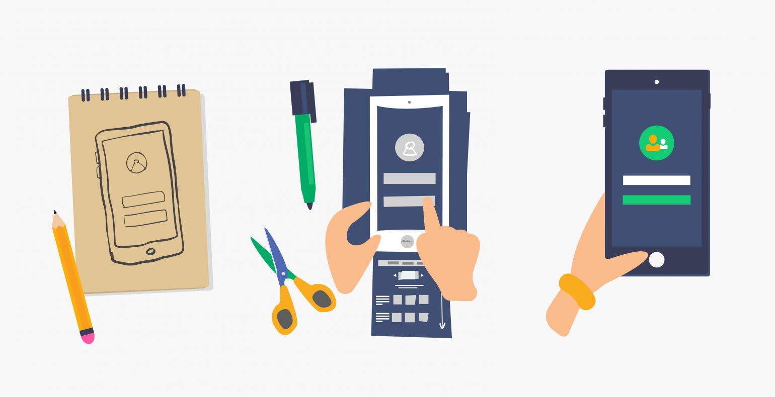
Prototype creation consists of a number of stages. First, the page’s overall layout is determined; then gradually, the information gets more precise. This makes it possible to test a number of versions before the system is actually sent into development. When it comes to the level of detail, prototypes can be classified as low-fidelity (lo-fi), mid-fidelity (mid-fi) and high-fidelity (hi-fi) prototypes.
PAPER PROTOTYPE
One example of a low-detail prototype is a simple paper prototype. Creating and testing a paper prototype is a good and cost-efficient method to find out whether the future system’s design is moving in the desired direction. Devices can be paper prototyped as well.
WIREFRAME
Wireframe is a term most commonly used when talking about low- and mid-fidelity prototypes. A wireframe conveys the idea of the object's layout by displaying the page’s content in information blocks that show where and how various components are located (e.g. latest news, ads, services, contacts etc.).
A wireframe usually only uses lines, boxes and black, grey, and white colours, but sometimes, these frames are replaced with placeholders — images, videos, and texts. In either case, the purpose and aim of this type of prototype is not to show the page’s final appearance. It is a very early version of the user interface design where not a lot of attention is paid to visual and technical functions. The main focus is on the layout of various elements or placeholders. In general, it is a colourless and content-free framework that provides an optically good overview of the future page’s or app’s appearance. It is reasonable to move beyond this stage only after it has been thoroughly discussed, different versions have been compared, and all parties involved have given their approval.
The wireframe explains what information can be obtained from where and how the design functions as a whole. Areas for ads or changing banners are also designated. Wireframes are made for various devices as well, in order to show how the information would be displayed on a computer, tablet, or smartphone screen.
INTERACTIVE/CLICKABLE PROTOTYPE
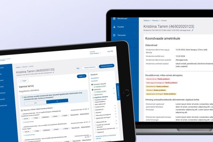
A clickable prototype is a partially interactive user interface/app demo that closely simulates the future product. It may still lack in functionality, but it provides a good overview of the details. It also provides a lot of useful feedback about how well the various elements work as well as about the logic and cooperation of the actions that can be taken. The purpose of a clickable prototype is to offer a comprehensive user experience. Its tester or potential end user should have the opportunity to test the actual user interface and perform planned actions.
With a clickable prototype, the order and logic of the steps and the clarity of possible actions or functionalities (i.e. what the programmer will be implementing later) play an important role. The prototype can be used to test under which conditions a user can click on a button or perform an activity, what happens as a result of said activity, and how the view changes as a result.
A user interface prototype can also be made as a conceptual (interactive wireframe without design) HTML prototype. This means that the user interface prototype includes all the important forms, data fields and their layout, command buttons, and paths.
PROTOTYPE — A PLAN
When it comes to prototyping, the focus is on the structure, steps, and processes – colours, icons, and fonts are all details that can be discussed later. When all parties have had an opportunity to give feedback about the prototype, and the updated version of the prototype receives no further complaints, then it is time to begin work on the graphic design and once that is done, the code.
A prototype is a plan, not a draft. The usability expert creates a prototype so that the client’s representative, the actual end user, and the system creators or programmers and designers would understand the processes in the same way. For example, what really happens when a client logs into the environment, which products can be ordered, how is the cost calculated and the discount shown.
TOOLS AND EQUIPMENT
There are many good methods and tools available to help ensure that the end user’s ideas make it first into prototype and then into the final product. Our upcoming post “Prototyping is more than just folding a paper plane” will expand on this topic further.
The easiest way to start a wireframe is to use a pen and paper. Even a blackboard or wall will do. For an interactive prototype, corresponding software is needed; we use a number of tools, mainly Axure RP.
CONCLUSION
Even the simplest paper prototype is enough to test how well a user interface works on future users. The main thing is to have a plan.
