On the Feasibility of Automating Design and Development – Our Lessons from Building the Veera Design System
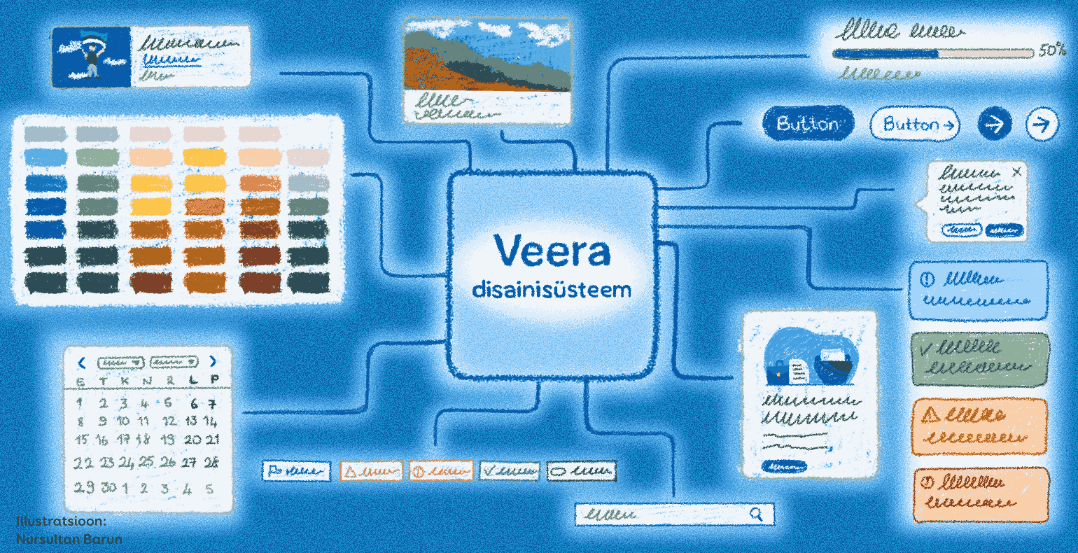
The Veera (short for web framework in Estonian) design system is a framework intended for constructing national e-services.
- A library of Figma components for designers;
- Libraries of HTML and CSS components for developers;
- Documentation and guidelines for everyone using these components.
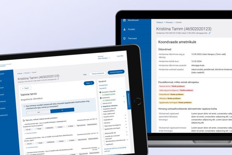
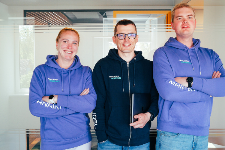
In 2023, Trinidad Wiseman and the State Information Systems Agency completed a new version of Veera.
At Trinidad Wiseman, we offer a comprehensive design system development service. We identify your needs, create a Figma-based UI kit, and develop front-end components with clear documentation. Visit our website to explore the service description and examples of our work — and get in touch to discuss how we can support you.
The History of the Veera Design System
The Veera design system was launched in 2018. Its first version was based on the newly completed style guide of the Tax and Customs Board's e-services (designed by Velvet). The initiative for this e-services design system came from the Information System Authority of Estonia (Riigi Infosüsteemi Amet), with the goal of:
- Minimizing the time and cost of creating user interfaces for national services;
- Offering citizens a uniform and high-quality user experience across all e-services;
- Compiling best practices and solutions for widespread use.
The first version of the Veera design system was little more than a requirement to use a system that did not yet exist. Available resources included PDF versions of the style guide, live versions of the Tax and Customs Board services and designs for the planned version of the eesti.ee site.
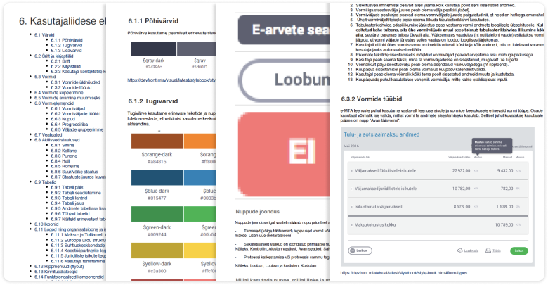
The first version of Veera was based on the e-Tax Board and existed only in PDF form.
Trinidad Wiseman first encountered the requirement to use Veera in the SKAIS2 self-service project. As a result of several iterations, we transitioned from the gray styles of the e-Tax Board to a blue solution, which remains in use to this day.
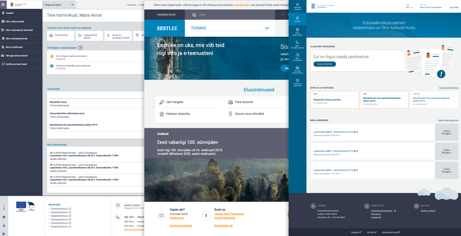
On the left, initial attempts to apply e-Tax Board styles in SKAIS, in the middle, the eesti. ee portal that emerged at the end of 2018, and on the right, the SKAIS design that finally reached the public.
In 2020, the pre-alpha version of Veera was released, containing a Figma component library for designers and web-based documentation, along with code components of varying maturity.
Issues with the Existing System
Typically for a pre-alpha version, many parts of the design system were incomplete, technically outdated, or undocumented. Every project that required the use of Veera meant the project team had to create the necessary tools themselves. This led to repeatedly solving the same problems.
Version 1.0.0
The project started in the summer of 2023 with the goal of completing the work begun with the pre-alpha version and formalize it properly. Based on our experience using Veera, we knew it was wise to focus our energy and resources on refining the existing solution - evolution, not revolution, as the foundation was solid.
Hence, the project was named Veera 1.0.0.
Combining the client's expectations with our experience in similar projects, we set 7 main goals for the project:
- Save designers' time and effort by providing ready-to-use components built using Figma's best practices and technical capabilities;
- Create a well-thought-out dark mode colour solution;
- Support developers by providing ready-to-use HTML and CSS components compatible with any front-end framework;
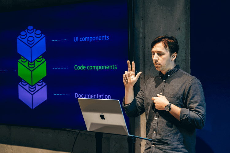
- Automate design to development hand off as much as possible, utilizing Figma Design Tokens (we discuss these more in the Design Components section);
- Support the accessibility of national e-services for users with special needs by building accessibility as much as possible into the components;
- Support user-friendly content and microcopy creation by compiling thorough content creation guidelines;
- Thoroughly document all components, workflows, and instructions.
With these goals set, we got to work.
Current State Mapping
Component Inventory
We conducted a component inventory to better understand how Veera has been used so far. We examined projects where Veera had been applied, compiled, and cataloged examples and variations of different components. This material helped us make decisions and answer the following questions:
- In what sizes should we offer the components? We decided to support three sizes (small, medium, large), which we used for buttons and form fields, for example;
- Which components should we support? If multiple projects had used components absent from the pre-alpha version of Veera, we included them in the 1.0.0 version's component list.
Accessibilty Analysis
Veera is intended for building public sector e-services, which are obliged to ensure accessibility. An accessible digital environment can be used by as many people as possible, including those with special needs using assistive technologies.
We analyzed the compliance of the components in the Veera pre-alpha version with web accessibility requirements. Based on the shortcomings found, we formulated tasks that were solved within the framework of updating the components.
Interviews
We interviewed current and future users of Veera to better understand the shortcomings of the existing solution and map expectations for the new version. The interviews did not yield major surprises. They confirmed that the main issues with Veera were competing versions, outdated technical solutions, inadequate documentation, and a lack of a management model. This gave us the confidence to proceed and tackle the solution.
Design Components
Veera offers Figma components for designers. Figma is a leading tool in the industry for user interface design.
Despite Figma's exemplary feature set, we faced a significant question at the start of the project: how exactly to solve the creation and use of Design Tokens in Veera?
Design Tokens
Design Tokens are the smallest reusable parts of a design system. They convey information such as:
• What colours are used;
• What texts are used;
• What sizes are used;
• Which components these colors and sizes can be applied to.
This information is typically presented in a machine-readable format - JSON. This makes the whole solution front-end agnostic, meaning it can be integrated with different frameworks (React, Angular, Vue, etc.).
The issue of obtaining Design Tokens is not new to us. We have previously tested such solutions in-house - they worked, but were very sensitive and error-prone. These would not be suitable for a national design system.
There are also third-party solutions available in the market, such as Tokens Studio. This would solve the problem but would bring ongoing licensing costs, which was not in line with the project requirements.
Fortunately, the project's start coincided with Figma's annual conference, FigConf, where new functionalities are announced. At this conference, the Variables functionality was announced, and it was the answer to our prayers. With Variables, it is possible to create a Design Tokens system using Figma's built-in solutions. Although this is a beta solution and not everything is as ready as it could be, we decided to formalize all design decisions using variables.
By the end of the project, we had a system with 976 design tokens, comprising 116 primitive and 851 semantic tokens.
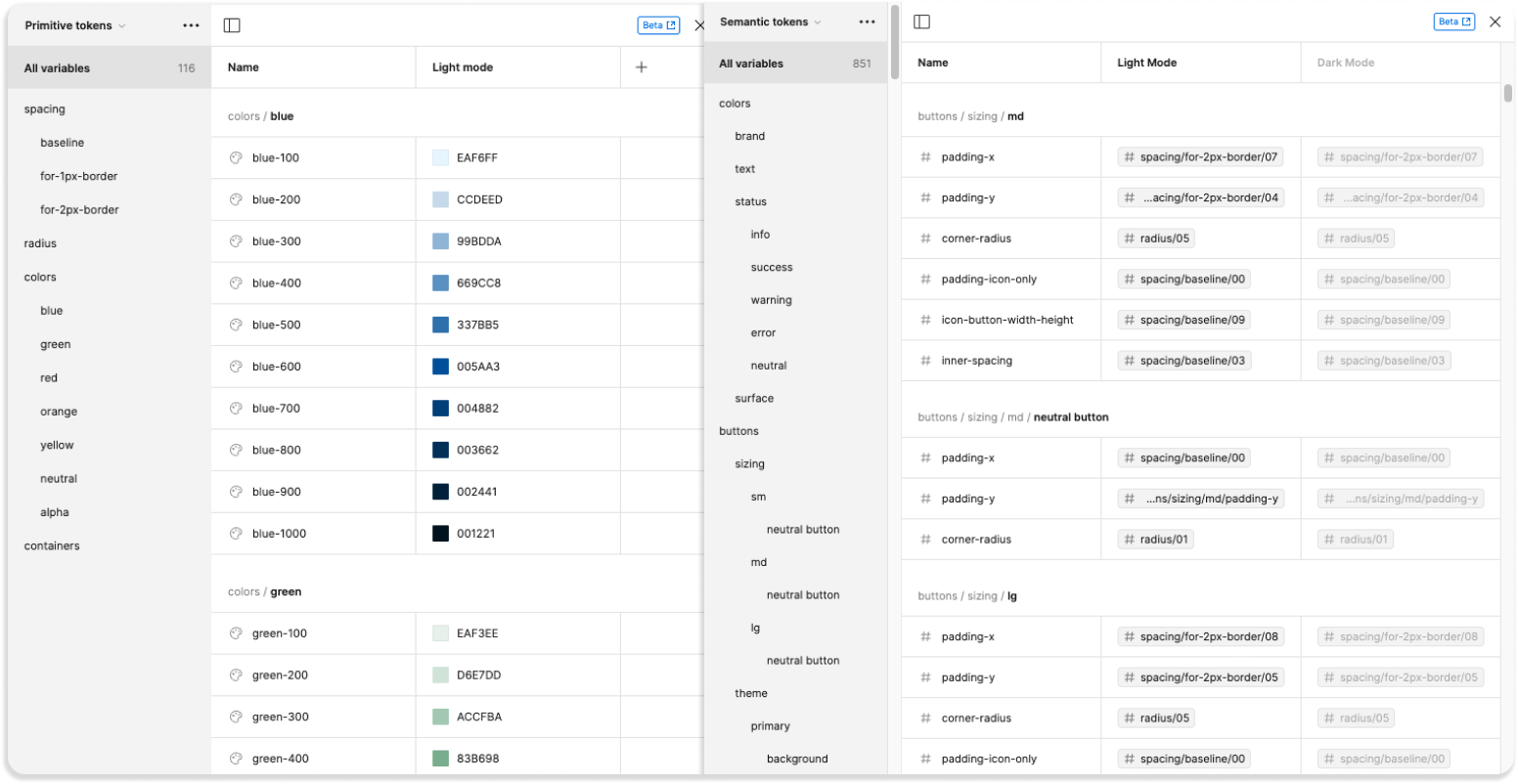
Left - primitive tokens, right - semantic tokens.
Primitive tokens represent the most basic style values, such as colours, text sizes, or spacing, which can be combined and reused in different parts of the design system, providing universal building blocks for design implementation.
Semantic tokens refer to the meaning or purpose of a design element, for example:
- alert-error-background - the background colour of an error message;
- button-theme-primary-background - the background colour of a primary button.
This helps create clearly defined and purposeful styles in the code.
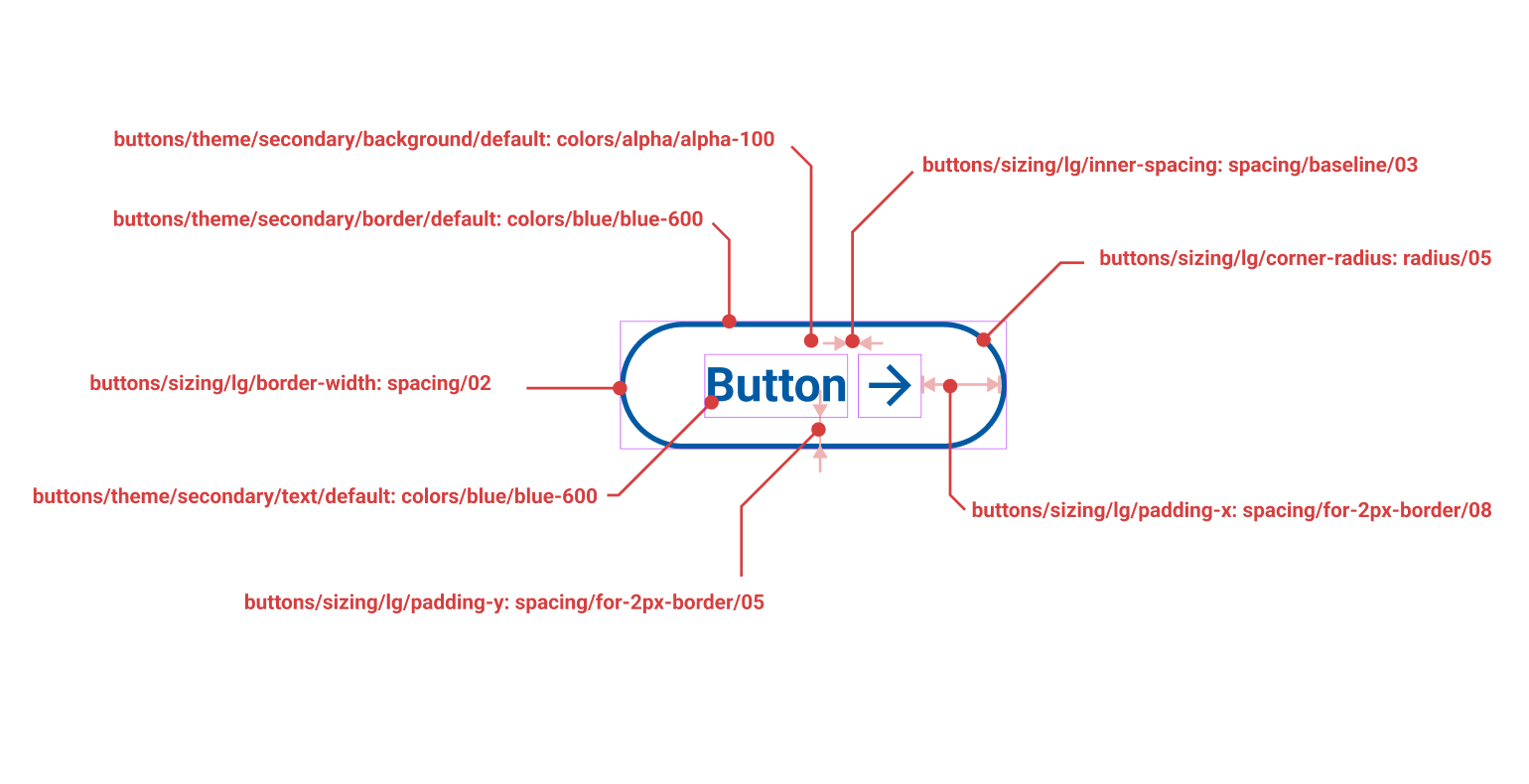
Overview of Secondary Button Design Tokens
General Structure
We decided to continue in the version 1.0 file with the approach that components are consolidated on one page. This allows users of Figma's free plan to use the Veera file. We defined the different sizes and interaction states for each component. We set the target that if something was possible in HTML/CSS, then designs would depict what it should look like.
Veera's primary target audience is creators of e-services. Consequently, design decisions are made in such a way that they facilitate the creation of information-dense screen views.
For example, H1 headlines are only 1.75 times larger than the body text. For presenting slogans, we defined both large and expressive headlines separately. Components are predominantly available in three sizes:
- Large – for situations with plenty of space and the need to make large, eye-catching content blocks;
- Medium – the default size, suitable for most standard cases;
- Small – for situations requiring particularly information-dense views, such as internal tools for officials.
Colour Solution
We decided to simplify the previous system for colours. The new palette consists of 6 colours, each with 10 shades (the pre-alpha offered 20 shades). In addition to the base palette, 3 transparent colours are used. A smaller palette helps maintain a unified style but still provides enough freedom to create unique solutions. The tones of all colours are derived algorithmically from the respective 600 shades of the colour. Some tones have been manually adjusted to increase the number of color combinations that meet contrast requirements.
In creating the dark mode, we also based it on the base palette colors. In most cases, it was sufficient to divide the base palette tones conceptually in two – 5 light tones and 5 dark tones – and replace the light color with its counterpart in the split palette. Figma's variables solution was a great help in the technical implementation. It allows defining different states for variables. Veera now had two: Light mode and Dark mode.
Now, when switching the design to dark mode, the light color is replaced with the dark color, and vice versa.
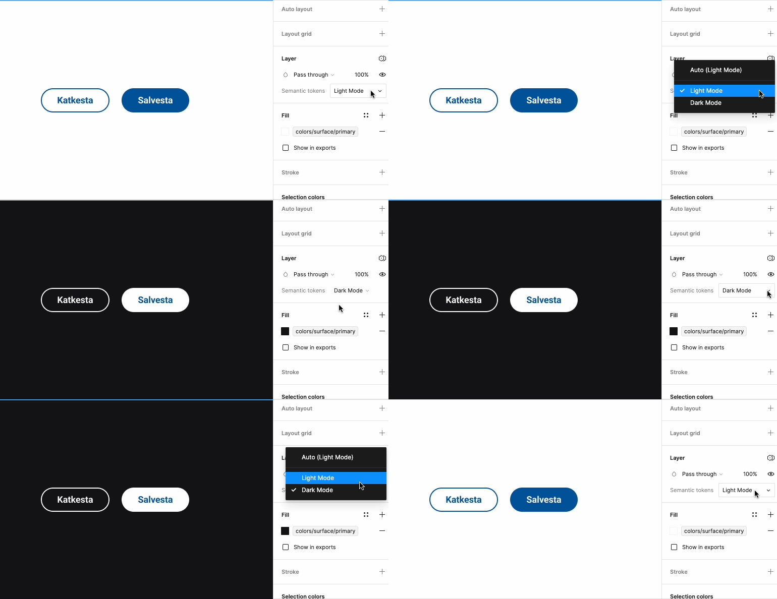
Veera Now Supports Dark Mode
Creating Components
The biggest challenge in creating components turned out to be the naming of Design Tokens. After some experimentation, the following pattern began to emerge:
Component:
- Background color
- Interaction states: Default, Hover, Active, Focus, Disabled
- Text color
- Interaction states: Default, Hover, Active, Focus, Disabled
- Line color
- Interaction states: Default, Hover, Active, Focus, Disabled
Sizes
Small: horizontal and vertical padding, spacing between sub-components, corner radius
Medium: horizontal and vertical padding, spacing between sub-components, corner radius
Large: horizontal and vertical padding, spacing between sub-components, corner radius.
This pattern had to be applied to each component. Generally, the components are divided into 45 different categories. In total, approximately 104 larger or smaller Figma components were created. Many components also have several variations, each with at least five interaction states. This easily illustrates how the number of necessary design decisions grows.
The Pros and Cons of Tokens
The "aha moment" in designing components came when, in a discussion with developers, the following was suggested: that once tokens are agreed upon and set, then from there on their values can be iterated as much as needed. This was a clear indication that we had reached a point in our process where the transfer of design decisions to development was automated, provided that the tokens existed and their naming did not change.
Since Figma is primarily a domain for designers, in the Veera 1.0 project, designers handled the development of tokens. This was a new challenge for many and required a period of adjustment. After hours of work, the result was “an Excel table with some variables,” not the visual design that designers are usually accustomed to. Certainly, the immaturity of Figma's variables management interface complicated the process. To date, it's relatively difficult to find the definition of a specific component’s token.
To modify any Design Token, the following steps are necessary:
- Select the component of interest;
- Identify the token's name from the component;
- Open the variables panel;
- Scroll through the variables panel until you find the correct token, which can take some time with 900 tokens.
Hopefully, Figma will make processing variables more convenient soon, such as by searching by name. Our designers used a workflow where the same work file was open in two windows - one was the main work file, and the other simply displayed the variables panel. This made life somewhat easier.
Despite all the challenges, using the variables solution was the right decision, as it allowed us to much more quickly hand off design decisions to development.
We would like to thank the RIA's Veera team, who actively thought along with us and trusted our decisions. It rarely happens in a project that there are people on the client's side who understand the topic of design systems so well and with whom one can discuss matters in depth from the outset, understanding a common language.
In the next post about Veera, we will discuss in more detail how we addressed the following project goals:
- Accessibility requirements;
- Microcopy;
- The technical side of the Figma plugin;
- HTML, CSS components.
Read also Part 2 of the article, where we discuss accessibility, code components, and content creation.
