How to recognise good user interface design: guidelines for product owners
Good design is much more than just an aesthetically pleasing appearance. A good design is characterised by user-centrism, functionality, and intuitiveness, creating a meaningful and enjoyable experience that supports users' goals and simplifies their daily lives.
Measuring design quality may seem like a subjective task. By following certain principles and nuances, it is possible to help ensure that the resulting product meets the expectations of many users.
This article will discuss the principles of good design in more detail and look at the design solutions used in various web environments - such as the Tax and Customs Board, Luminor, Sportland, and other web environments likely already familiar to you. Our designers provide recommendations and explanations alongside examples, detailing which aspects should be critically reviewed.
User Experience Needs Hierarchy
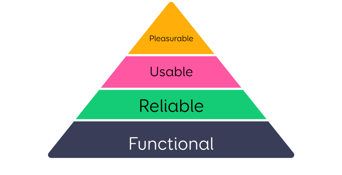
This is a model that helps understand and prioritise the different aspects that affect the user experience with digital products or services. Aaron Walter describes this concept, which grew out of Maslow's hierarchy of needs, in his book "Designing for Emotion".
He explains how products and services should first meet the user's basic needs and then offer rich and emotionally engaging experiences. According to Maslow's theory, human needs are organised into a hierarchical system, ranging from basic physiological needs to self-actualisation.
In the context of user experience, the hierarchy begins with functionality, ensuring that the product or service is reliable and meets the user's basic needs. Then, the focus shifts to the product's ease of use and reliability. The ultimate goal is to provide users with positive emotional experiences that enrich their daily lives, arising through a strong connection and loyalty to the product or service.
Figure 1 - User Experience Needs Hierarchy
- Functional: The foundational level of the hierarchy emphasises the necessity of the product or service for the user. For people to want to use a product or service, it must solve a problem for them or provide significant added value. The product or service must be clearly useful to ensure its practical applicability in users' everyday lives.
- Reliable: The next layer in the hierarchy highlights the reliability and stability of the product or service. Reliability ensures that users can depend on the product or service at any time and in any situation without worrying about performance issues or interruptions.
- Usable: This level focuses on how comfortable and easy it is to use the product or service. A usable design is intuitive and straightforward, reducing the user's cognitive load and enabling them to achieve their goals quickly and effortlessly.
- Pleasurable: The highest hierarchy level concerns the user's emotional response to the product or service. Design that can evoke positive emotions, such as joy, surprise, or even love, creates a strong emotional bond between the user and the product. Such a design exceeds expectations, enriching the user's experience and promoting brand loyalty.
Understanding these needs and the hierarchy is essential for creating a successful digital product or service. It's important to note that each level builds on the previous one, meaning that usefulness and reliability are prerequisites for convenience and enjoyment.
The Importance of Usefulness and Usability in Design
Prioritising purely aesthetic design while ignoring the basic needs of usability results in a product that users quickly abandon. A visually appealing solution might initially attract users, but their interest quickly turns to frustration if the product doesn't simplify their daily tasks. The practical value of a product is as important as its visual appeal.
User-centred design principles start from the user's needs, thereby reducing cognitive load and ensuring intuitive navigation with clear feedback. Considering functionality and usability ensures smooth and effortless interaction with the product or service, which in turn leads to a positive user experience, increases user engagement, and helps achieve business goals.
Based on the foregoing, we have compiled a user interface design checklist, or 7 criteria, to help you assess the design. Next to each criterion, we provide specific examples and lesson(s) on how design can fail if these principles are ignored.
The User Interface Design Checklist
1. Clarity and Simplicity: Is the information presented clearly and concisely? Can users understand the purpose and functionality of each element?
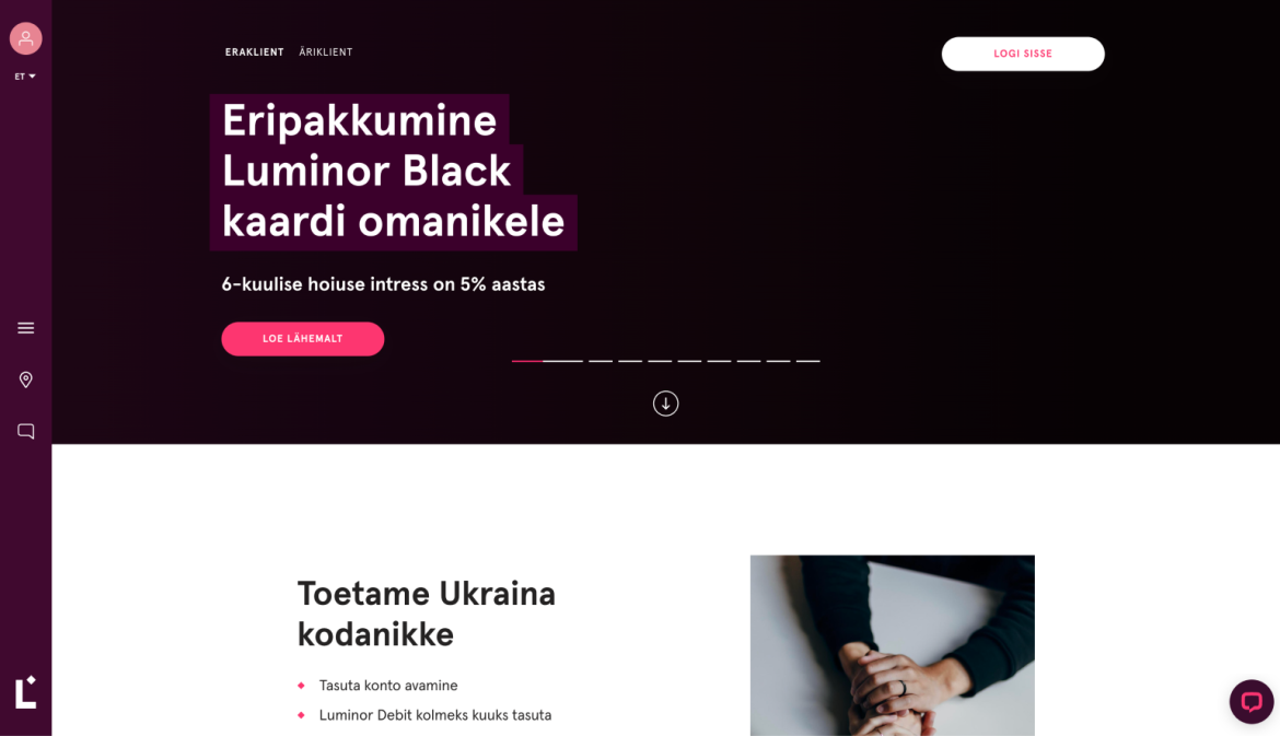
Image 1 – Luminor website
Current Solution: Luminor uses only icons for main navigation and functionalities (see, for example, the left side of the screenshot). While aesthetically pleasing, this approach does not offer unambiguously understandable options for users, and many may need clarification about what action a particular icon represents.
Using the page requires experimentation and clicking around. Icons are not unambiguously understandable, creating user anxiety about the possibility of misunderstanding an icon and clicking the wrong thing.
Recommended Solution: Add explanatory texts to the icons, and if necessary, make the left navigation bar wider to accommodate the texts. At a minimum, we recommend adding tooltip bubbles to the navigation elements, which are displayed when the user hovers over an element. This will give users more confidence and make their experience using the page significantly smoother.
2. Consistency: Are consistent design elements used throughout, including colour schemes, typography, and interactions? Do they follow established design guidelines?
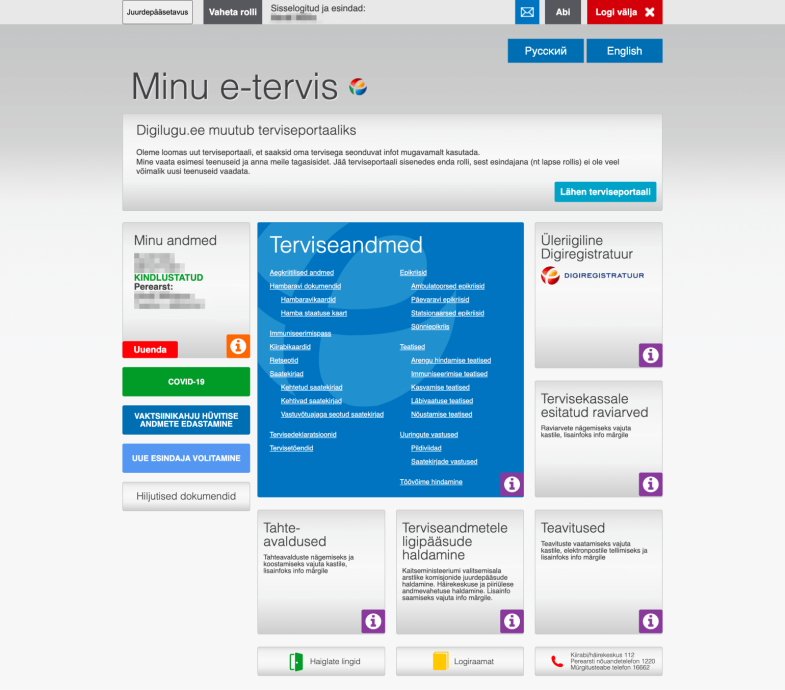
Image 2 – Former Digilugu self-service environment
Current Solution: In the Digilugu portal, it is difficult for users to understand which elements are clickable and what might happen if clicked. Elements with similar appearances behave differently in different places.
For example, the "My Data" block is not clickable, but visually it looks similar to the "National Digital Registry" block, which is clickable. Excessive and unthoughtful use of colours has also created a complex visual hierarchy that does not facilitate smooth user navigation or prioritisation within the portal.
Recommended Solution: The former visual design of the Digilugu portal was not user-friendly and required thorough analysis and redesign. In such cases, we recommend creating a clear information architecture and establishing a visual language and structure.
It is important to ensure that clickable elements are clearly distinguishable and readable from static elements. The good news is that shortly before this article was published, the Digilugu portal was replaced with the new and user-friendly Health Portal :)
3. Intuitiveness: Can users navigate easily without explicit instructions? Is the layout and organisation of the page logical and straightforward?
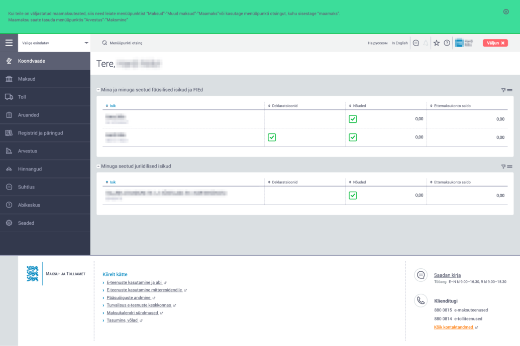
Image 3 – Tax and Customs Board self-service environment
Current Solution: The navigation in the Tax and Customs Board's self-service remains unclear to users. The only hint of how to reach certain topics is the green notification displayed in the system's header. The need for this notification likely arose from repeated inquiries to customer support.
Recommended Solution: As a start, we recommend assessing the names and structure of navigation elements through user testing. Consider elevating popular topics to the first level of navigation.
In the main menu, it would be good to visually hint to users that subtopics are under each main topic. For convenience, allowing users to explore subtopics without changing pages would be beneficial.
4. Readability: Are the fonts and typography legible and understandable? Is there enough contrast between the text and the background?
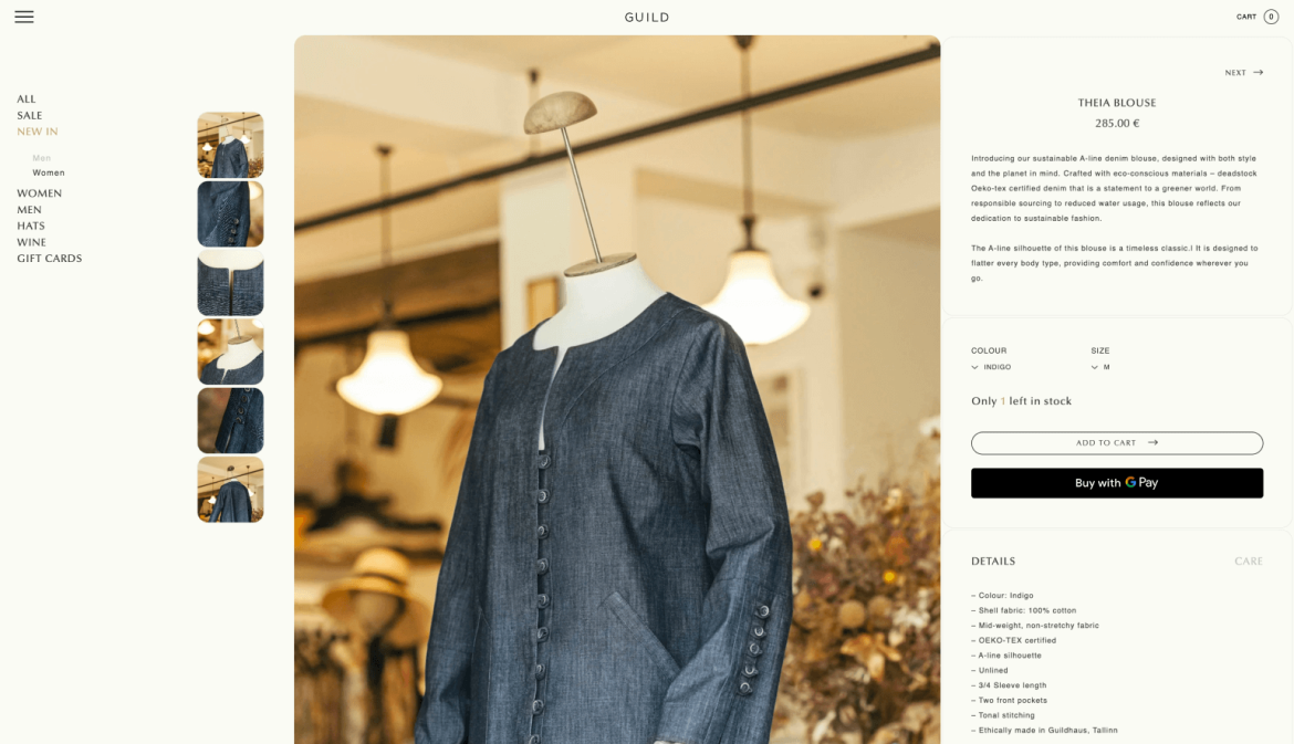
Image 4 - Guild's Online Store
Current Solution: Guild's online store has a strong and pleasing aesthetic. However, for aesthetic reasons, the text content is made tiny, and many interactive elements are barely distinguishable from the background. This makes consuming information and shopping uncomfortable for the user.
Recommended Solution: We suggest making the text content larger (ideally 16px) and the interactive elements more contrasting against the background (ideally at least a 4.5:1 contrast ratio). This step would significantly improve content readability.
5. Clear Actions: Are call-to-action elements easily distinguishable, and do they include clear references? Do they guide users towards the desired actions?
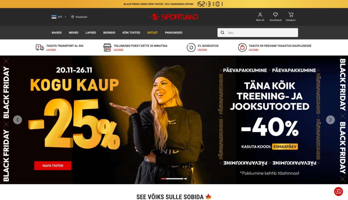
Image 5 - Sportland's Online Store
Current Solution: The Sportland homepage has a lot of information about campaigns but lacks specific information or a button on how to participate. The only clear action button is "See Products," However, this may go unnoticed compared to other content text sizes and fonts.
Recommended Solution: To highlight campaigns in the online store, we recommend using visuals with clear and specific messages (e.g., buttons and links) that are easy to use and help direct the user's attention to important actions.
Place these in easily discoverable locations for the user. Unlike a physical shopping environment, where the main goal is to attract people to the store, in an online store, it's most important to guide users smoothly towards the purchasing process.
6. Feedback and Error Handling: Are error messages informative and helpful? Does the design of success messages provide clear feedback?
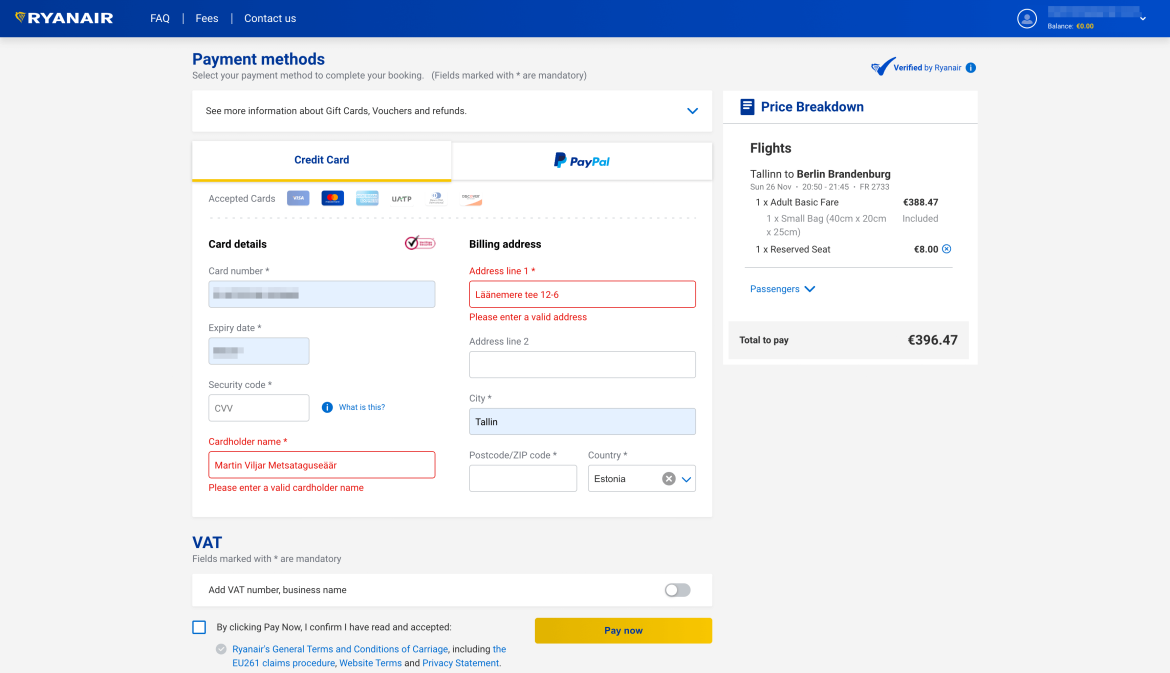
Image 6 - Ryanair Booking System
Current Solution: The Ryanair booking system asks users to enter a valid name and address. The problem is that the system does not allow diacritics, and the error message does not inform the user about this.
Recommended Solution: In such cases, a minimal solution is to describe the problem more precisely. In this case, the system's error message should state that diacritics are not allowed. Ideally, the system should be flexible and accept diacritics.
7. Adaptability: Does the design smoothly adapt to different devices and screen sizes? Is the design visually attractive and functional on mobile, desktop, and tablet devices?
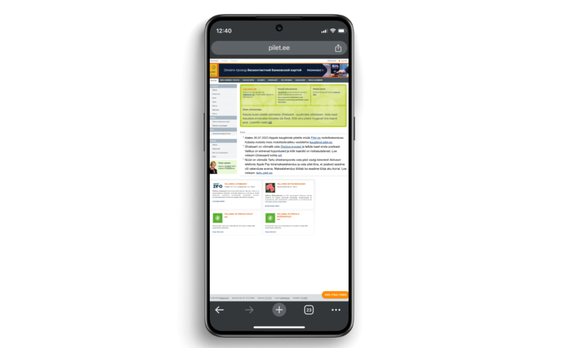
Image 7 - Pilet.ee Environment
Current Solution: The Pilet.ee page does not adapt to smaller screens, making it very difficult, if not impossible, for many users to access it when a larger screen is not available.
Recommended Solution: Create style rules for displaying content on small screens, and ensure the page is usable on screens at least 320px wide. In addition to other details, attention should be paid to the size of clickable elements – ideally, they should be at least 44x44 px for finger tapping.
These 7 criteria for good design listed above will help assess the practicality and usability of user interface design, improve overall quality, and provide users with a better experience.
Enjoyable Design
As previously mentioned, the highest level in the hierarchy of user experience needs is the enjoyment of using a product or service. In this context, enjoyment refers to a state where the user experiences positive emotions derived from using the product or service.
The user might not verbally express these emotions, but they significantly affect their overall attitude and behaviour towards the continued use of the product or service. This is not just about functionality but about creating memorable experiences.
Here, we list design elements that can create positive emotions for the user:
• Animations
• Micro-interactions
• Adding humour and personality through small texts
• Beautiful, high-quality, and relevant imagery
• Sound effects
Video 1: Tallinki website
Tallink uses a spinning ship's propeller to indicate data loading. This reinforces their brand and makes the waiting time for data retrieval a bit more fun :)
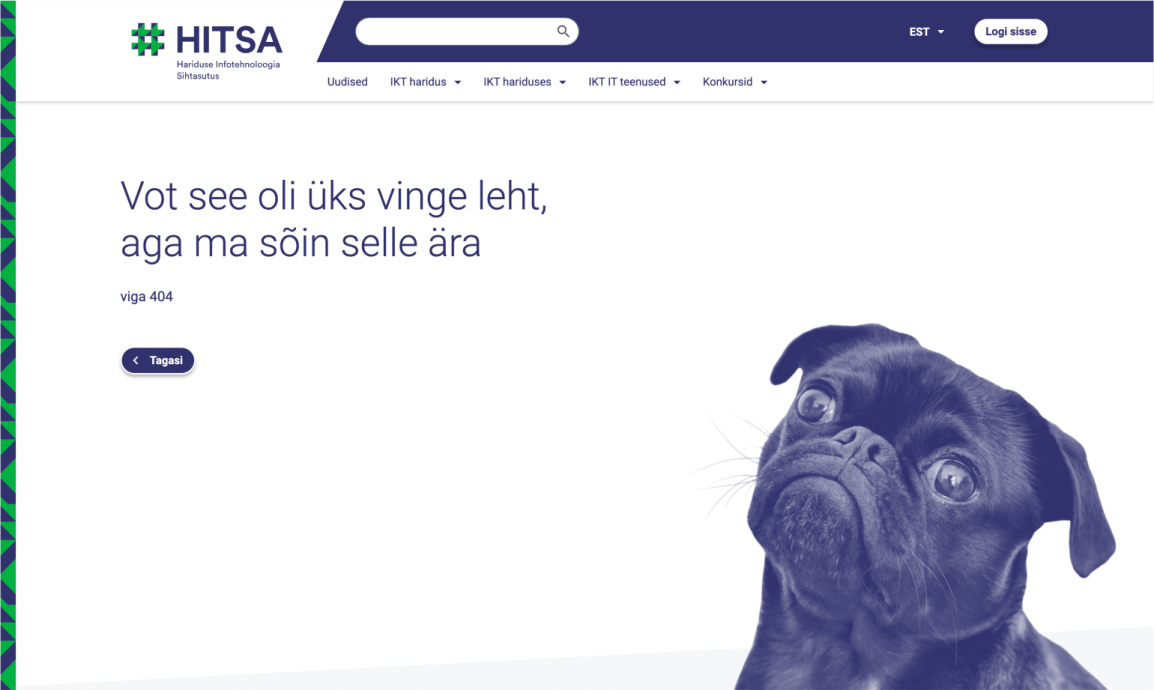
Image 8: HITSA website
The Education and Youth Authority's design system approaches the 404 error page with light humour.
Video 2: Wolt Food Courier Environment
On the Wolt food courier platform, users can play a simple but fun game while waiting for their food. The game starts as a "surprise" when the user repeatedly presses the expected arrival time.
Summary
Good design combines functionality and emotion, providing users with enjoyable experiences. Effective design deepens user engagement and creates positive memories, promoting repeated use of the product or service. By considering all levels of the user experience hierarchy – from clear functionality to emotional engagement – we can create a striking and joy-bring design in everyday use.

