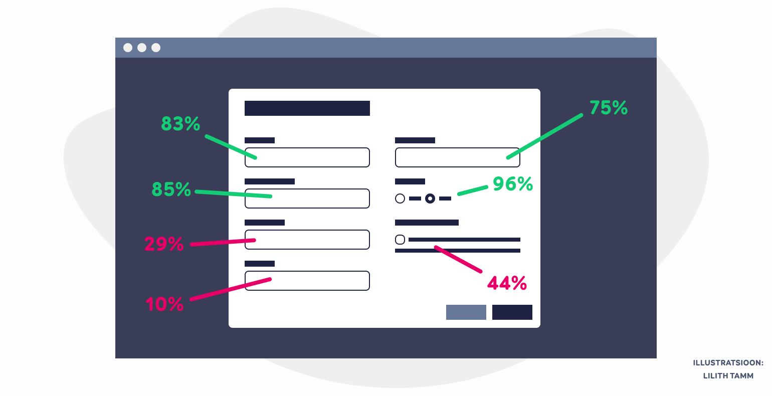
5 main indicators for evaluating the usability of web forms
Why is it that some web forms can irritate users so much that they end up not filling out the form and instead leave the website? In this article, we will take a closer look at indicators used for measuring the usability of web forms.
We have made a selection of 5 main indicators, which are all easy to measure and are the best for seeing how well users interact with your web forms. Additionally, these indicators also provide feedback about how well your web forms have been designed and structured.
All of the indicators we will be talking about are KPIs or key performance indicators, so the initial data when you start measuring them can be collected from web analytics tools (e.g. Google Analytics and Tag Manager).
Why is it important to measure the usability of web forms?
Nowadays, development is done quite fast and instead of collecting smaller changes into a bigger batch that gets implemented rarely, smaller changes are usually made fast and often.
A lot of the time, the cost of conducting usability testing for each little change ends up being a lot bigger than actually making the change, which is why it is much more affordable to simply publish untested changes to your users, including any changes and updates made to web forms.
“If you want to figure out what is going on with your web forms, then it is important to use web statistics to measure their usability. This allows you to see whether something improves or not as a result of any changes you make.”
By calculating the average of all of the indicators of all of the web forms, we can evaluate the general state of the forms as an aggregate. Then, we can focus on the indicators of a specific form, target group, device type, or language. The following provides an overview of the 5 main web form indicators along with the formulas for calculating their percentages.

Indicator 1 – the % of default values that get changed
We can talk about default values in the context of forms with pre-filled fields. For example, if it is clear that most people want to use the same selection for a field, then we can make that selection for the user by using it as the default value for it.
And the assumption is that by doing so, we are making the user’s life easier by one click. And in case the user does not want to use that option, they can still change it.
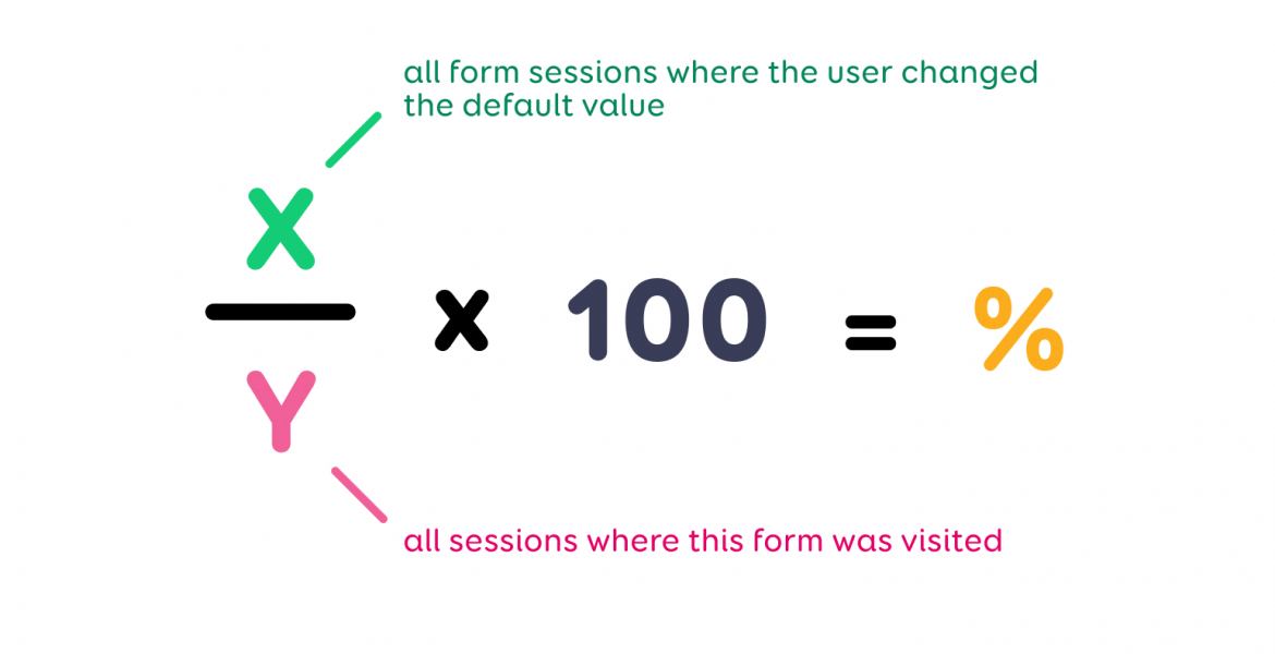
It may turn out that due to false assumptions or as a leftover from old settings, the default value is something that is not suitable for most users and they have to put in extra time into changing that value. We can evaluate whether that is the case by calculating the percentage of default values that are changed:
Formula for calculating the percentage change of the default values of the form fields
The result (%) will tell us in how many cases out of all of the form sessions the user was forced to change the default value. If it turns out that more than half of all users had to do that, then we recommend doing a critical re-evaluation of all your current default values.
Indicator 2 – the % of validation errors
A validation error is an error message displayed while filling out a form. It informs the user of any form fields that have been filled out incorrectly and provides them with instructions on how to properly fill them.
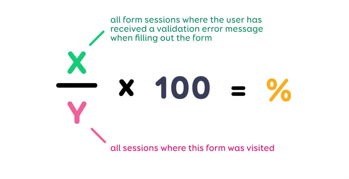
Error messages indicate that the form or a particular field in the form has not been designed in a way that is understandably clear for the user. In other words, the user did not understand how they are supposed to fill it during their first attempt. We can calculate the percentage of validation errors with the following formula:
Formula for calculating the percentage of validation problems
The result tells us in how many cases out of all of the sessions the user received an error message for filling out the form incorrectly or for not filling out a field. Based on this, we can evaluate whether the form’s design needs to be changed or not.
Indicator 3 – the % of tooltips and other help functions used in the form
Often, form fields will have help buttons attached to them (in the shape of a question mark or the letter “i”), which the user can click on when they get stuck. If a large percentage of users click on it, then that field – its label or the expected input – is hard to understand and should be fixed.
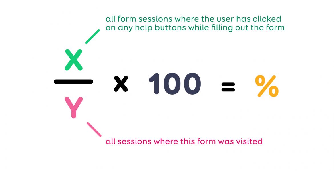
The severity of the issue or in other words, how easy it is to understand the form fields can be evaluated by calculating the usage of help functions:
Formula for calculating the percentage of use of form field help functionality
The resulting percentage tells us in how many cases out of all the sessions the user clicked on the help buttons, which helps us understand whether the form needs to be made clearer or not.
Indicator 4 – the % of abandoned forms
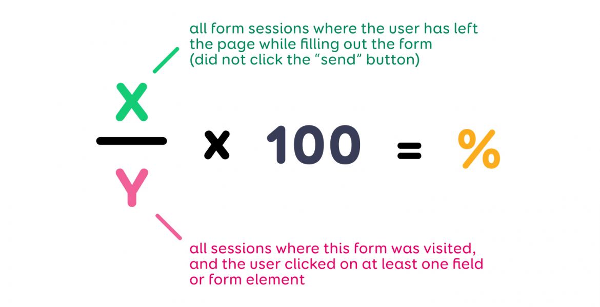
In this formula, we account for users who tried to start filling out a particular form – they clicked into at least one field – and did not just leave the page without interacting with the form. This indicator shows us the proportion of users who started to fill out the form but abandoned it for some reason. The formula for calculating the percentage of abandoned forms is:
Formula for calculating the percentage of abandoned forms
The result shows us how many users abandoned the form and helps us figure out whether something should be improved about the form and if so, what.
Indicator 5 – the % of users who have filled out a field more than once
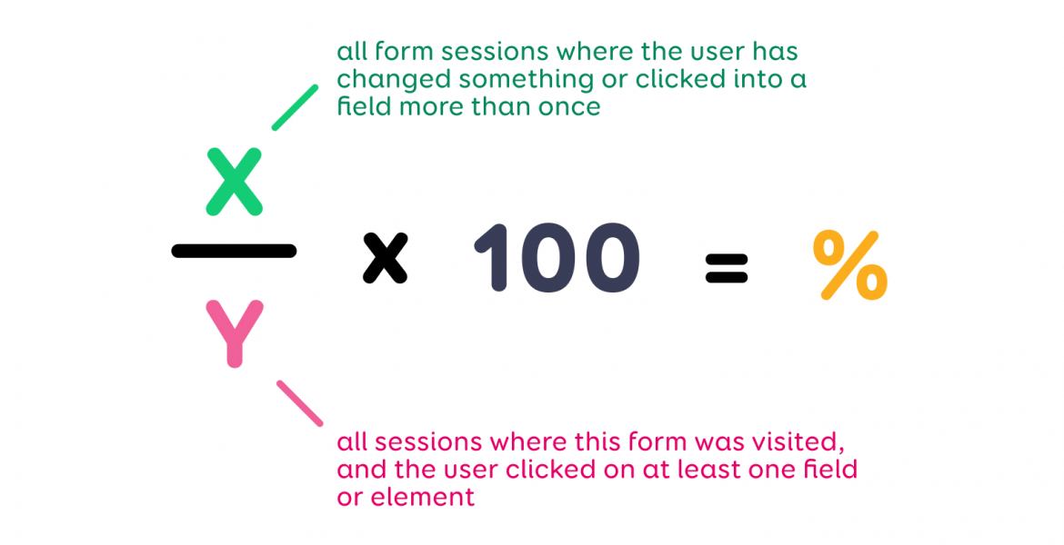
This means that the user filled out a field in the form but for some reason, they had to do it again. This indicator helps us measure whether the user has to do more work than initially planned during the form design phase. To calculate this, we use the following formula:
Formula for calculating the percentage of users who have completed more than one field
The result is a percentage that shows the proportion of users for whom filling out the form field was not an understandable task, which meant they had to do it multiple times. The value of the percentage helps us evaluate whether the form field needs to be redesigned to make it easier to understand.
Bonus indicator – the % of intimidating forms
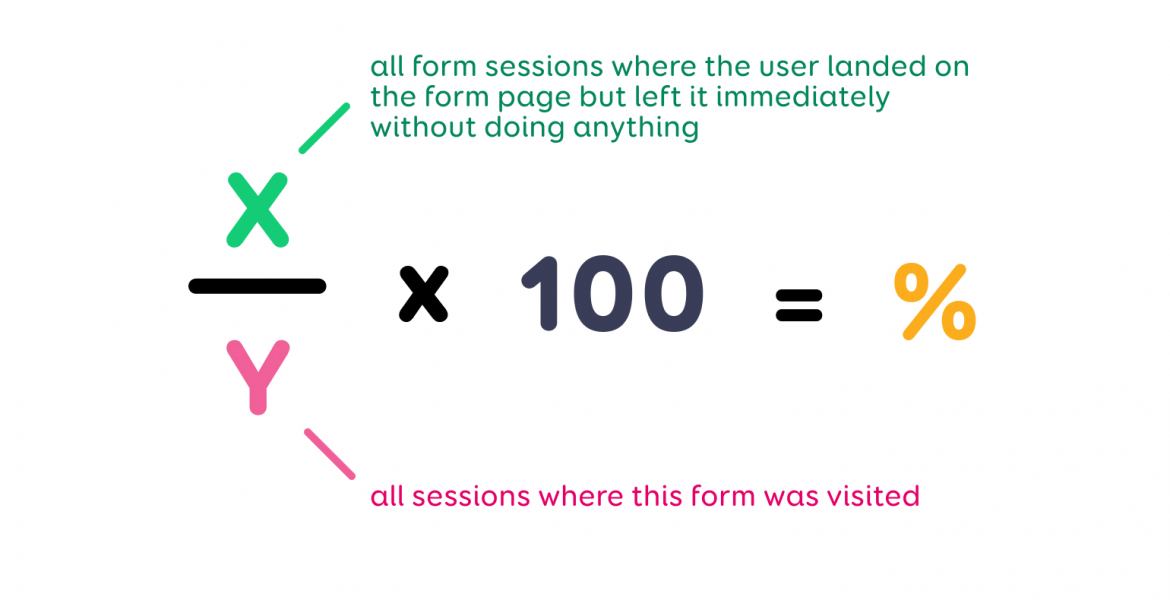
This indicator is based on those form sessions where the user landed on the form page but left it immediately without doing anything.
Formula for calculating the percentage of intimidating forms
This indicator tells us that the web form is intimidating to the user because of its length, amount of text, number of fields that need to be filled out or some other similar reason. It may also indicate that the navigational route that brings the user to the web form did not provide them with enough information about where they would arrive by clicking into it.
The frequency of calculating these indicators is dependent on various factors: how frequently changes are implemented, the number of visitors to your website, campaigns, seasonality, what precisely is being researched and evaluated etc.
Calculating percentages is one of the easiest first steps to take which helps you to evaluate what is happening with your web forms and whether they are user-friendly and meet expectations or not. We recommend that anyone who has web forms or self-service forms keeps a close eye on these indicators.

