Animation as a tool: why and how to use it?
Making the website’s visuals move is nothing new. Some time ago, people had to install Adobe Flash plug-ins to make the animations work. In addition to creating simple components, Adobe Flash was also used to create whole websites from ground up.
Adobe Flash was very appealing to designers because it gave them a possibility to create unique interactive solutions and animations that were back then not supported by HTML and CSS. Flash, however, has many negative aspects. For example, in addition to needing to be installed, it is not search engine friendly.
Nowadays, with better web technologies and browsers, we have many different ways to animate websites and mobile applications. Web animations are usually created with CSS3 and even though Flash was used in advertisement banners, better technologies are used in that field also.
Even though it is easy to make animations now, it doesn’t mean that they should always be used. This article is about how and when do animations help us to enhance our user’’ experience.
Why use animations?
DIRECTING ATTENTION

Animations are a great way to direct people’s attention to certain elements, for example, icons, call-to-action buttons, or form.
We also have to be careful with using too many animations on the same page as having many different focus points, the user might not be able to keep up with everything. This, however, can make the website or application even harder to understand and comprehend.
WEBSITE’S IMAGINARY MODEL

To help users understand website’s structure or navigation, animations can be used to create an imaginary model of a website. A user will always see only parts that are visible on their screen but it doesn’t mean that we should limit our design because of that. Through moving elements onto the screen from the sides we can create an imaginary model of the website's structure in the user’s mind.
One example of this would be an off-the-screen menu that a user could make appear from an edge of their screen and as easily make it disappear again. Through simple movements, that user will remember from where they opened the menu and to where it was sent back.
CREATING CONNECTIONS
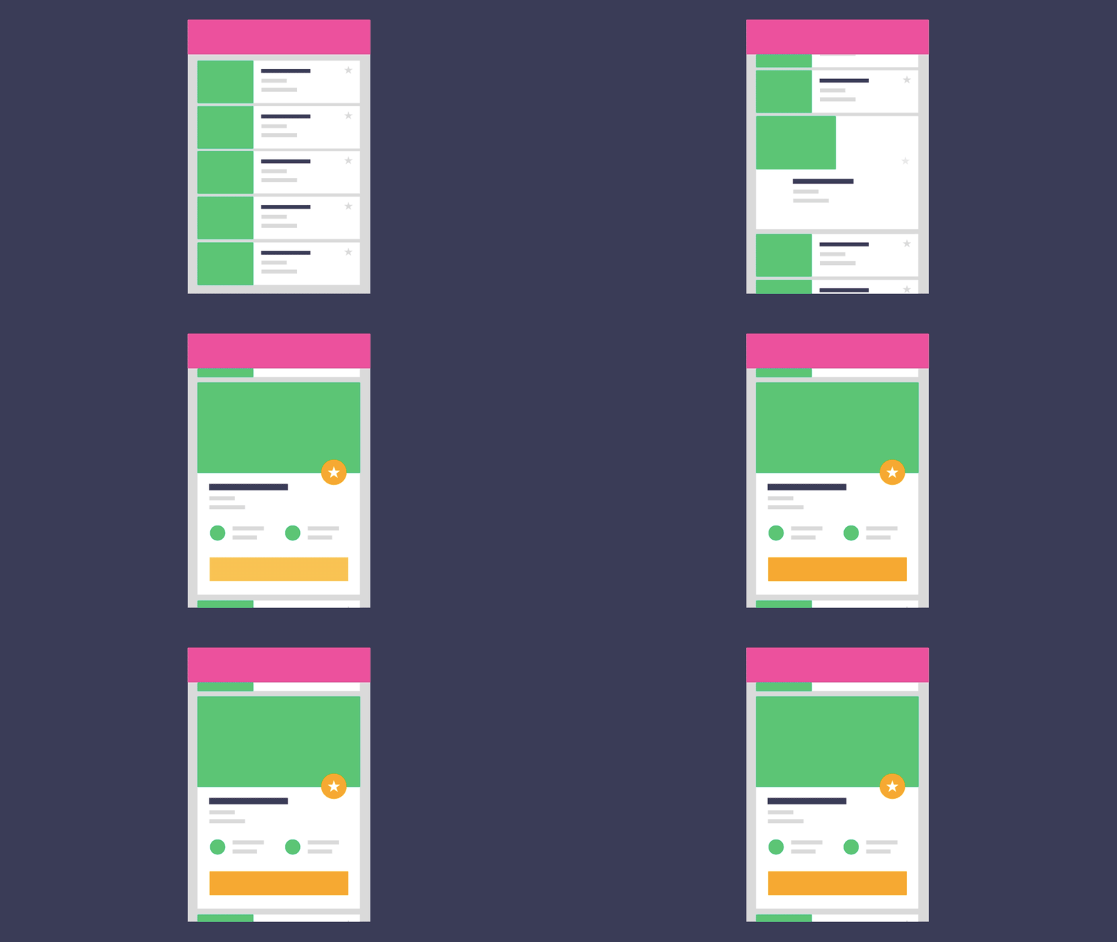
If we change the visuals of elements or reposition them, users must find the same information again on a different part of a website or system. To make this transition smoother, we use smooth movement to make it simpler for the user to follow the changes.
While moving and changing the elements, it is crucial to make animations easy to follow and understandable. Ignoring this simple rule will probably result in confused users.
HINTING ON THE CONSEQUENCES OF INTERACTIONS

Animations help us hint users what they should be expecting after they have taken certain steps. For example, when you swipe an email in your inbox, you can see the animation that indicates the removal of that email from your inbox.
DESIGNING THE SYSTEM’S NOTIFICATIONS

Although we can optimize our websites, our users will still have to wait sometimes when the website is being loaded. To not confuse users, we must implement loading animations so that they would not think that the website does not work or does not have any content. That animation could be something as simple as a moving circle of dots.
Other back-end processes must also be visualized. These processes might include user authentication, payment processing, email sending etc. With animations, we can show users what the system is currently working on and keep them from getting confused.
EMOTIONAL VALUE CREATION

In addition to making systems more user friendly, animations can also create positive emotions, for example, showing them a sparkly star after they have saved a file or launching virtual fireworks after they have successfully bought something.
These kinds of animations can create positive memories and make users visit a website again or recommend it to their friends.
What to remember when using animations and what not to do?
OPTIMIZATION
Animations, as everything else that is displayed on the website, require resources. It is important to not add too much content as the more you have on your site, the slower are the loading speeds. Too much animations can also make it more difficult to use the website and its functions and will use more battery.
CORRECT TIMING
Every animation should be kept as short as possible but as long as needed. Users should not have to wait for an animation to finish to be able to continue with their tasks.
AVOID DISTURBING ANIMATIONS
Animations are useful elements for websites but can also be a burden. Aggressive and hectic animations might scare the user. Furthermore, it is recommended not to use flashing animations that might cause epilepsy.
AVOID OVERUSING MOVEMENT
As with everything else, animations must be dosed correctly as well. If we are making a system which main purpose is to make information fastly accessible, making a purchase or supporting any other task oriented action, it is recommended to avoid animating the website too much so that the user could focus on their tasks instead.
ANIMATIONS AS A TOOL
In conclusion, animations are a useful tool in a designer’s toolbox accompanying, typography, colors, graphics, composition etc. To increase a system’s usability and aesthetic value, a designer must decide on which tool can be used most effectively to achieve the goal.


