How to Survive a 48h Hackathon as a UX / Interaction Designer
Last weekend there was another Garage48 hackathon, where a lot of products and services were developed in just 48 hours. The teams started with an idea and finished with a working product.
This was my first time participating and doing interaction design in such a short timeframe. Read on to find my impressions about the event and the challenges I faced. I will also give you tips and tricks to get the best results in such short time.
Hackathons need more UX designers
There are a lot of web designers, also called visual designers, but if you want someone who uses and understands the methods behind interaction design and user-centric approach then you can count them up on five fingers. At least in Estonia.
Design decisions are largely made based on gut feeling, but you probably already know that a tested and validated solution is both more efficient and brings greater results.
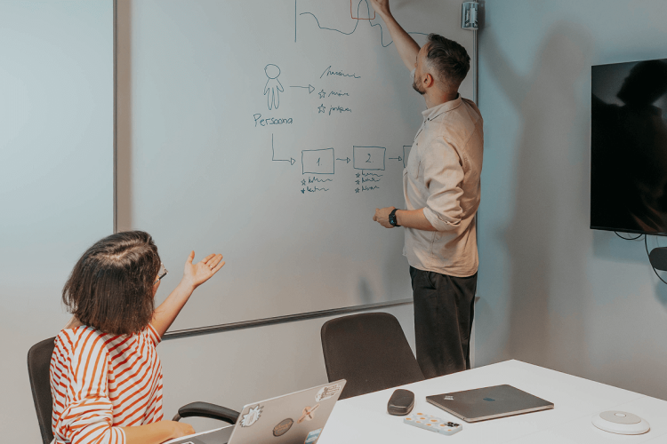
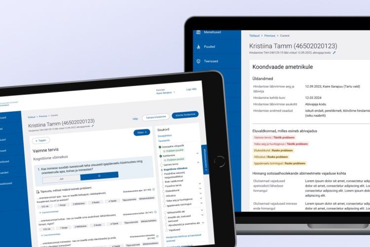
In our team I was in charge of the UX. I used my usual interaction design process – started by defining requirements and moved on to creating a functional prototype with Axure RP.
Our web designer was in charge of the visuals and developers put their energy into coding. It was obvious to everyone that the prototype is needed if we want make a good product. There were some hiccups though.
Web designers have a difficult time understanding interaction designers
I was given some pretty strange looks when I first launched Axure on my laptop. My guess is that developers and web designers still think that UX designers create their prototype either in code or in Illustrator.
But no. Our prototypes are interactive black-and-white wireframes that focus purely on interaction and usability.
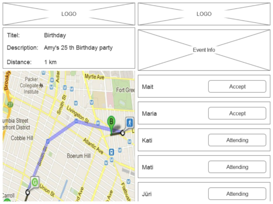
Interaction designers create prototypes based on the habits and needs of potential end users. It is important to know that visual designers and developers should not insert their own ideas into an already tested and proven concept.
This is a pretty common. Web designers often think that their visual design ideas are better, but that is not always the case. You may think that the product or service benefits from the latest design trend, but you might end up hurting instead.
If you do end up changing a product that the users already understand and feel natural with then you will most likely make it less user friendly and usable.
Focus on user experience as early as possible
The sooner you understand that the key is in good usability and experience the better. It is very hard to change an already finished system. The more time you can spend on the blueprints of your product, the less you will spend on fixing and redesign.
Once a prototype is completed, give it to potential customers/users. See how they understand it and how they use it. Try not to give any tips on how the app works, let them figure it out themselves. If they get it then great! If they don’t, then you have some work to do.
The earlier you test the quicker you will find out the potential problems and threats. You will also find new ideas and opportunities. Long story short: go out and talk to people. You don’t have to figure everything out yourself.
Top recommendations for great end results:
- Find out what has already been done and don’t repeat previous mistakes
- Teamwork is super important, do not work against each other
- Plan your time and make every minute count
- Find out the needs and expectations of your users
- Do customer journey mapping
- Test your idea, test your design, and test the final solution
- Be sceptical about design trends, they might seem cool, but they are not always user friendly
The winning formula
If you want to win then don’t think “oh, bloody hell, I will just do the project and it doesn’t really matter if it is usable or not”. You won’t win hackathons with this kind of attitude. If you make decision to participate then put some passion into it.
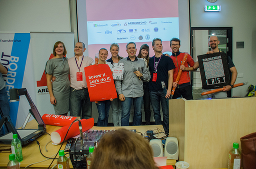
Teams focused on user experience really stood out. My recommendation is that you make an effort in finding a good UX or interaction designer to join your team.
There is a definitive need for these kinds of events. You will most probably see Trinidad’s crew at future hackathons as well.
A shameless plug - WUD UX design conference on the 14th of Nov
On the 14th of November we will have the annual World Usability Day Tallinn conference, which is an event for all UX designers, web designers, markaters and developers. There are some passes still left, so hurry up and register.
We will have speakers covering everything from hardware design, UX research, latest on eye tracking and gamicication, plus much-much more.
Read more and register https://www.facebook.com/events/463967703746366.
