Common misunderstandings of accessibility
When talking about usability and user centred design, we have to talk about accessibility which means that people with disabilities (for example people who cannot see, hear or use their hands), the elderly, first time users etc can also effectively use websites and mobile applications.
There are many myths and misunderstandings among the developers as well as the product owners when it comes to accessibility. Let’s bust these myths once and for all!
Misunderstanding 1: „An automatic test can tell if my website is accessible. “
There are plenty of different accessibility testing tools available online (for example WAVE) that are really useful for identifying technical WCAG (web accessibility standard) problems, but they tend to give a false-good score for the website because automatic tools are only able discover about 30% of all accessibility issues.
Manual testing (using the keyboard and screen-readers - special software used by the blind which reads everything on the website out loud) and expert review are necessary for testing many aspects of accessibility.
For example, if the text alternative of the image, or "alt" text, really conveys the same information as the image; if any information is conveyed only through colour; if a heading really describes the following content; if a form field’s label describes the input in enough detail, and so on.
Therefore, it’s not possible to say that a website is accessible just by passing an automatic check.
Misunderstanding 2: „Accessibility only benefits people with disabilities. None of them visit my site and thus, accessibility is unnecessary.”
Accessibility benefits more people than just those with disabilities: for example, older people who don’t see or hear as well anymore; children whose reaction- and reading time is slower; someone who has a broken arm and cannot use mouse well etc.
Accessible web is simply more robust, adjustable, mobile friendly and allows more people to use it. Also, when information is presented in an accessible way, today’s growingly impatient users can obtain it faster.
As the situation with web accessibility is pretty bad in Estonia today, making your e-store accessible can lead to a number of new customers for whom the competitors’ services are uncomfortable or even impossible to use.
Accessible e-solutions enable people with special needs to live more independently, for example, blind people (using screen readers) can explore products independently in an online store - something they can't easily do in a regular one.
A user-friendly and accessible website gives the company a proper market advantage.
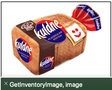
Screenshot 1 – If product images are not equipped with „alt“ texts or hidden from the screenreaders, blind people will hear strange and unnecessary information.
Misunderstanding 3: „Skip links are only for screenreaders and can be invisible.“
Skip link is the very first link on the page that takes the user to the main content of the page. This means the user can skip the header, navigation, and other sections that repeat on each page and quickly reach the actual content.
This feature is useful for those who do not use a mouse to navigate - for example, a person with certain motoric disabilities or a broken arm, as well as a blind user who uses a screenreader (a program that reads out everything on the page).
It’s common to make the skip link visible only when the user focuses it with the Tab key. However, if the skip link never comes visible, the user will not even know that they have the option to skip the menu.

Screenshot 3 – On Haapsalu.ee website the skip link becomes visible when clicking the Tab key.
Misunderstanding 4: „To comply with the WCAG standard, the website must have a high contrast switch.“
Hearing the word "accessibility", many get the picture of a black web page with bright yellow text. Text and other information on the website must be presented in colours contrasted enough to be read also by someone with a visual impairment, an older person or a child looking at a mobile phone covered with fingerprints, in sunlight.
The WCAG standard includes minimum colour contrast ratios which must be considered when designing a website. For example, for a website to meet WCAG 2.1 AA, regular text and its background must have a contrast ratio of at least 4.5:1. You can check the contrast between colour codes with this tool, for example. The higher the contrast, the better.
However, the WCAG standard does not actually require the possibility of switching to an alternative colour mode (black-and-yellow). Yellow text on a black background can be very comfortable to read for some visually impaired people, but on the other hand, older people who have difficulty distinguishing gray texts do not usually want to use a black-and-yellow page.
WCAG recommends adding a style switcher to the page if sufficient contrast cannot be provided by default (for example, due to the company's visual identity). And then why not go a step further and allow the user to also choose between black-and-white and blue-and-white style, for example. The more flexible the website is, the more people can use it.
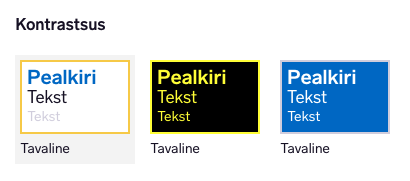
Screenshot 2 – On Tallinn.ee website user can choose between three diferent colour modes.
Misunderstanding 5: „Only links that leave the domain, are marked with <a>, all the rest with <button>.“
When creating an accessible page, it is important to use semantic HTML as much as possible. A page built only on <div>’s needs quite a lot of extra work to rebuild accessibility. But when to use a button tag and when an anchor?
True, links are things that take a user "off the page" and should be marked with an <a> tag; buttons are things that "don't take a user off the page" and should be marked with a <button>. However, changing the page doesn't have to mean a domain change. The link from home page to a subpage should be marked with <a>, but a button opening the login modal with <button>.
Here’s some more examples:
- Opens a picture in a modal? <button>
- Brings out extra content? <button>
- Opens the mobile menu? <button>
- Goes from home page to contacts page? <a>
- Opens the e-mail app? <a>
- Opens another page in a new tab? <a>
Misunderstanding 6: „Autofill must work on all fields.“
WCAG 1.3.5 indeed says that autofill must work on input fields, ie the fields must be filled in automatically with the data stored in the browser. However, there are two limitations to this point: only fields that collect information about the user and fulfill one of the input purposes for user interface components need to be filled in automatically. Autofill can work on other fields as well, but it is not mandatory.

Screenshot 4 – If input fields have the HTML autocomplete attribute, they are filled automatically.
Misunderstanding 7: „WCAG guidelines are only for websites.“
WCAG guidelines must actually be followed for websites, mobile applications and even documents uploaded to the website (PDF, Word, etc.). A number of success criteria were added in the new WCAG version 2.1 specifically for mobile devices. For example, mobile apps must work in both portrait and landscape.
Any functionality that can be activated by moving or shaking the device must have the option to be switched off and used in another way. Same applies to operations that require one or more fingers to be moved across the screen (such as pinch zoom). Additionally, the website must be built to be responsive so that it seamlessly reflows from desktop view to tablet and mobile view.
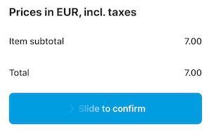
Screenshot 5 – In Wolt application, user must slide over the screen with a finger to confirm the order
Accessibility is a vital part of usability. We hope these 7 misunderstandings got sorted and brought some clarity into the complicated world of accessibility. Leave a comment if you’ve got any accessibility questions and let’s get them answered!
