Accessible web - for whom and why?
Imagine how frustrating it is to land on a website you can’t use. That’s what over 57 million people experience every day when visiting websites that seem to have decent enough user interface and user experience. Mari-Ell Mets is one of the web accessibility experts in Estonia and we asked her why we should invest in website accessibility and what it is in the first place.
Mari-Ell, what is your background and how did you come to be involved in the field of accessibility in the first place?
While studying Business Information Technology in TalTech, I took part in a UI design contest held by Trinidad Wiseman and was offered an internship. As I was interested in IT, user experience as well as visual design, I took the chance and found myself working for Trinidad Wiseman already during my last year of university.
The topic for my bachelor’s thesis was greatly impacted by one of Trinidad Wiseman’s founders, Hegle Sarapuu-Johanson, who suggested me to explore the field of accessibility. I was driven by my wish to help developers understand accessibility rules and thus help people with disabilities use the web.
What are you doing today in Trinidad Wiseman?
Today I work as an interaction designer. My responsibilities vary from creating new solutions to solving different business cases. I do a lot of wireframing and visual design, figure out how the solution should work down to every corner case and finally, test it. I also constantly research, consult and educate about accessibility.
We tend to focus our discussios of accessibility on users with physical impairments.
Actually, the topic is wider, isn't it?
Indeed. A great example of a real-life accessibility feature is a curb ramp. Though we may initially install it for people in wheelchairs, it also improves the road-crossing experience for people with baby strollers, skates and bikes. Accessibility issues can be very different and some people use assistive technologies to help them interact with websites. We may be using assistance – like the zoom feature – without even realizing it because the text is too small for us to read.
Or imagine being outside on your phone, trying to read an urgent e-mail about your bank account when the sun starts glaring from your phone screen in addition to it being covered in fingerprints, and the battery is dying so the brightness is turned down to the minimum… You get frustrated because you just can’t see the light grey text – that’s a widely spread accessibility issue – low contrast in colours.
Another good example is video captions – though we may have added them for people who can’t hear, they may be used by people who want to watch the video in a quiet place and don’t have headphones.
What is WCAG?
To say that a website is “accessible”, it needs to meet some sort of accessibility standard. WCAG, short for Web Content Accessibility Guidelines, is the standard document that includes guidelines on how to make web content more accessible for people with disabilities.
Last year, the latest version of it, WCAG 2.1 was published. The previous version WCAG 2.0 did not focus much on touchscreen mobile devices, which were quickly becoming the main platform for web browsing.
With my thesis, my aim was to improve the accessibility rules by adding guidelines for mobile development and making the rules more easily understandable by introducing friendlier language and real-life examples. My work resulted in website accessibility.twn.ee that explains how to create websites and applications that are usable by everyone. WCAG 2.1 was released just at the time when I was finishing my bachelor’s thesis with many improvements in the field of mobile accessibility.
What is the EU Web Accessibility Directive?
Following the release of WCAG version 2.1, the EU Web Accessibility Directive came into the picture. This means that all EU member states had to transpose accessibility rules into their local laws, forcing all public sector websites to make their websites accessible for everyone by meeting WCAG 2.1 level AA.
The development community is understandably alarmed because they haven’t generally been investing into accessibility till this day. Now, the public sector institutions only have about a year to fix their existing websites or create new ones that already conform with WCAG 2.1. This has brought along a noticeable increase in the demand for seminars and consultations.
A problem in web design is that organizations don’t want to spend extra money and effort just to make things accessible.
What do you think?
It is a normal reaction to ask if it is worth spending all that time and money so that a few disabled people could access your services.
Actually, it is.
Disabilities come in many different forms, including hearing disabilities, visual disabilities, motor disabilities. Although it’s probably not possible to design a website that’s accessible to everyone on the planet, a few common-sense modifications can go a long way towards helping people with disabilities use your site.
Also, we must understand that accessible web benefits everyone, not just the disabled. Our population is aging, people are using more hand-held touchscreen devices. This means that the user interface and the interactions need to be more and more thought through.
Making your website navigable with a keyboard also benefits a broader user base. Fulfilling this requirement implies that the navigational elements of your website are well-organized in a strict hierarchy, which will help everyone locate the content they need more easily.
In addition, many of the accessibility features like proper headings, titles and links are also beneficial for the SEO of the website. This means they also make your site more likely to be found in search engines.
To stay on budget and keep things easy, one should think about web accessibility already in the design and planning phase. Adapting your website to meet accessibility requirements later needs more resources and may not be something that the company sees as a necessary investment.
What’s the most important component of enhancing accessibility?
Web accessibility has so many aspects. The online environment is an empowering tool for people with disabilities and gives them more independence than ever before, but there’s much more that can be done in that regard.
The primary issue is definitely awareness. If you don’t have a disability and don’t know people who do, you’re just not aware of what you need to do in order to design for accessibility. Designers, developers and testers, but also clients need to know what accessibility means and what the basics are. The overall mindset needs to gravitate from towards inclusion and simplicity.
Secondly, there are requirements that relate to user interaction and visual design. Inadequate design can cause significant barriers for people with disabilities. Things like high contrast colors and a solid page structure must be the basis of the design. Next, content creators must provide alternative texts for all images which are read out by screen readers, but also write understandable instructions to help people with cognitive and learning disabilities.
And third, there are technical requirements that relate to the underlying code rather than the visual appearance. The website must be accessible using only the keyboard, as well as programmatically understandable for assistive technologies such as screen readers and voice recognition software used to input text. The page should be created using semantic HTML which means using standard HTML elements for their intended purpose as much as possible. That means most of the page will be accessible without any extra work. All the additional: aria-attributes, hacks and workarounds should be used as a last resort.
That brings me back to the beginning - technology has created a revolution in possibilities for the disabled. But technology alone will not bring the change that we need. We need the websites that are usable with these assistive technologies.
How do you test a website's accessibility?
To understand if the website is accessible, we must essentially put us in the shoes of people who use assistive technologies. For starters, the tester tries to go through the website and use all its functionality using only the keyboard. Next, they try to rely on their hearing by going through the page listening to a screen reader – a program used by the blind, that reads everything on the webpage out loud. There are also many automatic accessibility evaluation tools, but no tool alone can fully determine if accessibility guidelines are being met.
The website always needs to be tested by a real person to understand If things really make sense: if the order of content is correct, if the headings and links are understandable and if everything that’s visible on the page is also represented in code so it’s “readable” by assistive technologies.
Some of my favourite testing tools are:
- Achecker (https://achecker.ca/checker/index.php) for a quick overview of automatically detectable issues
- WebAim Color Contrast Checker (https://webaim.org/resources/contrastchecker/) for validating the colours of text and graphical components on the page.
- Apple products have a built-in screen reader called VoiceOver. For PC, you can download a free screen reader NVDA here: https://www.nvaccess.org/download/
Do you know how accessible your website is?
Try Siteimprove’s Free Accessibility Checker to get instant results.
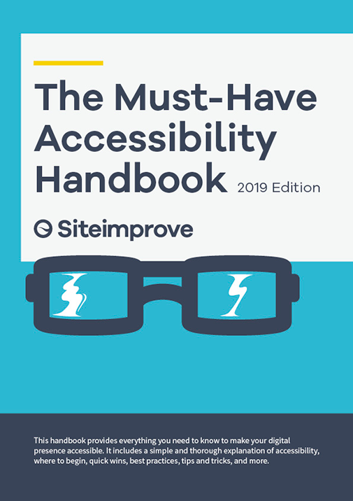
Download the "Must-Have Accessibility Handbook"
On 23.09.2019 European Union took a next step towards a more inclusive web, as the first section of the accessibility requirements came into effect. Now, public sector websites published after September 23, 2018 must be accessible. To celebrate and help you to get started, our partner Siteimprove would like to share with you The Must-Have Accessibility Handbook. This guide gives you a deep insight into accessibility and helps you ensure that your website is functional no matter what your needs are.
This handbook includes:
Part 1:
- Overview of Web Accessibility
- Roles and Responsibilities within Web Accessibility
- Web Accessibility Resources
Part 2:
- Beginner's Guide to Siteimprove Accessibility
- Who should use the Siteimprove Accessibility Tool?
- How to Check WCAG 2.1 Accessibility Issues
Are you coming to WUD Estonia 2019?
Accessibility is one of the focus topics at World Usability Day conference Estonia this year.
Head of Accessibility Relations at Siteimprove, Stein Erik Skotkjerra will talk why designing for the blind is pointless.
In this talk he will show you how to effectively get rid of customers with disabilities, elderly customers or customers with demands outside the ordinary. He will do this by showing you specific examples you can take home and start implementing on your website to ensure the opposite and make sure you never get difficult usability questions from your users again.
Designer of Public Services at Estonian Public Sector Innovation Team, Daniel Kotsjuba will be imagining the world after Accessibility.
Daniel thinks that accessibility cannot be met with only focusing on codes and measurements. The only way to meet the “New World Criteria” is to look past requirements and learn from and with the real people. This creates an opportunity to get inspiration from the connection with a fellow human being and develop new and clever solutions to everyday phenomenon that we all can benefit from.
There are less than 1/6 of the conference tickets left.
