How to create an accessible mobile app?
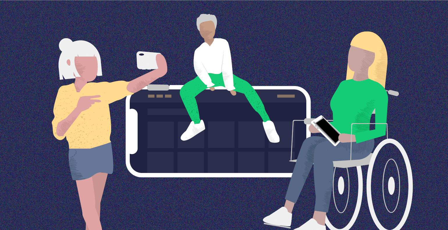
Statistics show that nowadays, the internet is accessed much more via mobile devices than computers, and that trend is growing. Mobile devices are also being used by children and the elderly as well as by people with various special needs who all wish to be able to use the web conveniently and independently.
Yet for some reason, online platforms are still being made for desktop computers and for educated adults who have access to a good internet connection. Mobile-first design has been talked about for a long time now – the kind of design where instead of the traditional order for doing this, the platform is first designed to work well on mobile devices and then adapted for desktop devices –, yet there are few good examples of this to this day.
If we talk about the accessibility of online environments, then mobile devices are nearly completely forgotten about. WCAG 2.1, the newest version of the Web Content Accessibility Guidelines, clearly establishes multiple requirements for mobile and mobile apps, but generally, people don’t know anything about these requirements, or they are unsure about how to implement them in their work.
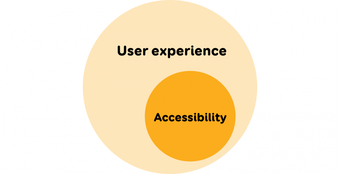
Accessibility is an important part of user experience as a whole for everyone. Tests conducted with users have shown time and again that it is not just disabled people who have trouble using inaccessible environments but nearly all users struggle with them.
Online environments that have a clear structure, are legible and adaptable to user needs provide the best experience for everyone. User testing is a great way to identify any issues with user experience or accessibility. Read more about involving people with special needs in user testing.
When designing and developing mobile apps, accessibility is often forgotten about or it is implemented afterwards by ordering an audit and then fixing the issues that are found. True, in the case of mobile apps, the operating system can do a lot for accessibility, but the development team still needs to do a couple of things as well.
Often, there is also a general lack of knowledge regarding how different users even use mobile apps. For example, a user could attach their smart device to their wheelchair and use a small switch, which follows the principles of keyboard navigation, to navigate the device. Blind people use smart devices with screen readers, which reads everything happening on the screen aloud to them.
Let’s start with the design: simplicity and clarity are the foundation to everything
Bring the main functionality someplace where it is easily accessible: for example, quick links could go to the bottom of the screen. Avoid creating a very untraditional structure, e.g. placing the menu button in the middle of the screen, because users will be looking for familiar functions from the places they expect them to be.

Although the screen size is limited, try not to display too many options all at once as it is tiring for the user and actually makes navigation much more difficult. The user should have at least two options for navigation, e.g. a menu and a search bar. (WCAG 2.4.5).
Design interactive elements (buttons, links) in such a way that it would be visually clear that they are clickable. Minimalism in design will drive us to remove shadows, frames and everything else until only the text on the button is left and the user may not even realise that it can be clicked.
It’s staggering how many unclickable things people try to click on in usability testing, while not clicking on any of the actually clickable things. You need to find a good middle ground – functional minimalism.
Make your interactive elements big enough (min 44x44px) and leave enough space between them so that people with somewhat bigger fingers can also tap on them (WCAG 2.5.5).

Use a big, legible font for your texts and colours with a good contrast (WCAG 1.4.4, 1.4.11). When putting together your colour palette, you could use Colorsafe or accessible colour matrix tools. Also, don’t forget to check the colour contrast on your icons, graphics, and user interface elements (e.g. the dashed line of the input field) with something like the WebAIM tool.
Try to place a title on every page that would clearly state what that page is. This will help users who get easily confused and also blind people who navigate through pages with screen readers.

Some users may find it difficult or bothersome to enter text. That is why you should make it as simple as possible to fill out any forms, for example, by using select menus, radio buttons and checkboxes instead of input fields.
If a user makes any mistakes when filling out forms, then mark the fields with errors clearly (use an icon in addition to a secondary colour) and add text by the field that describes what is wrong and how to fix it (WCAG 3.3.1).
Don’t delete any correct data that has been entered. For example, if a user enters their e-mail and password to log in, but makes a mistake with one of them, then don’t automatically clear the fields. If the user then clicks “Forgot my password”, then automatically fill out the e-mail field so that the user doesn’t have to type it in again.
Any functions that can be used by swiping across the screen with a finger or by moving the mouse across a specific trajectory could be difficult to use for elderly people and people with motor impairments. Additionally, screen reader users are generally unable to use them as well. Functions like this must have alternatives (WCAG 2.5.1).
Create less content that moves on its own and enable the user to stop the movements if they wish to do so (WCAG 2.2.2, 2.3.3) – for example, add a pause button to auto-playing banners. Moving content can disturb the user or even cause a seizure. Avoid any other kinds of time limits as well, e.g. don’t log the user out automatically.
Development: build a reliable and adaptable application
People often forget that mobile apps need to work in both portrait and landscape modes (WCAG 1.3.4).
Mobile apps also need to be usable with keyboards (WCAG 2.1.1). Keyboards can be connected to smart devices via Bluetooth and are used in cases where using a touch screen would be more complicated. The Tab key can then be used to reach each interactive element (button, link).
It must be possible to activate links with the Enter key and buttons, checkboxes, radio buttons etc. with the Space bar. Adding keyboard support to a mobile app ensures that it can also be used with other support tech (switches, sensors).
For keyboard navigation, the important thing to ensure is that elements have clearly noticeable focus styles (WCAG 2.4.7). Otherwise, the user will not know which element they are currently on and what will happen if they press Enter. Browsers will add focus styles to interactive elements automagically.
It is important not to turn those off and in case there are also any custom solutions, focus styles must be added to those. Another thing to do is to mark the currently active element clearly and uniformly (e.g. a tab, checkbox, menu item). The active element must be marked as such both visually and in the code (e.g. with the aria-current attribute).

If the user enlarges the text by up to two times, then the texts in the app must also double in size and cannot move on top of each other or disappear. (WCAG 1.4.4). Because of this, you should make your text boxes and buttons adhere to the size of their content (text).

With double magnification, it might not be completely possible to enlarge all the texts due to a lack of space. In such cases, we can use Apple as an example and add in a functionality that allows for text to be displayed in a larger format by holding down on it with your finger.
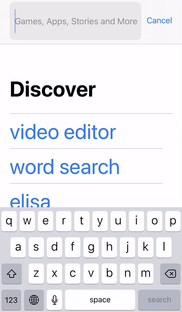
Screenshot 1 – The Cancel link next to the AppStore search bar is shown in a bigger format if you hold your finger down on the link
Icons that can be clicked must also have a text alternative in the code that describes the function of the icon (WCAG 1.1.1). Otherwise, it will not be possible to use voice commands and screen reader users will have to figure out what might happen if they click the icon.

If the user is shown success and error messages, search results, loading bars, and any other kinds of status notifications that indicate progress, then screen readers must be able to read them aloud without having to focus on them (WCAG 4.1.3). This ensures that the user is informed of these events automatically while retaining their place on the page.

Adding content without “breaking” accessibility
Keep your body text short and break the text up into sections by using headings (WCAG 2.4.10). Assess whether your grandmother or a child would be able to understand the text (WCAG 3.1.5). Today’s increasingly more impatient users can get the information they need much faster from a well-organised and legible body of text.
Remember that headings must be marked with the proper heading styles (e.g. in the content management system) and not just given bigger and bolder formatting (WCAG 1.3.1).
Image recognition technology has not yet been developed enough to reliably interpret imagery. Accordingly, when you upload pictures, you must also give them alternative texts (directly in the code or via a content management system) that describe what is happening on the picture (WCAG 1.1.1). This way, the visually impaired can also get information from the pictures.
Subtitles must be added to videos and you can make it so they can be switched on and off (WCAG 1.2.2). This ensures that the hearing impaired as well as users who cannot or do not want to turn on the audio on a video (e.g. they are currently in a quiet place) can still get the information presented. Additionally, videos and especially animations must also be given audio descriptions of the video that describe what is visually happening in the video to the blind (WCAG 1.2.5).
Conclusion
Accessibility guidelines are just as applicable to mobile apps as they are to websites. To ensure that your app can be used by as many people as possible, your designer, development team and content manager must all pitch in. We hope that you found some good ideas in this article to keep in mind the next time you are creating a mobile app.


