A/B Testing Guide: All You Need to Know About A/B Testing
Recently I gave an A/B testing workshop here at Trinidad Consulting and I would now like to share some of my tips with you. It doesn’t matter if you are a beginner or a seasoned pro, there’s something for everyone.
What is A/B testing
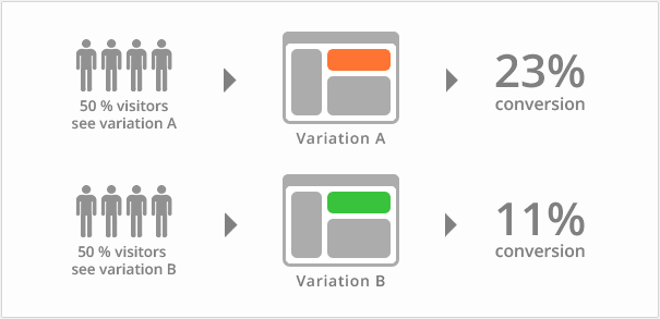
A/B testing is a quantitative research method that is known in science as controlled experiments. A/B testing means that you are comparing two otherwise identical websites. One is the original version and the second is a variation where a certain element has been changed with the aim of improving conversion.

Through A/B testing you can try out two different strategies or approaches and see which works best. It is a useful tool for all marketers and used mostly by digital marketers and growth hackers who are obsessed with conversion optimisation.
Good testers are a pain to find. You can often recognize good testers from their approach to experiments: they are highly systematic and focused. The kind of people who do not hop from one thing to the next.
When to use A/B testing
It is advisable to use A/B testing when you wish to test a certain hypothesis. For example when it comes to cases when:
- You don’t get enough sales
- You are not sure which solution works or fits best
- You have already done some usability tests and verified that the usability of the site is good
You goals could be a lower bounce rates, longer time on page, better click-through rates, higher conversions etc.
When to avoid A/B testing
A/B testing is a good testing method, but it’s not suitable for testing just any idea that comes to mind. Don’t use it if you:
- Are not quite sure why you are doing it
- Don’t have a solid hypothesis
- Don’t know what your visitors should be doing on the site
- Would like visitors to take many different actions at once
And of course, there is not much point in using if you don’t want to change anything or want to know if your website is usable. If you are concerned about usability then just do some user testing instead. That will give you a much better overview of where users fail. Another alternative is trying out different heatmap tools like Mouseflow and Clicktale to see how your visitors use the site.
That will give you a much better overview of where users fail. Another alternative is trying out different heatmap tools like Mouseflow and Clicktale to see how your visitors use the site.
What can be tested
Nearly everything. Newsletters, landing pages, internal websites, mobile apps, ads, information systems and even physical products.
Newsletters:
- Title – how does it speak to the audience
- Time – when do you get a better response rate
- Design – which design is more convincing
- Voice & tone – does your target audience prefer a casual or an official tone
- Length – does your target audience prefer longer or shorter newsletters
- Personalisation – do you get a better response from clients when you write about things they have expressed interest in on the site

Ads:
- Message
- Personalisation
- Design or image
- Price
Landing pages:
- The Call-to-Action button – copy, size, colour and position
- Title or product description & copy in general
- Form length – long vs. short
- Style and composition
- Unique selling proposition
- Price
- Images
Common misconceptions
A/B testing is a great tool, but it is also surrounded by a sea of myths. I’ll share just a few of them here. If you believe that some are not myths then leave do a comment below.
A/B testing is easy and everyone can do it - yes, everyone can certainly configure the tests and get the tests running but interpreting the results and test optimisation requires experience. Even testing tools can sometimes fail on you and give you bad data.
A/B testing is cheap. Great testing tools are not free and could turn out to be very expensive in the long run. Naturally you have some free tools as well, e.g. Google Experiments, Wordpress plugins, but they don’t offer a lot of features and get be painful to configure.
A/B testing gets you accurate results. Well, there are lies, big lies and statistics. A/B testing is only accurate when used properly. Unfortunately a lot of marketers are too impatient, tests are ended too soon and the sample size is too small. Beginners often take the results at their face value, getting excited about false positives.
You can dramatically improve conversion by changing the colour of a button. In most cases this is a very small change that is either temporary or an illusion. There have only been a few cases where changing the CTA button improves conversion and that is mostly due to improved usability. You can sniff out some of the biggest UX errors with heuristic analysis.
Sites with less traffic and high traffic can be tested the same way. Nope. Sites with less traffic can benefit a lot more from usability testing and require more testing time than sites with high traffic. Using the same approaches for both can get you some very iffy results.
How to plan for the tests and what are the best testing tools
When you start planning your A/B tests then you should think about what you want to test, what is your goal, what you will use the end results for and which testing platform or app you are going to use.
The best testing tools in my opinion are:
- Visual Website Optimizer– for websites
- Optimizely – for websites
- Unbounce – for landing pages
- Google Experiments – for simpler tests
- Mailchimp – for newsletters
- Mixpanel – for mobile apps
My advice is to look around and experiment with different tools until you find the one that works for you.
How to set the tests up
Before you can get to the good bits you need to install a small piece of JavaScript code on your page. Once you have added that you are all set and good to go. Each service provider usually provides their own instructions. With A/B testing there are only a few places where basic web development knowledge is required.
How to find ideas for the hypothesis
A/B testing requires a solid test hypothesis that consists of the solution offered and expected test results (better/worse/good/bad etc.).
You can draw inspiration from:
- Your previous marketing activities and research results
- Past usability and A/B testing results
- Failed experiments
- Heatmaps
- Google Analytics
- Visitor’s behaviour on the page (with SessionCam, ClickTale, Mouseflow & other tools)
- What your competitors are doing
It is also good to see what has worked on other websites that are similar to yours. You can’t copy everything, but occasionally you might get some good ideas. Just don’t expect to see exactly the same results.
Recommendations for improved results
Have patience. Let’s be honest, as marketers we want results here and now, but quantitative research takes time. New tests will show you great wins at first, but are often linked to the fact that people tend to look around more on an updated site. This is curiosity at play.
It is common to see huge gains on the first week and lower results on the second. Most sites will lose momentum after the second week. You might also see the lift disappear after the fourth week.
This is why you have to be sceptical about your conversions. Improvements can often be imaginary.
Don’t quit when you hit 500 visitors. The height of ignorance is turning off the test when it has not yet been up a full business cycle. You need to include not only a high number of visitors but also take in consideration your business cycle, which varies between different types of companies.
On average a business cycle is about 3-4 weeks, but it can also be 2 weeks… or 6 months (luxury goods, complex services).
Early shutdowns are bad because you do not take all the variables into consideration. Test results are influenced by trivial things such as day, date, marketing campaigns, new blog posts, tweets, FB activity, global events, newsletters etc.
Try A/A tests. With A/A tests you are comparing the original version with the original version. With these kinds of tests you might see that one test performs better than the other, even though they are the same. If this happens then you can be sure that you have a bug somewhere.
There are of course different test variations available. You can run A/B/B tests, A/A/B tests and A/A/B/B tests. Other combinations are also available. Some say that running A/A tests is a waste of time and suggest you use the combinations above.
I say that if you are just starting out then do the A/A tests at least once to be sure. You might discover something surprising.
Don’t delude yourself into thinking that a 5% increase is a phenomenal result. The lift is too small to determine that it has happened because of the changes in the new variation. As mentioned before, there are many factors that influence test results.
This applies especially for websites that have less than 1000 visits per day. The lift might be a statistical illusion, except in cases where the test has been running for ages and the fluctuation is minimal.
Don’t change too much at once. If you change a lot of elements at once then you won't know why your conversion has increased.
Pay attention to your sample size. The default settings for most tests are too small to have any statistical impact. The more you have visitors, the more accurate results you will get. Most testing platforms/applications have a default sample size of 500 visitors.
Don’t shut down your experiment when the test validity hits 95%. This is a common mistake. Change the statistical significance to 99% if you can. The higher it is the more confident you can be in your results. Yes, you’ll need more visitors, but it’s worth it.
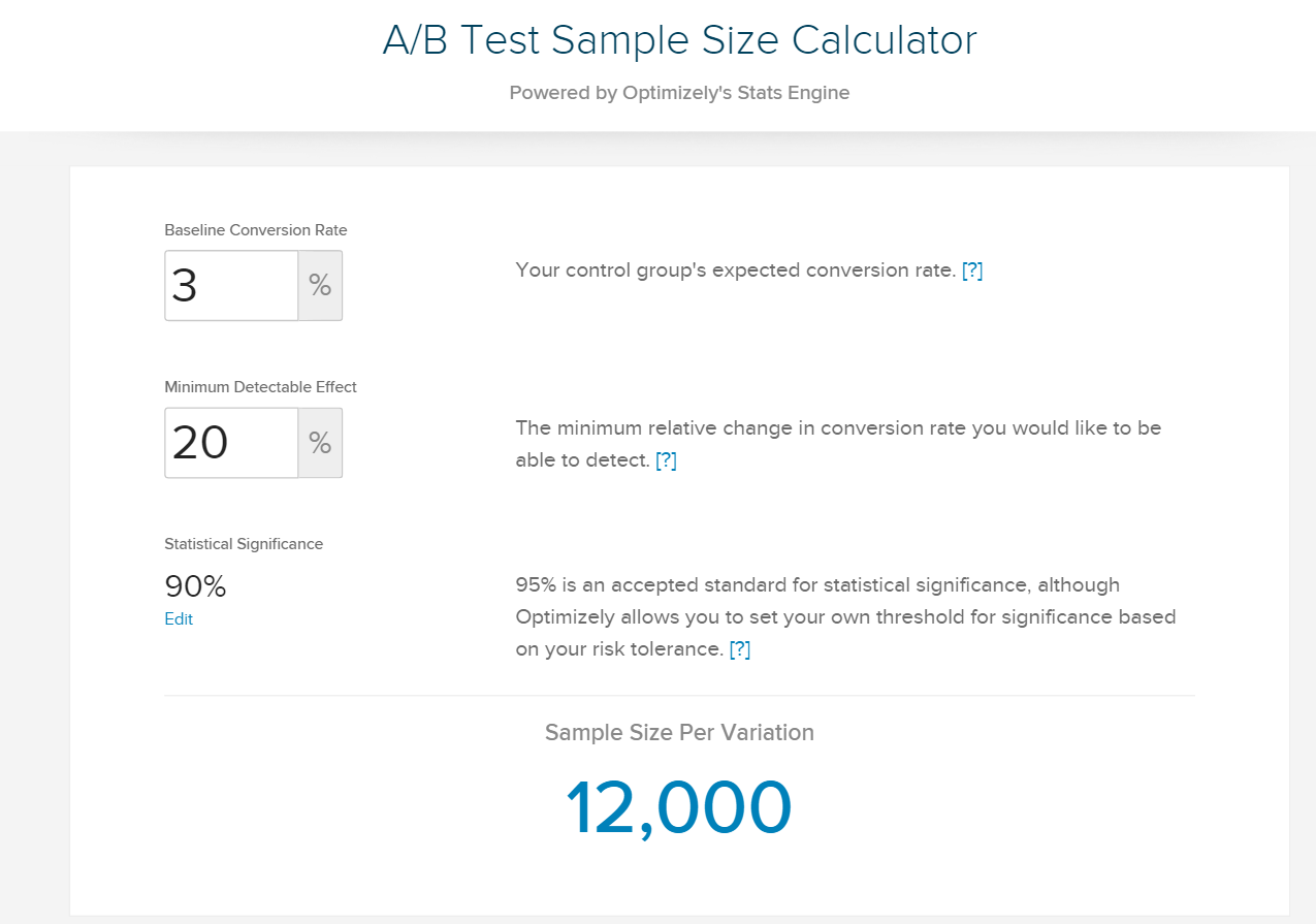
Choose the right sample size. You can use several calculators for this. I tend to use the calculator provided by Optimizely. Another good one is from Even Millers.

To sum it up
A/B testing requires practice. Start with A/A tests and experiment with different testing platforms and applications until you find the right one for you. After this, you can try to come up with more complex tests, and before you know it you are a pro.
Don’t let your head down if you fail at first. You will become a better conversion optimiser through failure.
Even the pros at Unbounce and Conversion XL, people who have done thousands of tests, discover new things every day. If you keep these tips in mind then you will soon see good results.
12 things that you should remember:
- Pick a specific goal
- Aim for a 50% increase
- Test only one element at a time
- Forget multivariate tests
- The number of visitors should be as high as possible, use a sample calculator
- Look at your previous experiments and campaigns for inspiration
- If you don’t have many visitors then only pay attention to major lifts and combine A/B testing with usability tests and heuristic analysis
- Your test should be up at least 3-4 weeks
- Don’t keep the tests online for too long
- Constant testing might annoy regular visitors who delete their cookies or use different web browsers
- No experiment is ever 100% identical
- Test results are influenced by many outside factors


