Liven up your designs with animations?
Digital environments we use every day can often feel a little cold and static at times, especially considering that the real world is constantly in motion.
There was a time in the earlier days of the web, when animations were the hottest trend and every site you visited was flashing, bouncing or covered with animated GIFs.
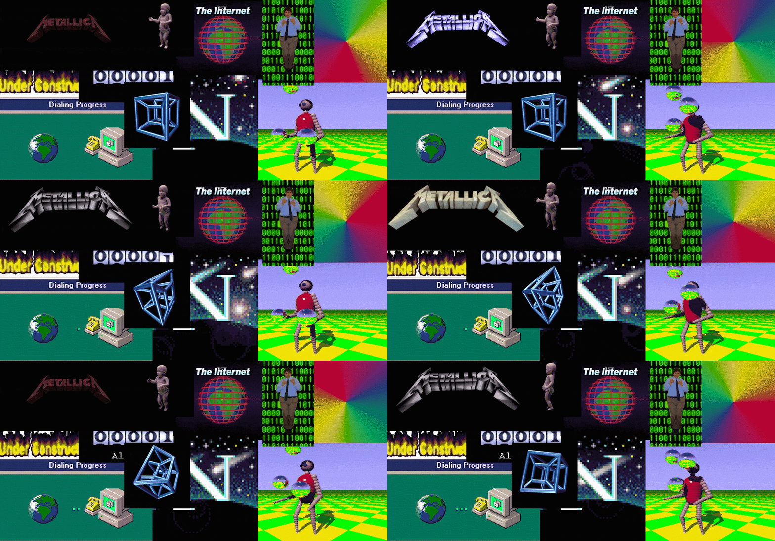
A large part of it was thanks to Adobe Flash, which enabled designers to create all sorts of animations on the web without too much development effort. While it might have been new and cool at the time, the internet matured, and websites became less flashy (pun intended) and more concerned about how to actually make content easier to consume and interact with.
That ultimately led to more minimalistic looking websites with little to no movement since it was considered to be a distraction, rather than a way to add meaningful value for the user. This approach definitely led to better user experience then what came before, but there might have been some overcorrection because of that.
As web technologies advanced in terms of what browsers and devices are capable of handling, we have seen more and more companies finding new value in animations and integrating them into their digital products and services.
Why add animations to your product?
When used in moderation, animations can give your product more liveliness and personality, which create add positive emotional value for your users. They are also a good tool to highlight your brand values and make your corporate image more approachable.
Animated graphics can carry a lot of information, that may be harder or take longer to describe in words or simple static imagery. While illustrations are often used to compliment text and make it more digestible, adding movement to those illustrations could prove even more beneficial in order to get your message through. Considering, that today, it’s hard getting people to read anything longer then a tweet, creating a neat little animation might be all you need to describe a complex topic with ease.
When to use animations?
A good rule of thumb is to reserve more detailed and complex animations for items that appear less frequently or maybe even only once. These can include onboarding flows, guided tours, completing an order or redeeming a voucher. The goal for these types of animations is to get users excited for your product or reward them when they complete a checkout process.

Onboarding animations made for Lokimo mobile app
Smaller micro animations, like a simple pop or fade could be used more frequently for events like saving favourites, liking a post, adding a product to the shopping basket etc.
The reason for this is, that showing complex animations for commonly used interactions would soon get repetitive and tiresome, while a short and simple effect would be subtle enough to not outstay it’s welcome, but still give some life to the interaction.
In addition, there are also practical animations that let users know what the system is currently doing. Even with fast connection speeds we have today, there is hardly any website or app that can get away without loading some content or processing data in the background. These are ideal cases to use animated graphics to let users know that the app has not frozen and there is no need to panic.
Movement could also be used to draw user attention to elements, when needed. Maybe you have just received a new message in your inbox and the envelope icon can shake a little to let you know. Other common use case is a moving scrollbar indicator at the bottom of the screen, when it’s not clear that there is more content below.
What to keep in mind?
Same as it is with designing icons or choosing a typeface, you should also consider what is the best fit for your company, when creating animations. Motion can influence how people perceive your brand and can emphasize your company values.
Timing is one of the most important tools in your arsenal, when developing animations. Is your brand fun and bouncy, precise and focused or floaty and dreamy? You can use the speed of movement, acceleration, slow-downs and inertia to give very different feelings to animations.
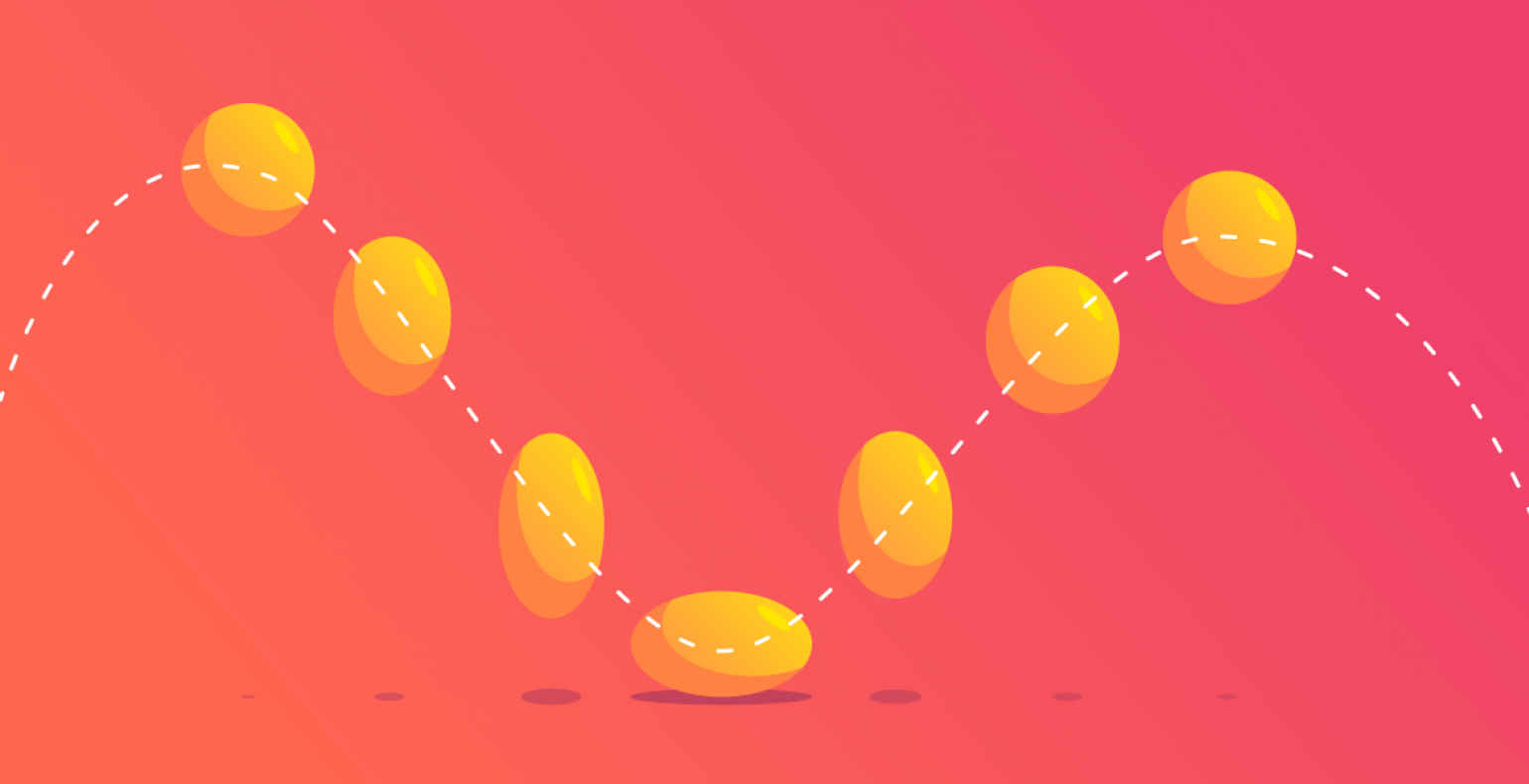
You should also consider the physics of what you are animating. If you want to create a bouncing ball for example, you can decide what material you want that ball to be. If it’s light but solid like a ping pong ball, it would have minimal deformation when hitting the ground and will bounce back up quite a lot. If it’s something squishy, like an orange, it would deform more when it hits the ground and bounce less. And something like a bowling ball would probably just leave a hole in the ground.
If you are in the security business for example, you might not want very loose or bouncy animations, which can feel too playful. Instead, you could have sharp and focused movement with solid elements that give a feeling of stability and reliability.
Check your animation length
It’s easy to get carried away, when animating and keep adding more and more, making the animation longer and longer. Keep in mind, that you are not producing a Disney animated feature and users are ultimately not there for the pretty graphics and animations. However beautiful and detailed your animations are, users should never have to wait for them to finish playing, in order to interact with the app.
That’s why it’s a good idea to keep most of your animations on the shorter side, since people will probably move on before they will see the end of it. If you are using an animation to describe some long and complex process, then rather than having it presented as one long animation, consider breaking it down into smaller pieces.
Final words
At the end of the day, animations are icing on the cake, and for that reason, usually left for later in the design process. While it’s true, that you shouldn’t spend too much time on animation before the final stages, they also shouldn’t be forgotten and left out of the process.
Even if the actual animating will be done later, you should try and plan which of the interactions, indicators or illustrations will be moving. That way you have a better overview of the work ahead and can estimate accordingly. It will give developers a heads up, when they work on components and content creators will benefit from knowing how much text is needed and what will be solved with animation.
Remember to use animations responsibly and see where they can improve your customer experience. But on those occasions, be sure they bring a smile to your users faces :)
Happy animating!

