
How to Recognize Bad Accessibility With a Quick Test
You have probably seen options for making text larger in your web browser and also a mode intended for people who can’t see well. It might have been a combination of a black background and a yellow or white text. Or you might have noticed some accessibility requirements in different projects and tenders.
These options and requirements mean that somewhere someone has made it a priority to think about users who are slightly different from the rest of us. Accessibility is even more important to public websites, online stores and business sites.
Long story short, if your site is not accessible then you will lose a lot of potential purchases. Imagine going to a store where you can’t buy anything. No accessibility = less clients.
Who has issues with accessibility?
Let’s start with the biggest of them all – everyone who wears glasses or contacts. Some of us are near-sighted, some are farsighted, others have various eye conditions and can’t see colours, and some can only see text that is high in contrast or can’t see at all.
We can also talk with users who have temporarily lost the movement in their dominant hand and can’t use the mouse or trackpad correctly. Now imagine when he/she tries desperately to open a tiny menu point from an automatically opening second-level menu. Not all that easy now, is it?
Or we might talk about how the elderly feel when trying to understand how a phone operator’s self-service opens or, even worse, tries to find something specific.
All of this points to a serious problem – most websites are not compatible with the needs of their users. They exclude, in one way or another, up to 50% of their potential users. Is the number huge? You betcha!
So how do we know if things are bad?
For this we suggest a simple web accessibility test that can be completed very quickly and consists of seven very simple steps. Everyone can do it. If you get into trouble then do let us know about it in the comment section below.
Ironically we have only used Internet Explorer because it is the only browser that has built in accessibility tools and doesn’t require any plugins, which cannot be said about Chrome and Safari.
In Safari you can also use a mode called Reader view where you can change your font size by just clicking on an icon, but that only works with articles and is not much help when using sites such as healthcare.gov.
1. Turn off all pictures and see if there is an alternative text behind them
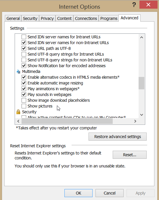
If you are using IE then go Internet Options > Advanced > Multimedia and remove the tick from Show pictures.
2. See if the content and functionality is usable when the text is 2x larger
This has been made overly complicated in browsers, but still possible. Note that you want to only change the font size and not zoom into the website.
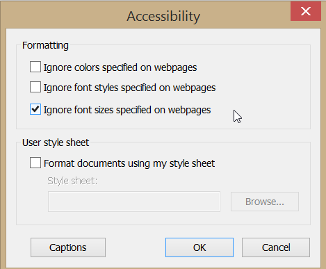
Go to Internet Options and choose Accessibility from the bottom left. A new window will open where you can choose between various accessibility options. Make a tick at Ignore page font size.
Click on the browser’s heading with the right mouse click and choose the Command bar. From the Page menu you can now change the font size.
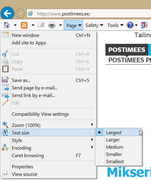
The menu itself was there before as well, but before the previous steps the font didn’t change all that much. That option is turned off by default.
3. Turn off the sound and see if every bit of information is accessible
If you have used video clips or sound then do make sure that the information is available in text. If you have made some videos then add closed captions if you haven’t yet as the video below demonstrates. Deaf people need the same information in written form.
4. See if the website works with even the smallest of screen resolutions
Go to your Windows desktop, make a right-click with your mouse and choose Screen Resolution from the menu. If you are using Mac OS then go to System Preferences > Displays and choose the right resolution from the list.
Change it to as small as possible. Now look at your website and use only the horizontal navigation bar for navigation. Make sure that nothing important stays unreachable.
Take a look at your Google Analytics data and see what the screen resolutions that people use are. If your visitors do not use tiny resolutions then you can also experiment with larger ones.
5. Print out the website in black and white and see if the information is readable
Notice the difference between the background and the contrast and brightness of the text. Your text needs to be visible at all times and strain free. If you need to make an effort to read the content (especially applies to charts) then things are not great.
6. By using only the keyboard, make sure that the content is reachable and all functions are usable
Use the Tab-key to hop from field to field and menu section to menu section. Hop back with Swift + Tab. Press the Spacebar to make a choice in the fields.If something remains unreachable or the fields are reachable in an unexpected order then you have problem.
7. Ask some teenagers to explain what’s on the website, does he/she understand it?
If they understood the content correctly and without much effort then you have done a great job in writing the content. If however not then you have some work to do even though teenagers might not be your exact target group.
You can make exceptions only when your target market consists of lawyers or doctors who work with very specific systems and websites. If your website is meant for everyone then you need to meet this criteria.
Ok, I did the test, now what?
If the test is completed and everything worked great then it is possible that your site also meets WCAG 2.0 requirements. If meeting these requirements is important then you can move forward to the next step – a through accessibility evaluation.
A speed test is still a speed test. It doesn’t check everything and doesn’t go into details. But we believe there is no point in spending your money on an evaluation before you pass our speed test with flying colours.
On the other hand, if your web meets the requirements then congratulations! Well usable and accessible websites are beneficial to everyone and not just for users with special needs.


