
Web accessibility: a colourful world
It is time to switch to some accessibility topics again and today, we will focus on one of the most important pillars in web design – colours.
About accessibility
An accessible website is easy to use, for as many people as possible. What is convenient for one may not be convenient for the other, and there are more ways to use the web than one could count. To make accessibility a 'measurable thing', we use the WCAG 2.1 accessibility standard.
It defines the requirements that it takes to meet accessibility levels A (base level), AA (mid-level), or AAA (highest level). The European Union mostly obligates websites and mobile applications to meet the AA level, so that is what we will base our recommendations and examples on as well.

Our colourful world
We live in a colourful world, where colours play an important role, such as helping us to decide when to cross the road or whether a banana is ripe or not. But do we all perceive colours the same way?
Every twelfth man actually has some form of colour blindness. It does not mean that the person sees the world in black and white – they just see some colours a bit differently, and many may not even be aware of this condition.
Colour sensitivity also decreases with age, which is why it can be more difficult for older people to distinguish light or low-contrast colours. It is also difficult for a completely "average person" to see a website when they use their smartphone in the sun, their screen is covered with fingerprints, and the brightness is turned low to save battery life.
Use of colour
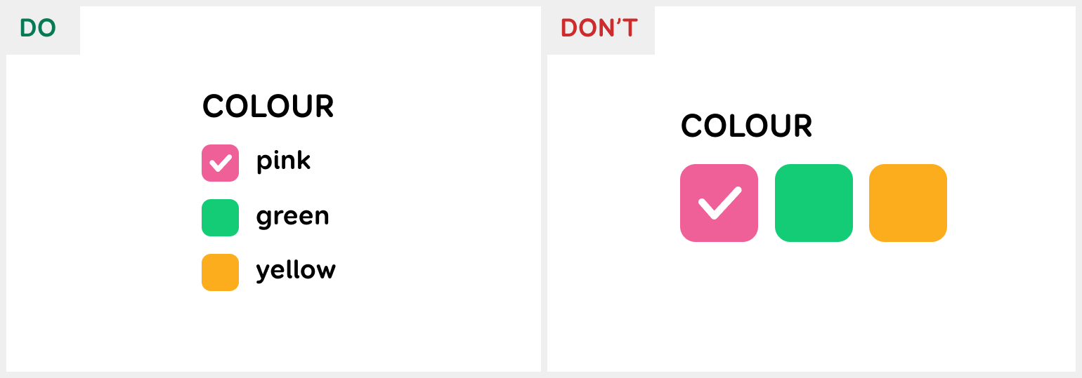
As mentioned, colours are a good indicator of different states and relationships. However, not all people may see the relationships presented in colour. That is why it is important that we do not rely solely on colour, but also give information using something else.
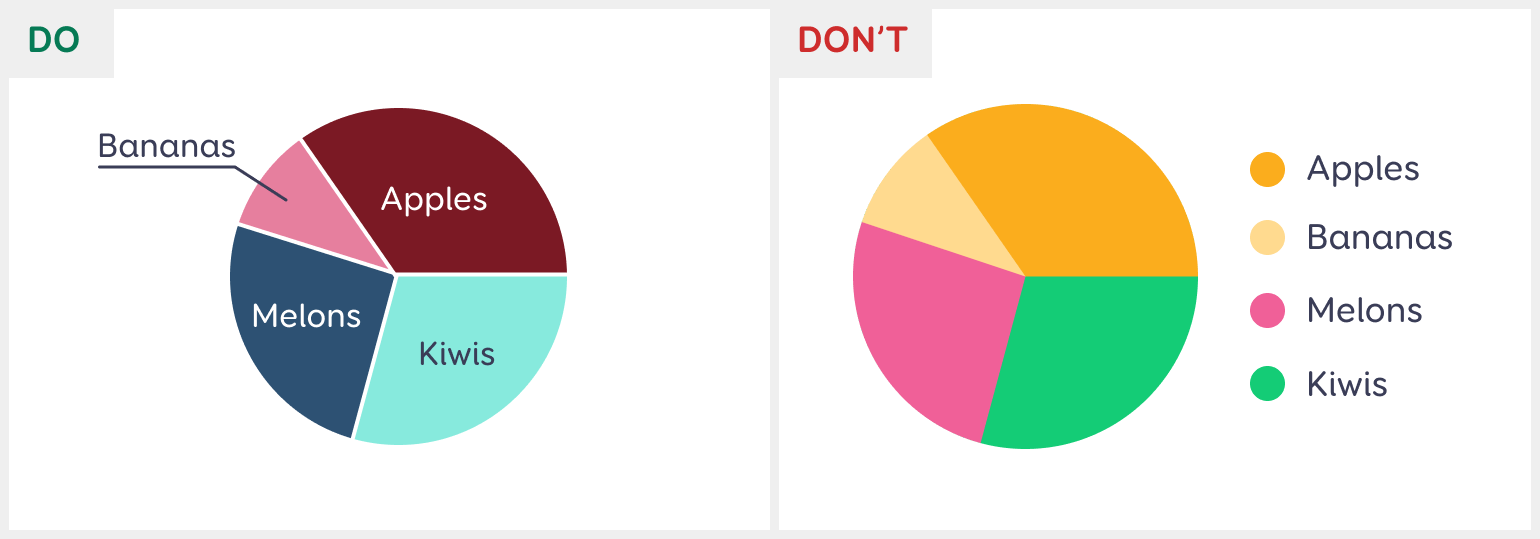
For example, pie charts: instead of linking the sectors to the legend by colour, it would be good to write the labels inside or next to the sectors. It is also good to slightly separate the sectors so that the transition from one sector to another is more visible.
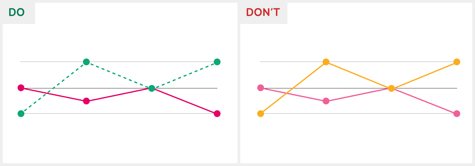
In line charts, different coloured lines can get confusing when they cross each other, and if the colours are too similar for the user, the chart can be difficult to follow. It is better to use different patterns or dotted lines in addition to colour.
Colour alone shouldn’t be used to differentiate form fields with errors either – you could add an icon or make the border thicker. Another example is the selecting the colour of a product in an online store. Here, too, you should not rely on coloured boxes only, but also write the colour names out in text.
An accessible colour palette
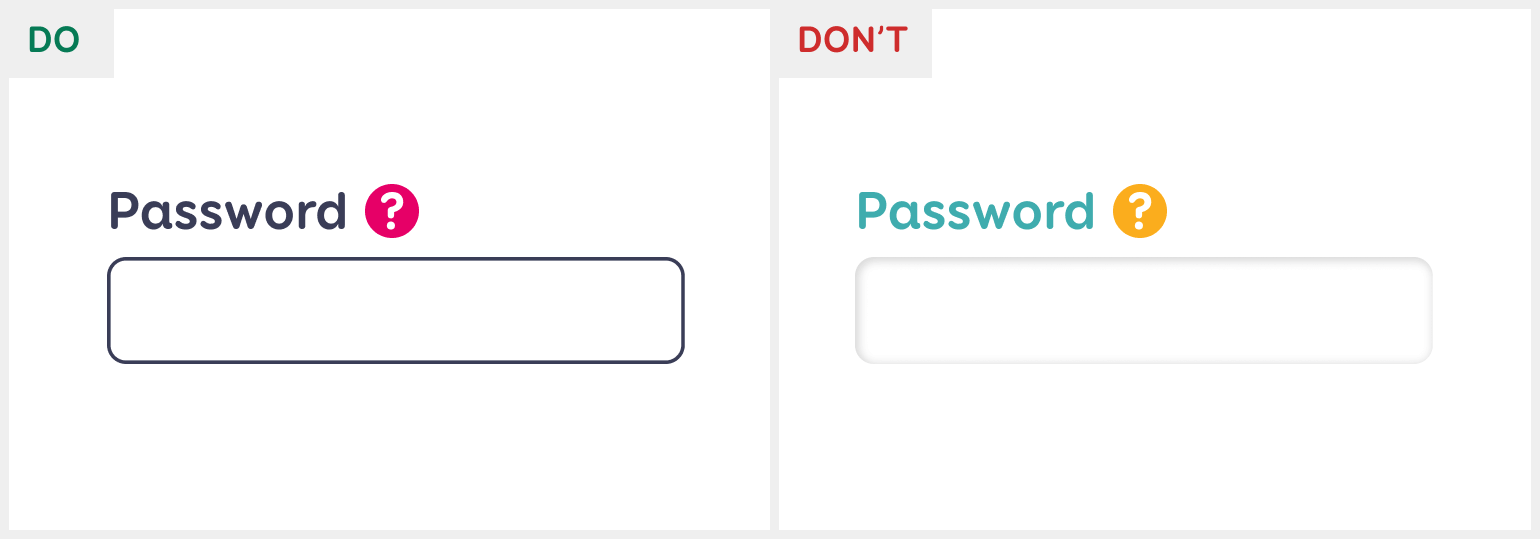
One of the first steps in designing a new website is deciding on the colour palette. To ensure accessibility, it is also important to check the colour contrast ratios at this stage. Light text on a light background and dark text on a dark background are difficult to read – they have low contrast.
The rule is simple: the text and its background must be sufficiently contrasted to be easy to read. For large and bold text, a smaller contrast is enough, because the text itself is already better visible. So how to check them?
Open a web-based colour contrast checker and enter the HEX colour codes of the text and its background. The contrast ratio must be at least 4,5:1, and for large text at least 3:1.
It is important to check all the colour combinations you are planning to use. For example, black text on a white background, black text on a light grey background, white text on dark blue, etc. If the colour contrasts are too low, it may mean that the entire corporate visual identity must be reviewed. Most of the time, you do not have to change the colours much to meet the requirements.

When links are used within text, it is good to distinguish them from the rest of the text by, for example, underlining them. However, if you want to mark the links in the text only by using a different colour, it is necessary to check that the colour of the link and the colour of the rest of the text have at least a 3:1 contrast ratio. Do not forget to also check the contrast ratio when the link is hovered, active, or visited.
In addition to text, colour contrast must be checked for all elements that the user can press – buttons, icons, form fields, radio buttons, etc. For example, clickable icons must have a 3:1 contrast ratio with their background to ensure that the icon can be seen well enough.
For form fields, the colour of the field or its outline must have a 3:1 contrast ratio with its background so that the user can clearly see where they can enter text. For buttons, you only need to check that the text on the button has at least a 4,5:1 contrast ratio with the button itself.
For decorative elements that the user cannot click, there is no need to check the colour contrasts. Additionally, any disabled elements do not have to meet the contrast requirements.
Conclusion
When showing information and relationships, we cannot rely solely on colour, because we all see colours a little differently, and for some they look more similar than to others. Use patterns, layouts, dotted lines, and other creative solutions!
Check that the colour contrast ratio between the text and its background is at least 4,5:1 or at least 3:1 for large text, icons, input fields, and other user interface components. If you get the feeling that there are only a few colours now that can be used at all, then Colorable is a great tool for generating WCAG-compliant colour combinations.
This was our summary of how to use colours on an accessible website. Soon, we will talk about web forms and their accessibility. If you do not want to wait, you can go on and read about how designers can improve the accessibility of a website.