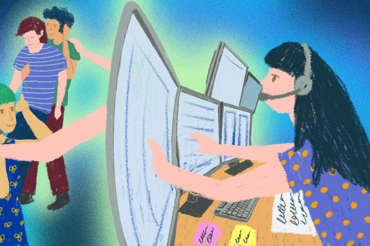
Accessibility issues caused by content editors
Web accessibility is a part of ensuring equal possibilities and providing a more independent life for people with special needs, the elderly, and many others. Online environments, mobile applications and digital documents must be designed and built to be perceivable, understandable, robust, and usable in a variety of ways.
However, accessibility has not reached a uniformly good level in Estonia yet. In this series, we explore which accessibility problems can be addressed by the different parties involved in web development.
In the first part, we talked about the role of designers, and in the second part, we looked at the role of developers. In this post, we will look at which WCAG standard criteria must be taken care of by content editors.
There is a widespread misconception that if a website or system is designed and developed following the WCAG accessibility standard, then you can just relax and never think of accessibility again. In some cases, it means that a few text size and contrast options are added to the corner of the page, and then the work is considered done.
In fact, web accessibility is a much bigger issue than a couple of additional choices for visually impaired people, and content editors have an important role to play here. By changing and adding content to a website, an inexperienced content manager can cause a number of accessibility issues. Today, we will talk about how to avoid them.
Accessibility testing
In order to find and avoid errors, it is important that the website manager is able to test the accessibility of the website at a basic level. There are all kinds of free automatic control tools, such as WAVE, which give an overview of many accessibility issues in just a few clicks. Unfortunately, not all accessibility problems can be technically identified and thus require manual checks and human assessment.
One of the most important and most easily tested aspects of web accessibility is keyboard support. Can you navigate the page and move from link to link only by pressing the Tab key? The keyboard is used for navigation by people who for some reason are unable to use the mouse (hand trauma, motoric disability, etc.). Keyboard support paves the way for various other assistive technologies.
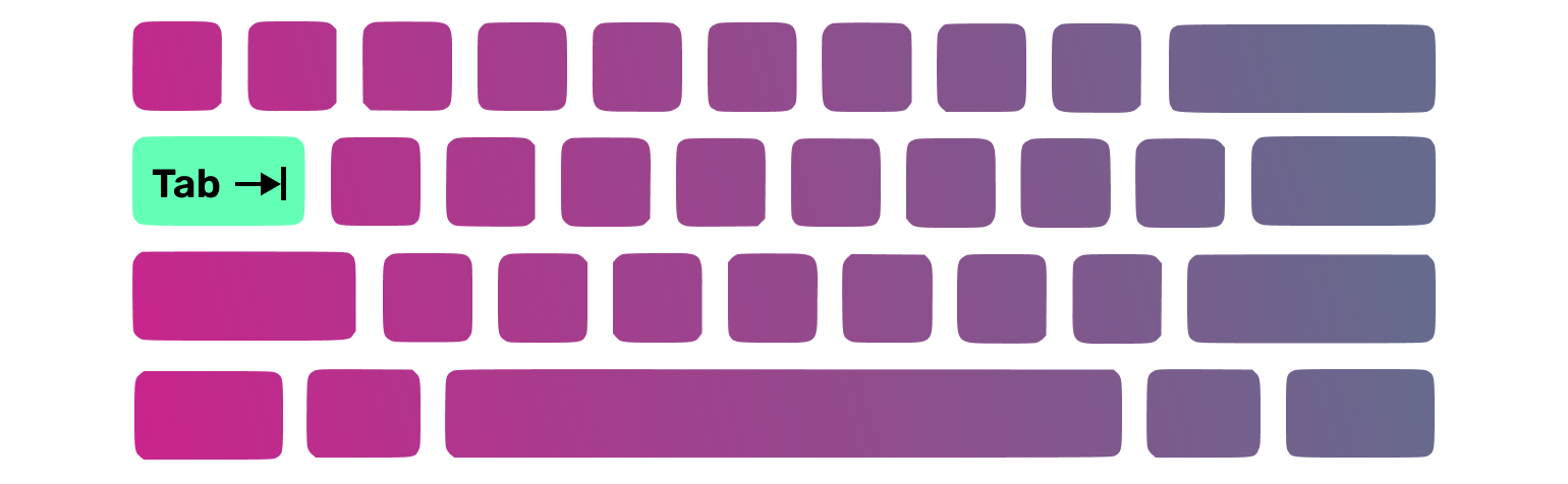
The keyboard is also used by the blind, whose main tool on the web is the screen reader. A screen reader is a program that reads everything that happens on the screen out loud — all the text, links, and other content.
Screen reader support also allows robots (like Google) to better understand the website. The rising popularity of voice commands and "digital assistants" shows that it is wiser to make your websites futureproof starting today.
Hard-to-read text
Complicated texts create problems for people with low vision, dyslexia, autism, difficulties concentrating, the elderly, children, and people who are simply not familiar with the subject. First, there is the reading level of the text, i.e. the complexity of the words and sentences used, and the writer’s ability to convey the meaning in text. Secondly, there is the formatting.
It is recommended not to use fonts with serifs (decorations) for web content. For example, Times is a popular serif font, while Arial is sans-serif. The size of the text must also be sufficient for reading – a good body text size is at least 16 pixels.
Text alignment also plays a big role in readability – left alignment is always preferable. In the case of center or right-aligned text, the human eye must wander at the end of each line to find the beginning of the next. Furthermore, justified alignment creates large and disproportionate spaces between words, which makes reading more difficult.

Keep an eye out for lengthy lines of text – lines with more than 80 characters are generally too long and, again, force the eye to "search" for the beginning of each line. The space between the lines should be about 1.5 times the font size for convenient reading – for example, 24px line spacing for 16px text.
Be sure to break up the text with headings, pictures, lists, graphs, and other illustrative elements. It is difficult, even for an average user, to consume a long wall of text. Headings must not simply be larger and bolder, but also correctly marked up so they are seen as 'headings' by assistive technologies as well. For example, in Word, you can select a "heading style" with the correct level to mark the heading.
Links are added as URLs
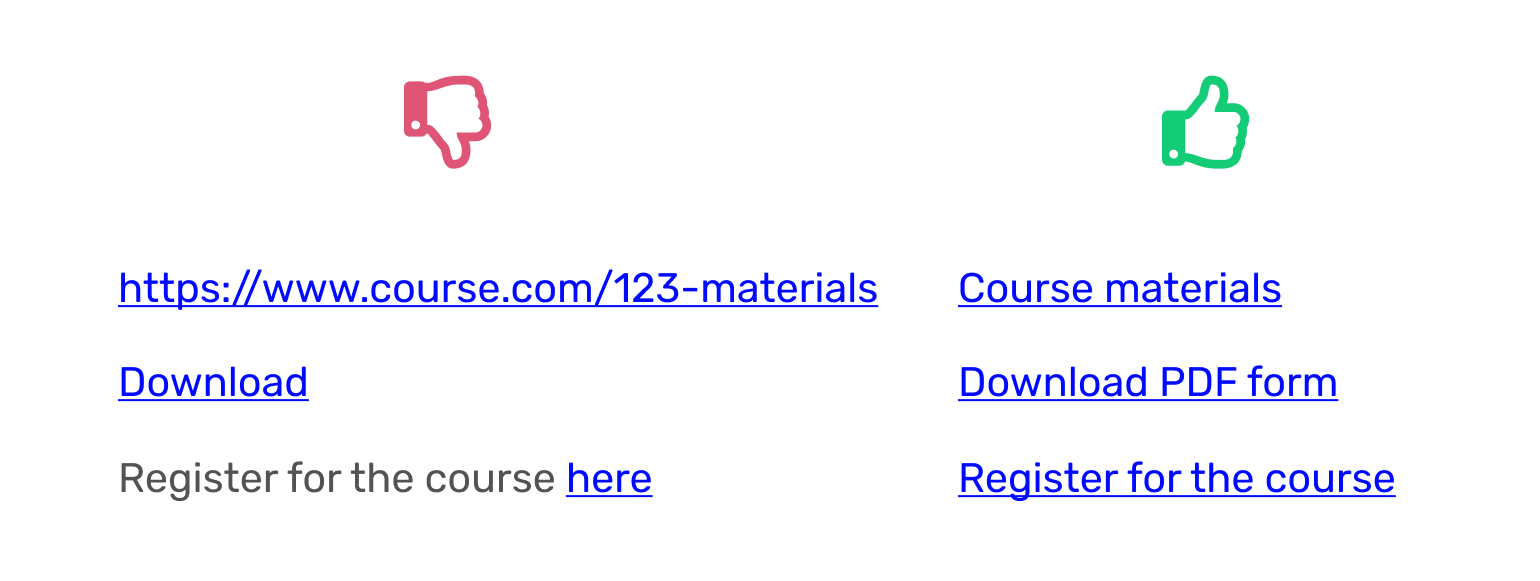
The meaning of links and buttons must clearly come out of the visible text. If the link is shown as a URL (https://www... ) or as a meaningless pair of words, such as "Click here", "Read here", See more", the user may not understand what it really does.
This leads to an accessibility problem, as screen reader users, people with intellectual disabilities, or customers using screen magnification may not see the context of the link. Therefore, the link text must briefly and specifically say what it does – for example, "Register for the course", "Download application form", or "WCAG 2.1 guidelines".
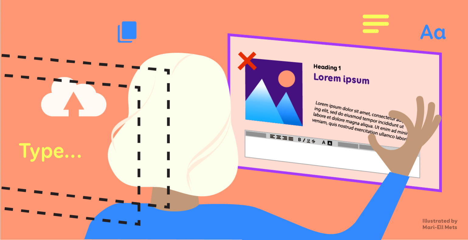
Text is inserted as a picture
Text that is added to a web page as an image, such as a scanned PDF, or text typed onto an image in a design program, creates several accessibility issues. As already mentioned, blind people use screen readers to navigate the web, which can easily understand the text content of the website, but unfortunately does not know when the text is actually a picture. Text from a picture cannot be read to the user.
Additionally, if text is added as an image, then the user cannot select and copy the text, make it larger, or change the line spacing, font, or colour of the text to make it more readable for the visually impaired.
Text inserted as an image does not adapt, is usually too small to read on a mobile device, and when zoomed in, easily gets blurry. Moreover, search engines do not understand text that has been added as an image.
No text alternatives are added to
While image recognition technologies are already more or less able to decipher text on top of an image, they cannot understand the meaning of the image. Even if the software realises that the picture has, for example, boots on it, it could mean men's shoes in one context, boots from a particular brand in another, and just feet in the third.
Moreover, people often use certain symbols or images in different senses. An arrow icon rarely means arrow, but rather "Back", "Next", "Scroll up", etc., depending on the direction. A house icon can represent a home page link or an address. A magnifier icon can mean search or enlarge.

It is important to add text alternatives to uploaded images so that assistive technologies can also understand them. The text alternative must say exactly what the meaning of the picture is. It must not repeat information already visible as text, such as the title of an article, or contain the words "Picture", "Link", "On the image...", etc. See examples and tips for writing text alternatives.
A text alternative can be added to the image in any modern content management program, directly in the code, or in a document editor. For example, to add an alternative text in Word, right-click on the picture and select "Edit Alt Text..."
Conclusion
Accessibility means more happy customers, a higher quality website, and equal opportunities for all users. Ensuring web accessibility is the entire development team’s responsibility.
In this series, we have explored what problems can be prevented by designers, what can be done by web developers, and now also by content managers.