Accessibility problems caused by web designers
Web users, their knowledge, and capabilities can be quite different. A modern website that meets the European Union requirements is inclusive and accessible, which means it can be easily used by people with special needs, the elderly, children, as well as everyone else.
To achieve this, it is important to follow the WCAG criteria when planning, developing, and managing any web environment. Testing the website with target group representatives is also recommended.
Today, accessibility does not receive enough attention across Estonian websites because the general awareness on the subject as well as the level of inclusive design and development is still quite low.
As we already know, there is no silver bullet when it comes to uncovering and fixing accessibility problems. Web-based automatic tools cannot find most of the accessibility problems because they simply cannot be programmatically determined.
That is why it’s important to also test websites manually and try to use them the same way that users with various assistive technologies do.

Image 1 – Web accessibility benefits not only people with special needs, but also the elderly, children, and many others.
It’s also not enough to only train your developers to fix the problems you discover – you also need to work together with designers and ensure that the content managers are constantly paying attention to accessibility.
In this article, we will shed some light on those accessibility problems which can be caused as well as avoided by web designers. Although there is a big difference between UX and UI designers, we will refer to both under the same term here for clarity. All the examples below stem from real experiences and websites.
Complicated content hierarchy
Generally, a UX designer is responsible for the overall structure and hierarchy of an information system or website. hey create prototypes for the web views to make navigation as simple as possible and information easy to find.
Unfortunately, the layout of the prototype can be fatal for people who use the keyboard to navigate (users with motor impairments, the elderly, users with a temporary hand trauma).
Keyboard navigation is linear, from top to bottom and left to right: by pressing the Tab key, the visible focus (usually a glowing blue rectangle) will move from link to link and from button to button.
When users reach the desired link, they click the Enter key to activate the link. Navigation may become complicated if elements are not focused in a logical order and sometimes, it can be the “fault” of the design. Here are a couple of examples:
-
The cookie notice is designed to be at the bottom of the screen.
Problem: if the cookie notice has been designed to be at the bottom edge of the page, the developer will likely add the notice as the last thing in the code as well. A user who can see and who uses a mouse has no problem with this – they can simply close the notice and continue to scroll the page. But with keyboard navigation, the user must move through the entire page to reach (and close) the notice, which can take hundreds of Tab clicks and a lot of time.
A better solution: place the cookie notice at the top of the page when designing a website.
-
The sidebar is designed to be on the right side of the screen.
Whether it’s a sub-menu or a set of filters, if something is located on the right hand side in the design, the content order gets complicated for the developer: should the keyboard user first navigate through the content of the page and then go to the sidebar (so to reach the menu, you must first Tab through the entire page) or should they first go to the sidebar and then to the content (as if going backwards, from right to left)?
A better solution: design the sidebar to the left of the page.
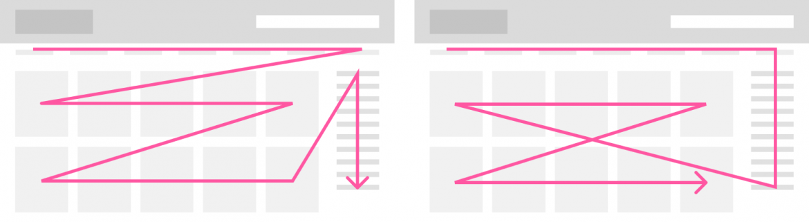
Image 2 – If the sidebar is on the right, then the reading order is illogical regardless of whether the menu is navigated to before or after the content.
No option for skipping the header
As mentioned above, keyboard navigation is linear, from left to right and top to bottom, which means that moving through the page requires a pretty large amount of Tab clicks.
To make keyboard navigation a bit easier, the beginning of each page must include a “skip to content” link, which allows the user to jump over the header and navigation and go straight to the main content of the page. If the user clicks the link, they will be scrolled to the main content and their focus will also be moved there.
The “Jump to main content” link must be the very first element of each page. The link does not have to be constantly visible and may be shown only when focused AKA when the user moves on it with the Tab key. But if the designer excludes it from the design, chances are it will be forgotten during development as well.
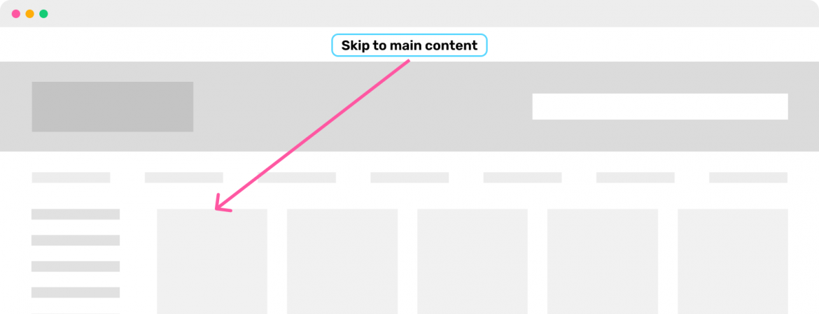
Image 3 – The beginning of each page must include a link that is shown when focused with the keyboard and that allows the user to move to the main content.
Why can’t I click here?
If items that can be clicked and items that cannot be clicked look very similar, users can easily get confused. For example, if the title of the article sometimes acts as a link, but other times doesn’t, you need to really think about how to clearly differentiate between them.
In general, buttons should look like buttons, links should be clearly distinguishable from regular text, and the rest of the content should not look clickable. Here are a couple of examples:
-
Titles look like buttons
People are used to scanning pages with their eyes to find various user interface elements – for example, buttons are generally distinguishable because they have a coloured rectangle behind some text that has a larger font. So to avoid confusion, it is best not to use rectangles behind non-clickable text.
A better solution: differentiate user interface elements from each other in a commonly used and consistent manner.
-
Sometimes it’s clickable, sometimes it isn’t
People are very good at noticing and learning all kinds of patterns. We should take advantage of this gift when designing for the web, instead of working against it. For example, if your website uses green links everywhere, then you should not use that green colour to mark other, non-clickable words. Or if the news page generally includes pictures and titles that are both clickable, you should not make some of the pictures unclickable.
A better solution: use a similar navigation pattern across the whole website.

Image 4 - Titles look too much like buttons and the user may try to click them.
Form field labels disappear when given input
Lately, a trend has been around to hide form field labels whenever the user writes something into the field. This means that after the form has been filled out, it is no longer possible to check whether it was filled correctly.
This is especially problematic if the user uses the autofill function which fills the form automatically, but often makes mistakes – for example, fills the first name field with the user's full name or fills out the address fields in the wrong order. The best solution is to always have the form field labels visible.
Image 5 – If form field labels disappear, then the user cannot check whether form was filled in correctly.
Unreadable text
Web content must be easily legible – meaning that the text must be large enough, have enough colour contrast, be left-aligned, and in a well-readable font. In general, it is better to use sans serif fonts for the web.
Left alignment is always preferable because middle- and right-aligned text forces the reader’s eyes to wander around at the beginning of each line while justified text creates disproportional spaces between words, which also makes reading more difficult.
A good font size for body text is at least 16px. You should never use text below 12px font size. Although the recommended amount of characters in a block of text (80) is specified only for the WCAG AAA level, it is still good to keep it in mind when designing any kind of text for the web, because longer lines are just uncomfortable to read.

Image 6 - left: low contrast, right: high contrast
The only requirement set for text by the WCAG AA level is to check its contrast ratio. Essentially, the more the colours of the text and its background differ, the more contrast that text will have. For example, light grey text on a white background has a low contrast ratio, but light grey text on a black background has a high contrast ratio.
For regular text, the contrast ratio must be at least 4,5:1. If the size of the text is at least 24px or at least 18px and bold, then the contrast ratio may be lower, but not less than 3:1.
Colour contrast is something that designers must definitely check – this can be done quickly and easily with tools such as this one. For Figma users, the plugin Contrast is a good tool to use.
I recommend checking any light-coloured texts on light background, such as orange or light blue on a white background, and all kinds of grey tones, such as form field placeholder texts.
You should also check whether the fill or stroke colours of various UI elements like clickable icons, form fields, checkboxes, radio buttons, etc. have a contrast ratio of at least 3:1 with their background colours. The only elements that don't have to follow the contrast ratio requirement are disabled elements.
Missing focus styles
For people who navigate with the keyboard, it is extremely important to always see where their focus currently is. To do so, it is important to assign a focus style for each clickable element (links, buttons, form fields, radio buttons, checkboxes, select dropdowns etc.).
The default browser focus styles can be replaced by custom ones created by the designer, but if doing so, it is important to make sure that for example the focused link has a high enough contrast ratio with its background and is clearly distinguishable from other, unfocused links. Focus styles must never be made invisible.
No way to stop automatically moving content
Almost as popular as automatically rotating banners on landing pages is the accessibility problem connected to them: if the user has difficulties related to attention or reading, then moving banners may significantly disrupt their user experience. The popularity of ad blockers shows that moving and blinking banners actually bother nearly all users.
According to the WCAG standard, the user must be able to stop or hide automatically moving content. To achieve this, the designer should draw, for example a pause button on the banner, which the user could then use to stop the slides from automatically changing.
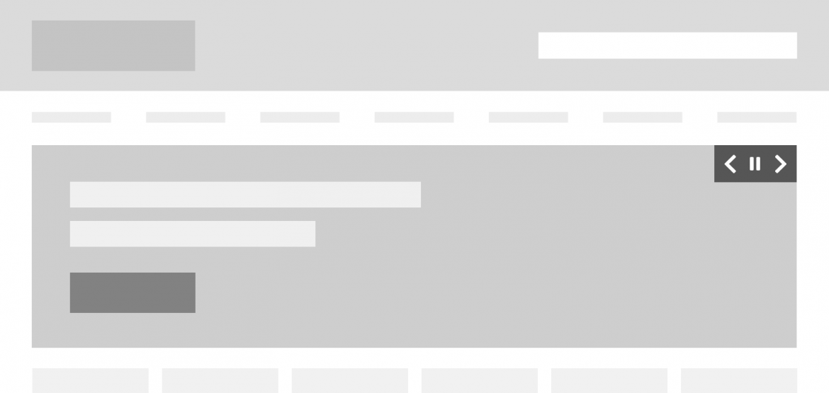
Image 6 – Automatically changing banners include a pause button that can be used to stop the slides from changing.
Conclusion
Ensuring accessibility is not just a task for developers, but something that designers and content managers must also contribute to. In this article, we looked at some of the most common accessibility problems that the UX and UI designers can help to avoid.
You can find even more ideas and tips in our article “How to design for accessibility?”. You can also find inspiration from these inclusive design posters.