Axure RP Tabbed Menu Tutorial plus a FREE Widget for Download
Welcome to our article series about prototyping. In our mind one of the best tools for this is Axure RP, but not a lot of people know how to fully use the software. To remedy this problem we will be sharing some of the tips and tricks of our favorite prototyping tool.
In one of my recent projects I needed vertical tabs where the active state of the tab would form a seamless outline with the contents outline. In this tutorial I will show you how to make a vertical tab widget.
You can see a preview of the end result and download the finished widget here.
You are free to download the widget and play around with it yourself. but if you want to know how to build your own then go on reading.
Getting started
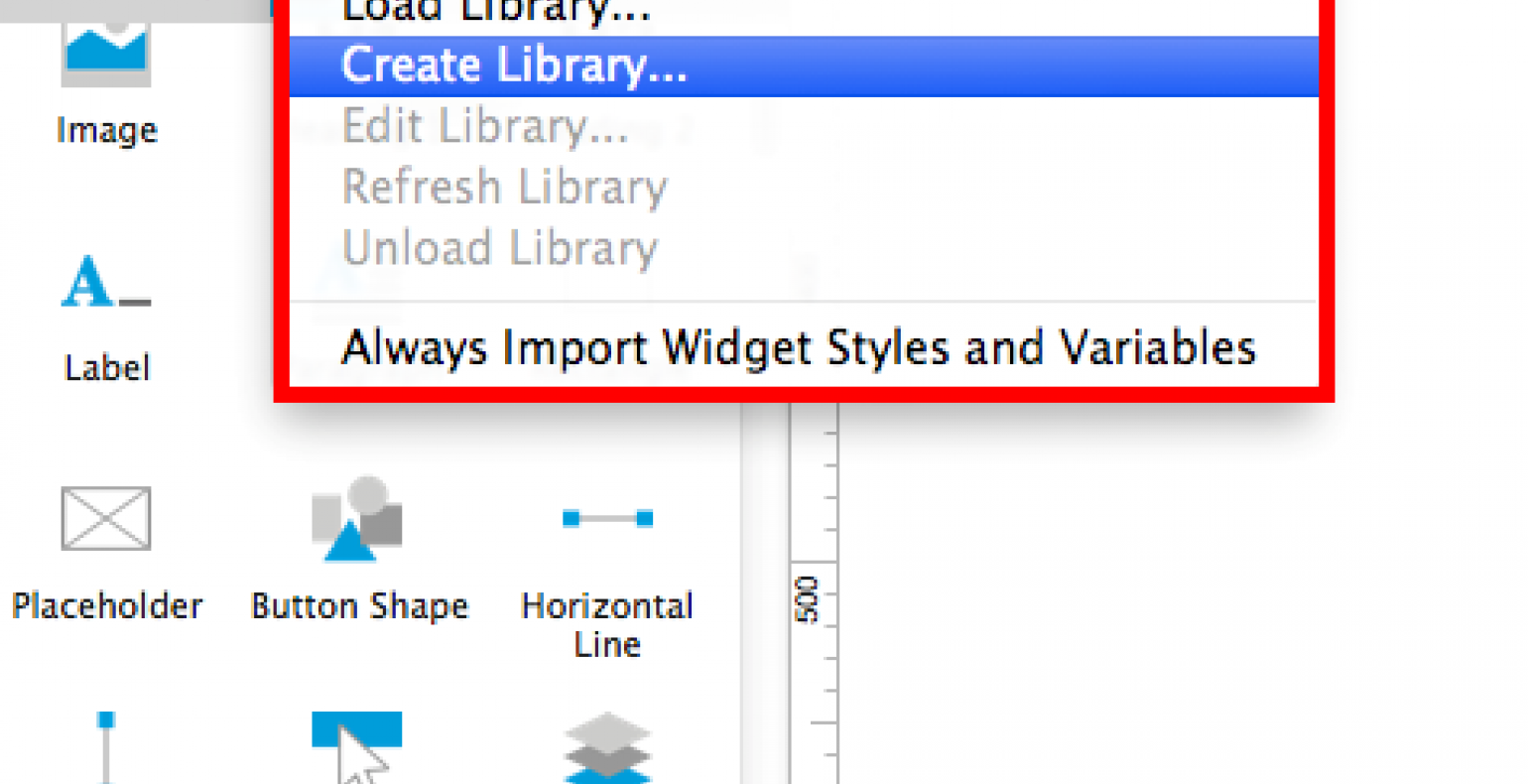
First start by opening a new Axure RP file and find the widget pane. From there click on options and choose Create Library.
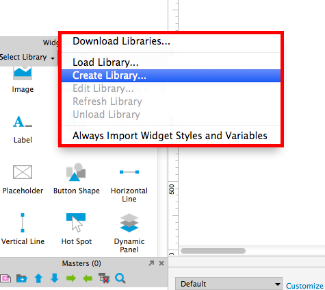
Next, give your library a meaningful name and click Save. This opens up a new Axure file.
In the left column you can see your new widget with the name „New Widget“. As with everything it's a good idea to give your widget a meaningful name.
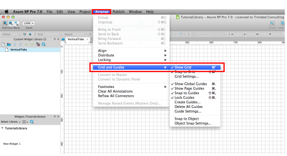
I like to work with grids and I recommend all of you to do the same. Using grids helps you to keep all of your elements in proportion. You can turn the grid on by going to the arrange menu and clicking on the Show Grid option.
What the actual grid units should be is a whole other blog post. Maybe I'll get to it in the near future. Right now you can use the default value.
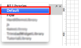
Now that we have the grid, we can start adding the elements that make up the widget. From the widget pane, click on Select Library to open up the Default Widget Library.
From there, click and drag a rectangle onto your grid (work area).
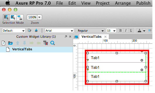
As with everything, give your elements a name. I am naming mine "Tab1". To keep it simple I'll also set the text on the rectangle to "Tab1". Once I have the first tab ready then I'll duplicate it and name the copies accordingly to "Tab2" and "Tab3".
For the purpose of this tutorial three tabs are enough. Now you should have something like in the image below.
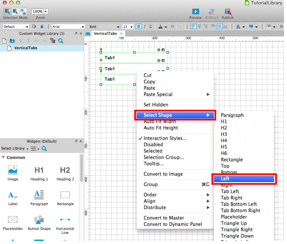
Now let's style the tabs. With all of the tabs selected, I'll align the text left, and set the left padding to twelve pixels. You can do this in the widget properties and style pane. I have also set the font weight to bold and the outline colour to white.
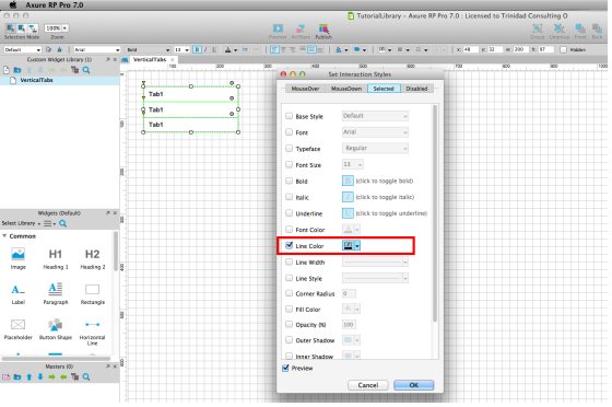
Next we need to set the active state for all the tabs. To do this, select all the tabs, right-click on them, and select Interaction Styles from the context menu. In the Interaction Styles click on the Selected tab, select the Line Color attribute and set it to black.
With the tabs still selected, right-click on them again, and from the Select Shape menu, select Left. This way our shapes won't have an outline on the right.
Next let's assign a selection group to the tabs. This assures that only one tab will have active state when the user interact's with the widget. With all of the tabs still selected, do another right click on them and click on Selection Group. In the Selection Group dialog assign tabs to the "TabsGroup" or whatever name you like.
After this is done we can move on to mocking up the content of the tabs.
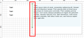
Drag another rectangle onto your grid. Give it an appropriate size and don't forget to name it. Since this rectangle will serve as the main outline for the content of the tabs then I am going to name mine TabsContentBackground.

Drag a paragraph widget onto your content background and add some text to it. It can be whatever you want, lorem ipsum or something else. Right click on the paragraph and click on Convert to Dynamic Panel.
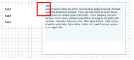
Give your newly created dynamic panel a name. I am naming it TabsContentStates. I am going to add two more states for each tab. All together three states.
Now open up your states and add different content to each of them. This makes it easier to see if the widget actually works.
As a final element, drag a vertical line onto your grid and align it with the left border of your content background. Give your vertical line a name. I am going to name mine LeftBorder.
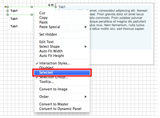
Before we get to actions, select the first tab and bring it to the front. You can do this from the menu on the upper bar.
Nudge all of your tabs a little bit to the right so that the first tab overlaps your left line of the rectangle. Don`t forget to set your first tab to Selected. You can do this by right-clicking the tab and clicking on Selected.
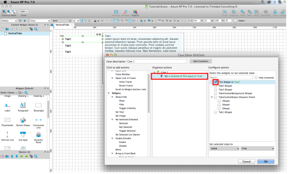
Now to the actions. I'll do the actions for the first tab first and then copy-paste them onto others. Start by selecting your first tab. In the interactions pane double-click on the OnClick button to open up the Case Editor menu.
From there choose the Selected widget and set “This Widget to” to “true”. This sets the clicked tab to a selected state and since we have previously set interaction styles then our tab will get a black outline.
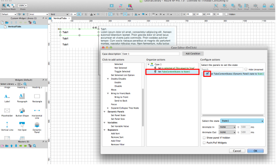
Next we'll add a action that sets the tabs content to the correct state. With the Case Editor still open, find the actions for the Dynamic Panel and click on Set Panel State. Find the correct dynamic panel, in my case "TabsContentStates", select it and set the selected state to State1. This is because we are currently setting actions for the first tab.
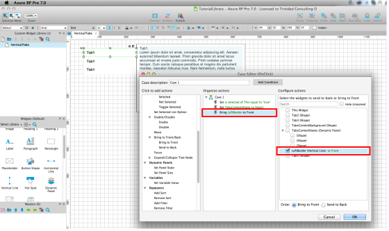
Next, find the Bring to Front action and add it for the LeftBorder shape and "This Widget".
Important! Make sure that you tick the LeftBorder before "This Widget".
This ensures that the active tab will stay in front of the left border. This works because actions in Axure RP are executed for the elements in the order they were added to the action. Once this is done, click OK.
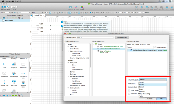
Now we have all the actions for the first tab and we need to copy and paste them to other tabs.
With the first tab selected, go to the Interactions pane, select the OnClick case and copy it either by right-clicking and choosing Copy from there or just keyboard shortcuts. Then select the second tab, paste the actions to the OnClick case. One thing we need to change here is the Set Dynamic Panel State action. Double-click on the set state action and set the selected state to State2.
Repeat this for Tab3 and set TabsContentState to State3. Voilà, you have made some vertical tabs! But if you find this too big of a hassle then you can use our already finished widget.
Click to Download the Axure RP Tabbed Navigation Widget
After downloading is completed, save the widget to your widget library. To load the library to your files, click on Options in the widget pane and click Load Library. Navigate to the folder where you saved your library and click to open it. Now, all you have to do is drag it to your prototype and use whenever you have a need for it.
Did you like the tutorial or have a tip of your own? Leave us a comment down below!
To conclude
All of our prototypes so far have been made in Axure because it is indeed a very fast process.